Do you have any worries as to why customers aren’t interested in your goods and services? If that is the case, you might not be using the proper user onboarding procedures. Users who come across a product on your page want a detailed description.
Clear instructions are required. Any complex or confusing information will quickly cause the customer to lose interest.
Making sure the customer understands how your goods and services will benefit them is your main objective as a marketer. Make sure the person learning about your product for the first time feels as though they have known it for a very long time by the end of the user onboarding procedures.
In this article, we’ll define user onboarding practices, the user onboarding best practices, and examples of user onboarding for advancing your product purchase.
What Is User Onboarding?
This is the initial perception you have of something. People lose or gain interest in things depending on how they are introduced. No matter how often we tell people not to judge a book by its cover, it is inherently human to pass judgment.
In a digital context, the user onboarding experience refers to the user’s first impressions after using your product.
The complexity and scope of various software applications vary. It is your responsibility to ensure that a customer is aware of the benefits and drawbacks of your software before they decide to purchase it.
User onboarding’s primary goal is to encourage user activation and user retention. The user onboarding process involves several patterns, some of which are as follows:
1. Use of Welcome Screens
Greeting customers with striking designs is a great way to introduce them to your products. This enables quick interaction with the product. The welcome screens may display videos, slideshows, or descriptive pictures. Leveraging AI, like AI slideshow maker, AI video & image generator will helps in seamless way to present your ideas to your customer.
Below is an example of an online platform dealing with food services. Delivery is one of the services provided. For customers who order food online, this is an eye-catching feature. The welcome message starts on the first slide of “Order Your Food.”
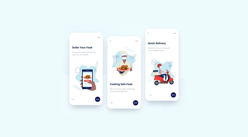
Food Services – Image Source: Dribble
2. A Tour of the Product
While some of your customers visit your website frequently, others are new. If they need to install an app on their devices, you should walk them through each step of getting the app to function.
An overview of the product should be provided to the customer using a dynamic video, audio, or slideshow.
3. Interactive Walkthrough
Following the installation of an app on a device, users may see pop-up instructions. Each step needs to be described; for example, the purchasing section should specify whether to make purchases using a credit or debit card.
Top User Onboarding Best Practices
We’ve put the following user onboarding practices in place to support you in reaching your objective of broad user coverage and customer retention:
1. Examining Your Intended Audience
Customers have a variety of demands. It is your responsibility to meet these various needs. You might be wondering how you can anticipate everyone’s needs. Knowing the needs of your customers requires a team effort.
Knowing your customers’ needs will help you determine how to keep them and attract new ones. You can learn about their needs by using the following methods:
- Using questionnaires or surveys
- Organize user interviews
- Examining your rivals
- Integrating feedback platforms into your web applications
- Leveraging online portals for customers
2. Managing User Onboarding Expectations
At the beginning of any relationship, there are frequently high expectations. The organization expects the sales team to generate revenue, while the customers expect to receive flawless goods and services.
If you don’t manage expectations, you’ll deal with unrealistic demands, deadlines, and scope creep. When setting a plan, the following should be inclusive:
- Deliverables
- Metrics for gauging achievement.
- Contractual commitments
- Datelines for every stage of onboarding
These requirements should be met by the project management software you use. The software will assist you in keeping track of your accomplishments.
After establishing reasonable expectations and goals, keep your word to everyone on board – failure to deliver results to an enraged client who you will undoubtedly lose.
A disgruntled customer can quickly spread awful news to others by, for example, leaving a bad review in the comment section of your website.
3. Less Overload on the Features
The goal of user onboarding is to help customers quickly understand the features of your products. The information should be descriptive, concise, and straightforward. Within the first impression, the customer should be able to determine whether the product is worthwhile buying.
New users will likely leave quickly if your website or applications contain lengthy and confusing information. Use attractive features that catch the eye to keep new users onboard.
With the help of monitoring software, you can quickly determine what to offer customers using your app or website for the first time.
With time you can offer your products with more in-depth features for regular customers. You can start by simply informing people that you will launch some products, soliciting their opinions and interest in trying new things.
4. Communicating the Value Proposition
Before making a purchase, the first thought that crosses anyone’s mind is whether the item is worth their money. You don’t want to provide your customers with sluggish apps or products that become unusable.
Customers need to understand what makes your product unique and why they should buy it from you rather than another company, which necessitates a compelling value proposition.
The time it takes to persuade someone to purchase your product should be as short as possible. Spotify is a good example, with the tagline “Soundtrack Your Life.” This suggestion encourages many users to install the app to access music that impacts their lives.
If the drive is comedies, adopt a lighthearted and playful tone. If the drive is software technology, adopt a style that would excite software developers. Whenever setting the tone, keep the target audience in mind.
When customers log in to your website, they should have an “aha” moment. The “aha!” moment refers to the customer’s finding out the value of a product to them. This might occur when a user uses a particular feature or reads content on your website or app.
Below is the Ordermark dashboard platform that supports various online boarding services. They provide operators with flexibility and control over their online ordering, enabling them to add more outlets. With this, their revenue and clientele coverage improve.
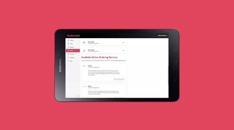
App Dashboard – Image Source: Ordermark
5. Use of Email
One step in the user onboarding best practices is email communication with a new or prospective client. A person needs to use your products to be recognized as a user. Emails help you build a strong relationship with your customers.
The goal is to make your customers aware of your products and encourage them to recommend them to others, building customer loyalty. The next step is to explain what you offer to the customer once you have them on board.
This approach can be accomplished by:
1. Introduction
Even if the customers know you, start with a simple greeting before introducing your business and the products you sell. By introducing yourself, you demonstrate your concern for them and desire for a lasting relationship.
2. Giving crucial details about a product
Simply stating your product is insufficient. You should provide customers with personalized information and various options for using your product in the emails.
Although it may differ slightly from what they have seen on the website, the information should not be confusing. Giving product information builds your company’s reputation.
3. Facilitating interaction with the website or product
This is an excellent opportunity to guide around any potential pain points if your product or app needs more instructions.
You can encourage FAQS or create content through tutorial videos and slideshows. You can offer links that will guide customers to the content.
4. Encouraging immediate purchase
Your main goal is to push sales. Using email to inform new and existing customers about new products or discounts you offer is a good idea.
Never forget to refrain from filling your emails with numerous images and detailed information. The customer will become exhausted as a result and leave your website.
An example of active and inactive users interacting with your app or website is explained below.
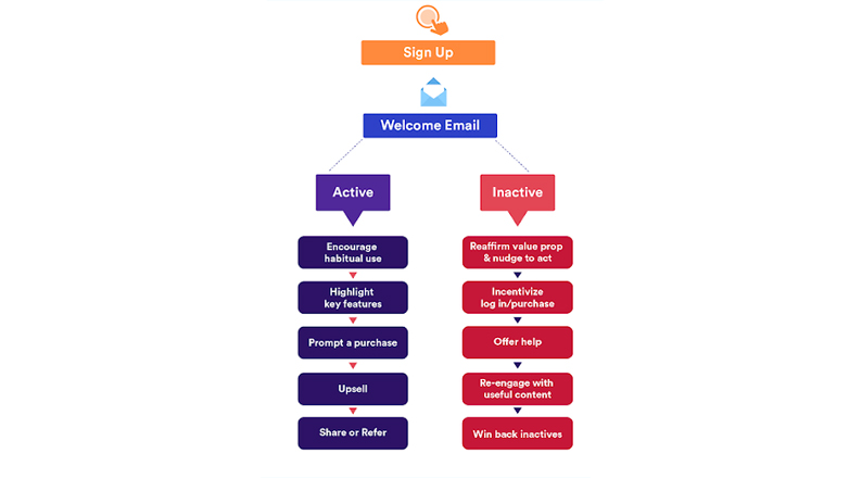
Emails Engagement – Image Source: Hubspot
6. Using the Element of Competition
Applying competition techniques is an excellent way to increase sales and attract new users to your website. This way, you have the aspect of social proof and gamification.
Social proof involves showing evidence that people are using your product. People become more interested in trying a product if they can see proof that others have benefited from it.
In contrast to the marketer pleading with them to use the product, people are more likely to believe customer reviews to use a product.
On the other hand, gamification entails making a portion of your product into a game. A clever tactic is to add unlocking steps after a player has completed several in-game steps.
This tactic adds a bit of fun to the user onboarding process and appeals to users’ competitive nature. Essentially, competition is where gamification and social proof meet.
The idea is to demonstrate to new users how their friends, coworkers, or strangers are using the app.
Here is a Duolingo Club feature for a language that various people attempt to learn. User engagement with the app is encouraged by a leaderboard. You must use the app frequently to move up the leaderboard. As a result, more users are competing to be at the top.
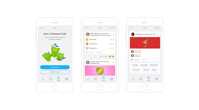
User Club Leaderboard – Image Source: Duolingo
7. Testing the User Experience (UX)
Before releasing an onboarding procedure to the public, test it. It is your responsibility to ensure that users of your application or website won’t become stuck in the middle while using it. Processes that don’t work correctly are destructive for the business.
Knowing your customers’ needs is ideal, as we have seen in other user onboarding best practices. Testing your process through tools like usability tests will help determine whether you have attended to these needs.
The tests offer helpful feedback that identifies issues with the product interfaces or the onboarding process for new customers. 79% of customers who don’t find what they’re looking for on your website will visit your competitors’ websites to look for services.
Benefits of usability testing:
- You have the advantage of getting feedback before starting your onboarding processes.
- Onboarding bottlenecks are easier to get rid of.
- You get the advantage of understanding your customer and their needs. You can also learn about actual and anticipated user behavior.
- You can save time by knowing what to concentrate on.
- You get to come up with fresh solutions to design issues. Information from your customers and UX design experts is simple to gather.
8. Using Eye-Catching Graphics and Effects
Effective onboarding designs provide a warm and exciting view of your page. Many designers use animation, visuals, and effects to attract and maintain customers.
The graphics used should promote the content you are promoting as well. For example, waving of hands gifs can be used for greetings on welcome screens.
Through videos or slideshows, people can learn quickly about your products. Avoid using boring fonts and images to keep them interested. These techniques reduce the time needed to explain everything to a client in detail.
An illustration of a video introduction graphic explaining how to use video for employee engagement and onboarding is shown below. You’ll be curious about what is in the video content because of the introductory pictures and the title.
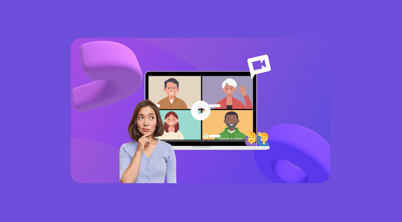
Introduction to a Video – Image Source: Clipchamp
9. Automation
Automating your user onboarding practices should be incorporated. Most app or website users don’t want to perform numerous clicks on various steps.
Automated procedures maintain client interest without causing disruptions. However, not all of your onboarding processes can be automated.
Based on user testing and feedback, you can determine whether you need automated or manual processes for your users.
User Onboarding Examples
Now that we have looked at the user onboarding best practices, we need to know some user onboarding examples that are being used across the globe.
1. GitHub

GitHub Logo – Image Source: Dev Genius
The web-based version control system GitHub allows for collaboration between software developers. In June 2018, Microsoft, the most significant individual contributor to GitHub, started the acquisition of the application for $7.5 billion.
GitHub delivers its services using the software-as-a-service (SaaS) delivery model. The application has been used by numerous developers to create commands, codes, and maintain various software.
Users have commented on how interactive GitHub is, giving new users the impression that they are writing and running a coding command right away.
2. Mockplus
Designers use Mockplus to create UI/UX designs. An automated guide explaining the application’s various features is immediately provided to users after they have finished the sign-up process.
Users who are familiar with the user guides can skip that section. Images and videos are used to facilitate learning.
Below is a beneficiary designer who used the Mockplus application to make online house purchasing easy.
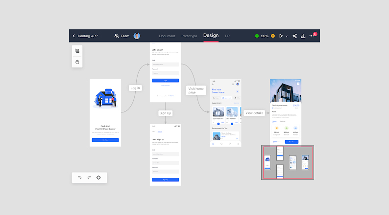
Apartment Purchasing- Image Source: TEGAKARI
3. Duolingo
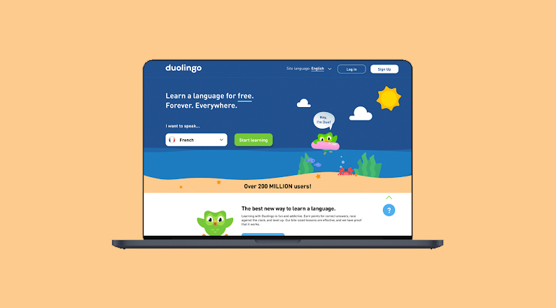
Duolingo Welcome Screen Website – Image Source: Bootcamp
Anyone can learn new languages with the help of the Duolingo website, and app user onboarding begins. You are guided through both the language you speak and the language you want to learn step by step.
The process includes gathering user information to understand user needs and provide services that meet those needs.
You can participate in gamification, where you are ranked as you keep improving in the foreign language.
In 2021, Duolingo generated $250 million in revenue, up 55% from the previous year. It has over 500 million registered users, of whom 37 million log on once per month, and there are 95 courses available in 38 different languages.
3. Basemap
You and your team can work together more efficiently using the project management tool Basemap. It includes a step-by-step account setup flow and a two-minute video tutorial to explain the app’s main features.
You are led through a walkthrough that pops up multiple times to familiarize yourself with the interface after you sign up and finish the registration process.
To direct the new user to the project template that best suits their needs, the onboarding team inquires about the projects the user currently has underway.
Bottom Line
User retention can be significantly impacted by the onboarding process you use for new users.
The user onboard best practices we’ve discussed are necessary to satisfy more than a hundred needs available in the market.
Although it is not a guarantee that you will receive 100% results, there is a good chance of success if you understand your users’ needs, prioritize the onboarding process from most important to least important, interact with your customers, and control expectations.
The top-performing apps and websites in the market are successful because they have invested in their onboarding procedures and pay attention to user feedback.
You must do your best to neutralize the situation as a marketer when dealing with difficult customers. Try a few onboarding procedures, even if you don’t use them all, and you will reap the rewards.
Acowebs is an award-winning WooCommerce plugin development company having more than 60,000 customers across the globe. WooCommerce plugins from Acowebs like WooCommerce Quick View help users to make a quick look at the products rather than opening the entire product page. There are also free plugins from Acowebs for WooCommerce Deposits, WooCommerce PDF invoices, WooCommerce Product Labels, etc. which are being used by thousands of customers.


 Login
Login
 Cart
Cart


