After installing the Quick View for WooCommerce plugin, you can see a new menu “Quick View” in the WordPress admin menu bar.
General Settings
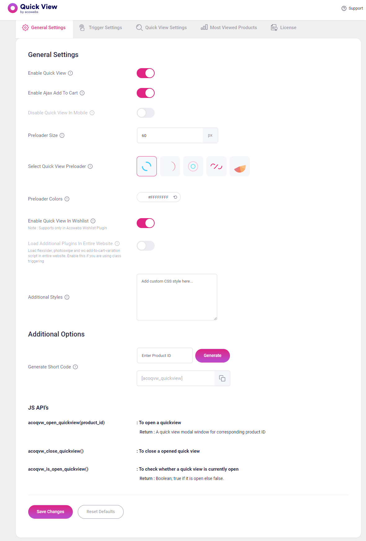
General Settings
Enable Quick View : Here you are able to click a button on your product archives for a specific product and immediately see a popup with that product’s information, as well as its add to cart button.
Enable Ajax Add To Cart: It uses a button that utilizes an AJAX call to a function that adds the product to the cart without leaving or reloading the page.
Disable Quick View In Mobile: You also have the option of enabling mobile device Quick View.
Preloader Size: Edit This To Set Preloader Size. In Pixel
Preloader Colors: It is the color of a selected preloader.
Enable Quick View In Wishlist: Enable This To Display Quick View Button In Wishlist(Supports only in Acowebs Wishlist Plugin)
Load Additional Plugins In Entire Website: Enable This To Load All Scripts In Entire Website(Load flexslider, photoswipe and wc-add-to-cart-variation script in entire website. Enable this if you are using class triggering)
Additional Styles: You need additional styles, you can use this area for put styles.
Additional Options
Generate Short Code: Add Product Id And Click Generate To Generate Shortcode For A Specific Product. Leave Product Id Empty To Get The Shortcode That Can Be Used Inside A Product Loop.
JS API’s
acoqvw_open_quickview(product_id): It is used to open a quick view modal window for corresponding product ID.
acoqvw_close_quickview(): For closing the opened quick view modal window.
acoqvw_is_open_quickview(): Used for checking whether a quick view is currently open. If it is open it shows true or it is closed then shows false.
Trigger Settings
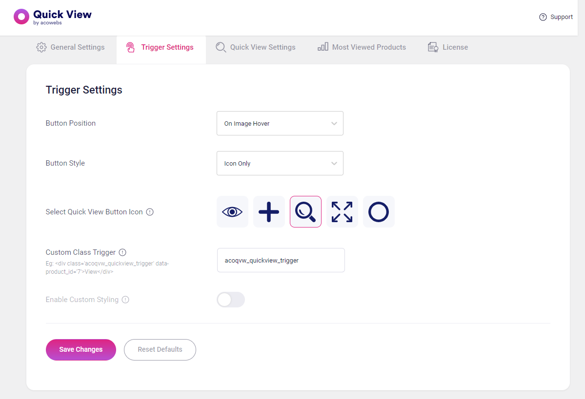
Trigger Settings
Button Position: Used for positioning the quick view buttons where you want.
2.Button Styles: If you want a quick view like an icon choose ‘Icon Only’ or a text choose ‘Label Only’ or if you want to display both icon and text choose ‘Icon + Label ‘.
3.Select Quick View Button Icon: for selecting the icon viewing model.
4.Custom Class Trigger: Add A Class To Trigger Quick view Via Class
In this case it display the product based on the product_id=’7’
5.Enable Custom Styling :If you want to style the quick view icon, you can enable the button then displays an area to give a style and color.
Quick View Settings
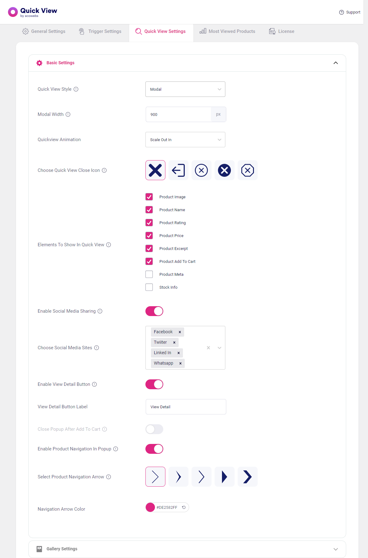
Basic Settings
Quick View Style: Choose The Quick View Style From The List Of Styles.
Modal Width : Set The Width Of The Modal Box From Here. It Will Only Applied To The Quick View Type ‘Modal’.
Quick view Animation: It is for setting the quick view window animation . if you want zoom effect select ‘Zoom’ .
Choose Quick View Close Icon: Select the icon for closing the quick view window.
Elements To Show In Quick View: Select The Elements That You Need To Display In Quick view If It Is Enabled
Enable Social Media Sharing : If you want to share this for social media you can enable the Button ,otherwise disabled.
Choose Social Media Sites: This is for adding social media for share the product.
Enable View Detail Button: In this quick view window near ‘add to cart’ button ‘view detail ‘ button is displayed .If you want to this section ,enable the button, Otherwise disable.
View Detail Button Label : Put the needed text for the button.
Close Popup After Add To Cart :Enable This To Close The Popup After Adding Product To Cart. Works Only In Ajax Add To Cart.
Enable Product Navigation In Popup : If you want to display the arrow next or previous in quick View window, enable the button else disable the button.
Select Product Navigation Arrow : Choose which style of arrow in the window.
Navigation Arrow Color :Click the color button to choose the color of arrow.
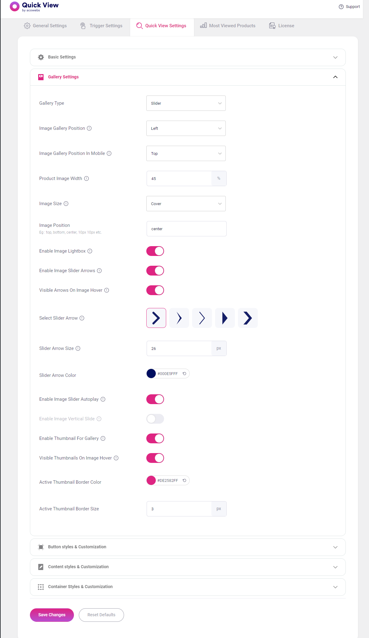
Gallery Settings
Gallery Type: It is for display the quick view window like slider, thumbnail. if you want display without the product image you can choose “do not show”.
Image Gallery Position: Select the position of product image display in the quick view window.
Image Gallery Position In Mobile: It is for setting the position of an image on a mobile device(Only Applies For Width Less Than 768px Devices).
Product Image Width: Edit This To Set The Width Of The Image Section In Percentage.
Image Size :Set The Size Of The Image Related To The Image Container. Note: Only Works When Gallery And Content Is Side By Side
Image Position: Indicate the position of the image.
In this given example shows 10px 10px,it means change the size of an image From top and right 10px.
7.Enable Image Lightbox: For add an image block, or double-click an existing image block to open the product image
8. Enable Image Slider Arrows: Enable This To Show Image Slider Arrows On Top Of The Gallery.
9.Select Slider Arrow: Select the arrow for the slider.
10.Slider Arrow Size: Edit This To Set Arrow Size. It Will Take Effect Only When You Enable The Slider Image Arrows
11.Slider Arrow Color: Choose the color of the arrow from color picker.
12.Enable Image Slider Autoplay: The image slider plays after a specific interval of time.
13.Enable Image Vertical Slide: In a slider image shows vertically.
14.Enable Thumbnail For Gallery: Enable This To Display Thumbnail Slider In Product Gallery
15.Visible Thumbnails On Image Hover: If you want to view thumbnail on image hover, then enable the button.
16.Active Thumbnail Border Color: Select the color of thumbnail border.
17.Active Thumbnail Border Size: Put the width of the active thumbnail border.
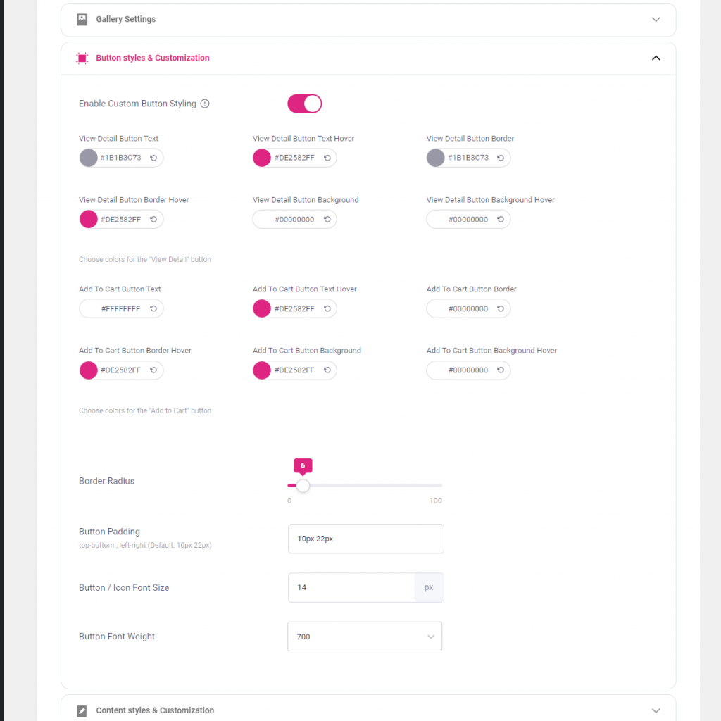
Button styles & Customization
Enable Custom Button Styling : This for styling the ‘Add to cart’ button and ‘View Detail’ button.
Border Radius: Rounds the corners of an element’s outer border edge. You can set a single radius to make circular corners by entering the value from 0 to 100.
Button Padding :The value indicate the top-bottom and left-right space in between the Button text and border. Here the default value 10px 22px means, the top-bottom distance between the Text and border is 10px and the left-right distance between Text and border is 22px.
Button / Icon Font Size: Put the value for how large the characters displayed on a screen.
Button Font Weight :This is for setting the weight (boldness) of the font.
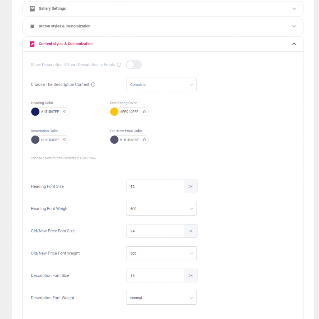
Content styles & Customization
Show Description If Short Description Is Empty :If the short description field is empty then enable the button for displaying description.
Choose The Description Content: If you want to display a full description ,select ‘complete’. If you want to display some starting content from the description select ‘excerpt’.
Choose colors for the Contents in Quick View: Put the color of product name ,Star Rating Color, Description Color, Old/New Price Color.
Heading Font Size: Put the value for how large the product name displayed the on a screen.
Heading Font Weight: This is for setting the weight (boldness) of the product name.
Old/New Price Font Size: Put the value for how large the old & new product price displayed the on a window.
Old/New Price Font Weight: This is for setting the weight (boldness) of the product price.
Description Font Size: Put the value for how large the product description displayed the on a window.
Description Font Weight: This is for setting the weight (boldness) of the product description.
Container Styles & Customization
Container Background Color: Here select the color for container background color.
Foreground Color: Select color for the quick view window outer area.
Container Content Padding: The value indicate the top-bottom and left-right space in between the content and container. Here the default value 50px 42px means, the top-bottom distance between the content and container is 50px and the left-right distance between content and container is 42px.
Border Radius: The value given for rounds the corners of the container.
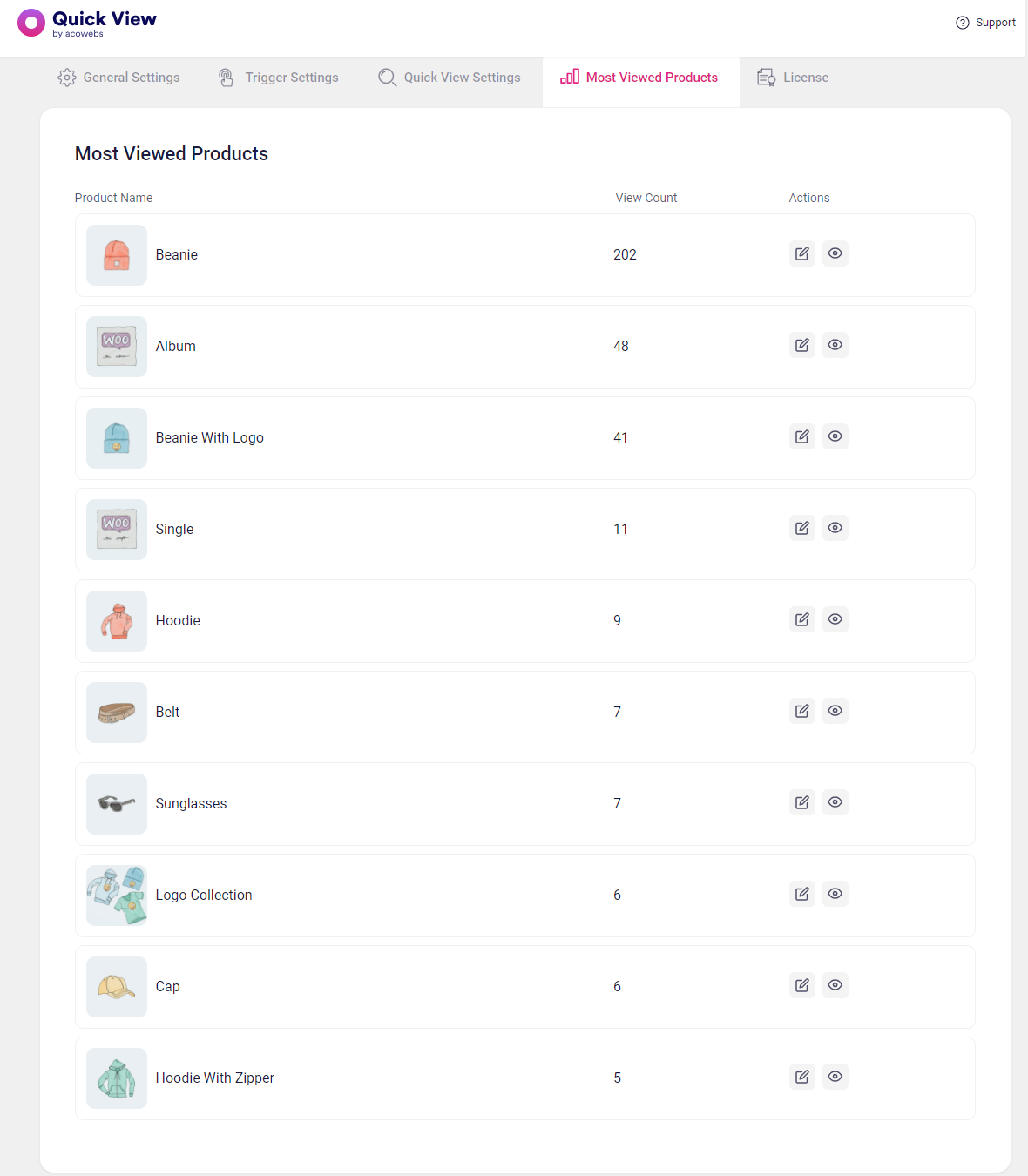
Most Viewed Products
Most Viewed Products
Here listing products based on most viewed products. In the first column product name ,second column view count, in the third column contain two actions, edit and view the Woocommerce quick view page of corresponding product.
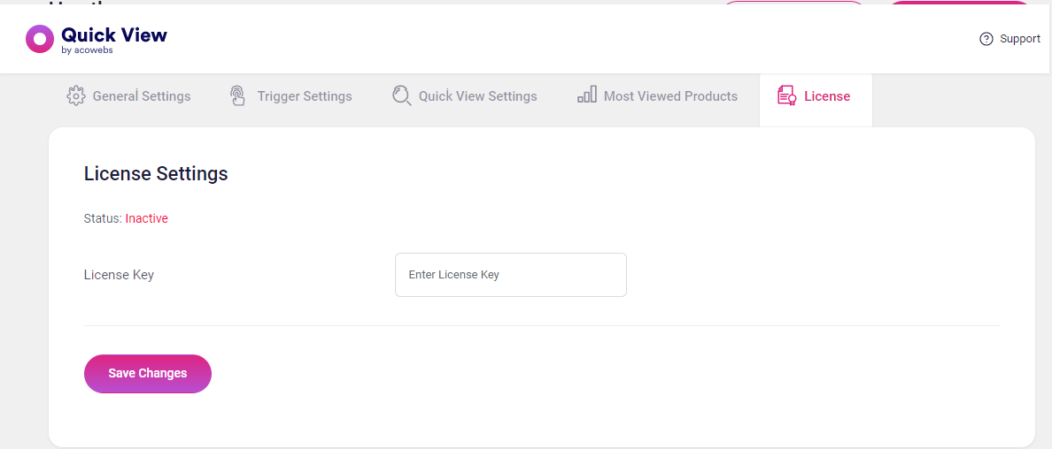
License Settings
License Settings
License Key: Here you can add and activate plugin License Key to get future updates and bug fixes.


 Login
Login
 Cart
Cart