- Woocommerce
- Shopify Apps
- WordPress
Instructions regarding Installation and activation, please visit: Installation & Activation
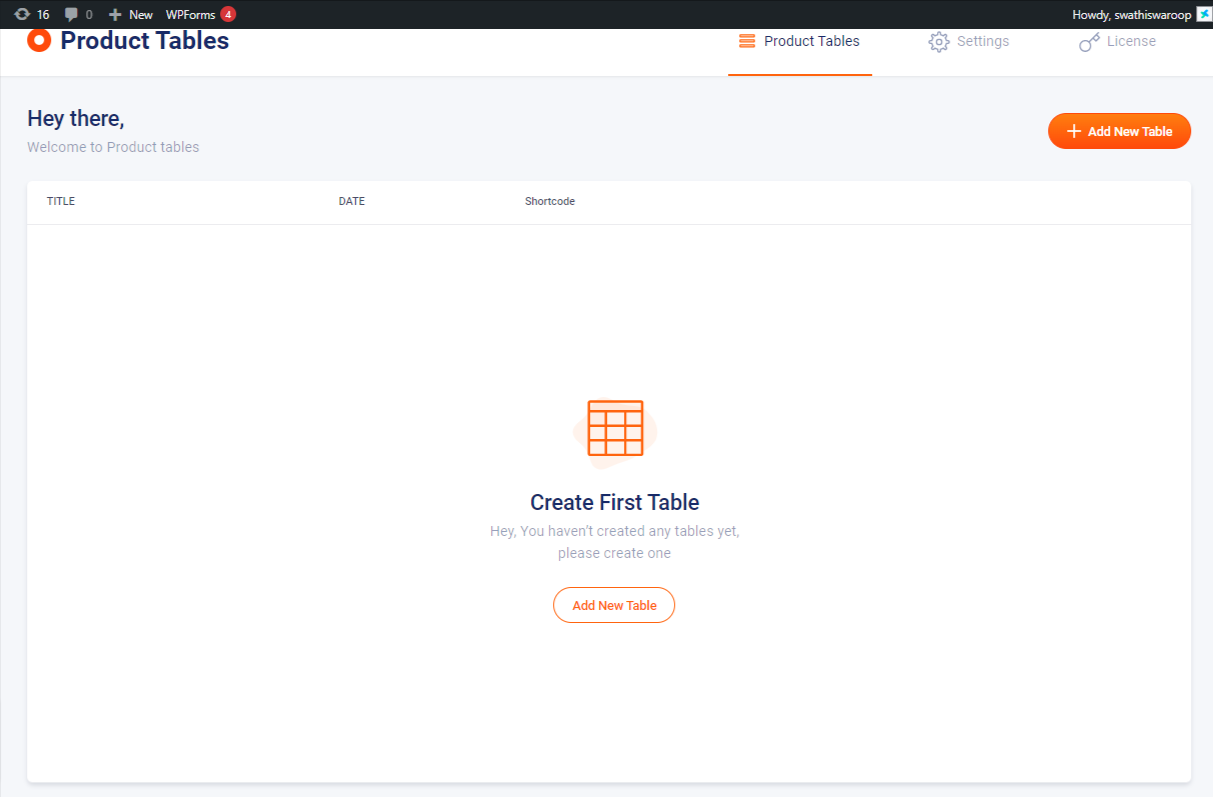
After installing the WooCommerce Product Table Plugin, you can see a new menu “WC Product tables” in the WordPress admin menu bar.
Helps to display the products in a table layout in a customizable and responsive way using shortcode.
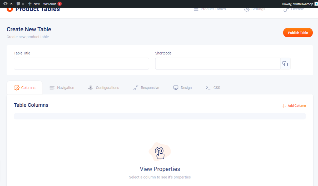
1. Table Title: Define the required name for your created table
2. Shortcode: The shortcode of the created table appears here, copy the same and paste it into “add new post”.Publishing the same will result in creating a new product table.
You have the option of selecting to show the elements like title, Image, Attributes, Category, Tags, Quantity, Stock status, Dimensions, Date, etc. as columns to build the best user experiences. If there are variable products, you can show the attribute values available. You can choose to show a lightbox image from settings or decide on the quality field types such as input field or dropdown.
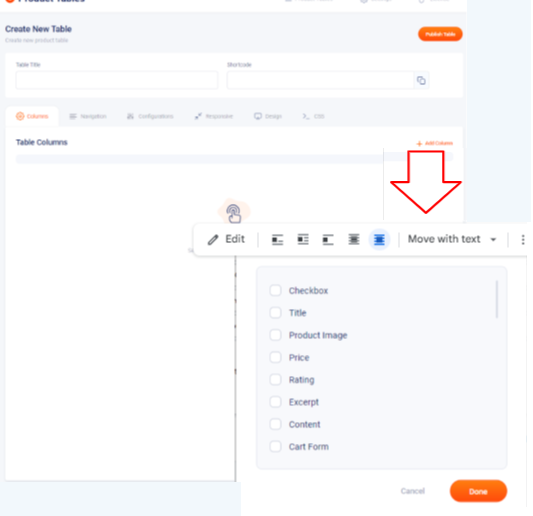
1. Add Column: Used to add the required specific elements to the product table
The available specific elements are shown below
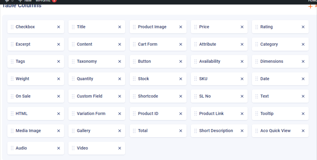
You can obtain results based on your requirements. Drag and drop the table columns or filters easily, and make it easy to adjust the element positions as per your requirements.
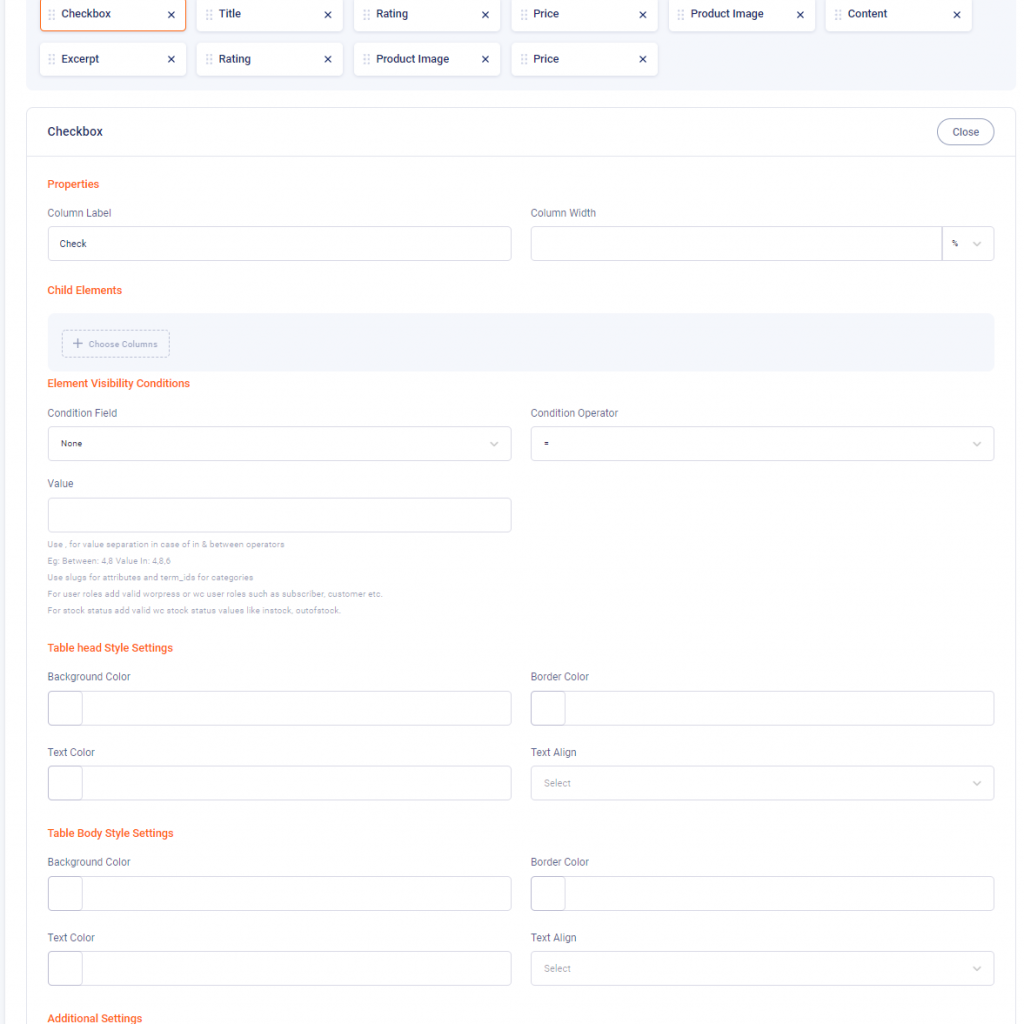
Each element has its own editor field, from which you can make your customization
1. Column Label: Define the name of the column you have selected
2. Column Width: Adjust the column width from here either in percentage or px
3. Image Size: Choose the required image size from this select option
4. Click Action: Define what to do when you click. The different actions are none, open product page, open product page in a new tab, and display image in a lightbox
5. Display Placeholder If Image Is Not Available: Enable this check box if you want to display a placeholder if the image is not available
6. Zoom Image: Enable this option to zoom the image
1. Choose Columns: Choose the required child column from the options
1. Condition Field: Choose the required conditions from the select option
2. Condition Operator: Choose the operator for the condition selected from here
3. Value: Define the required value here. Use ”,” for value separation in case of in & between operators. Use slugs for attributes and term_ids for categories.
For user roles add valid WordPress or WooCommerce user roles such as subscriber, customer, etc. For stock status add valid WooCommerce stock status values like in-stock and out-of-stock.
1. Background Color: Choose the required background color from here
2. Border Color: Choose the required border color from here
3. Text Color: Choose the required text color from here
4. Text Align: Align the text from here
1. Background Color: Choose the required background color for the table body from here.
2. Border Color: Choose the required border color for the table body from here
3. Text Color: Choose the required text color for the table body
4. Text Align: Align the text from here
1. Custom Class: If you need to create a custom class, define the custom class name here.
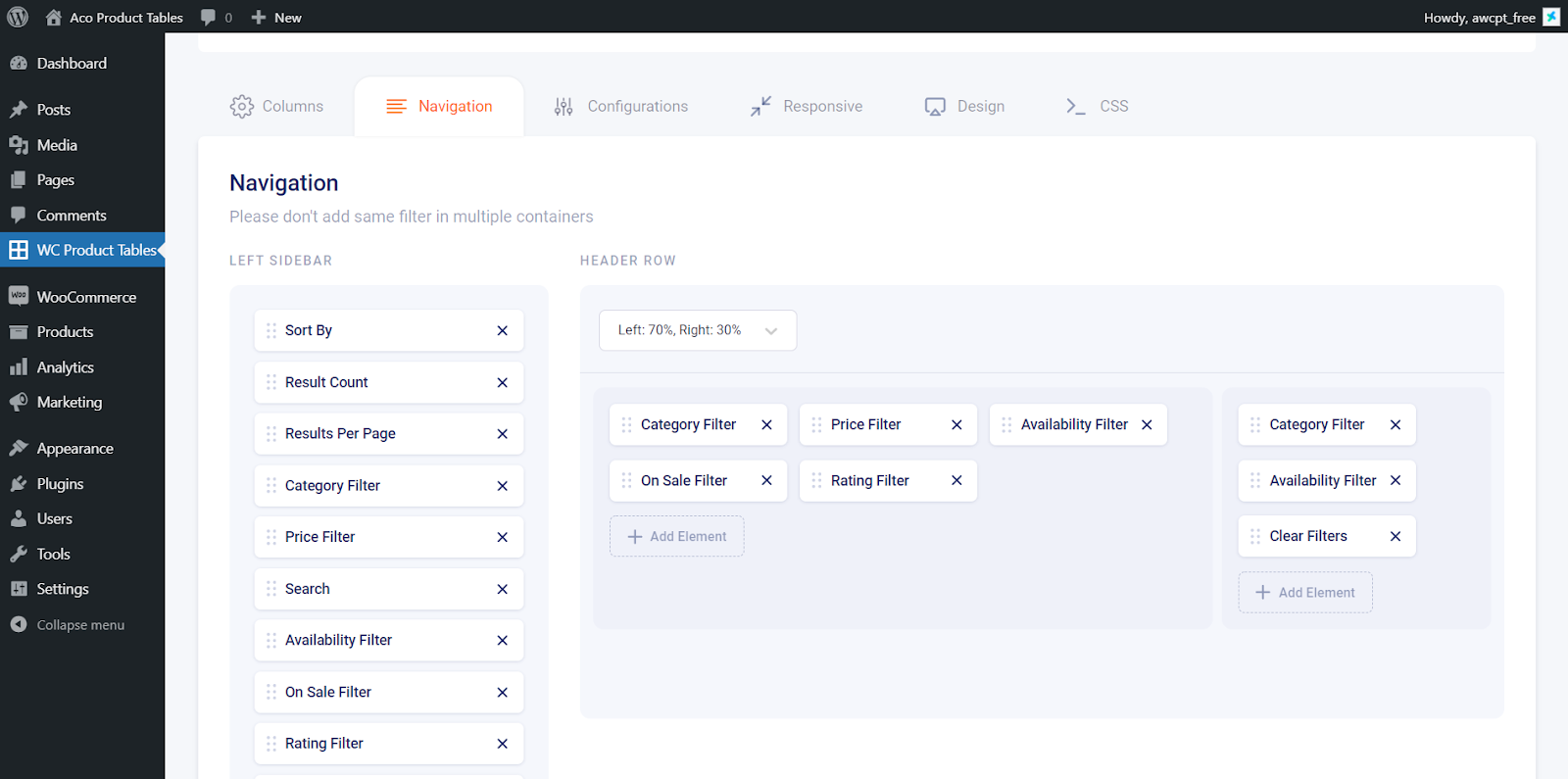
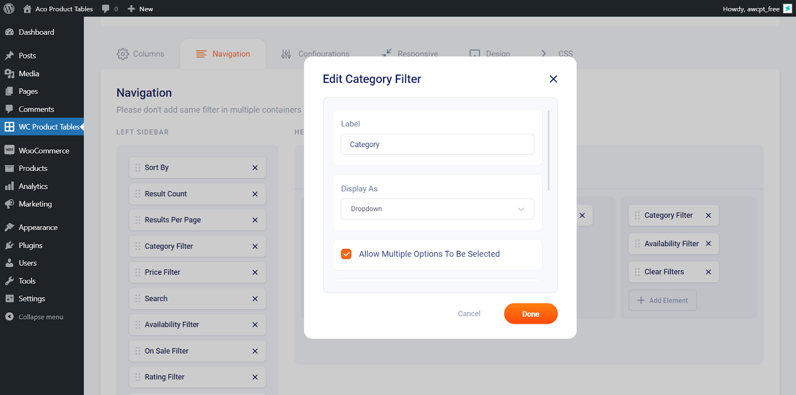
The display filter area can be divided into both left sidebars and header navigation. The header navigation is further divided into left and right. Choose your preferred layout from navigation settings from the backend. Add both results per page and filter elements from the navigation areas. The multiple elements like attribute, price, category, availability, rating, on sale, custom fields, etc. can be customized. You can also adjust the view of filters ie, as dropdowns or even as rows.
Display filters on the left sidebar next to the Woocommerce product table.
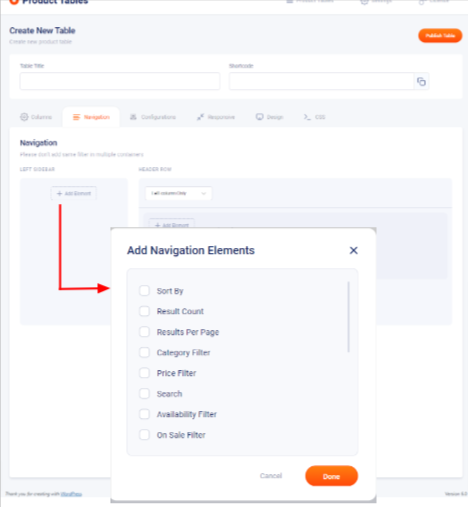
1. Add Element: Used to add the desired filter elements to the sidebar. These multiple filters element can be customized according to your needs
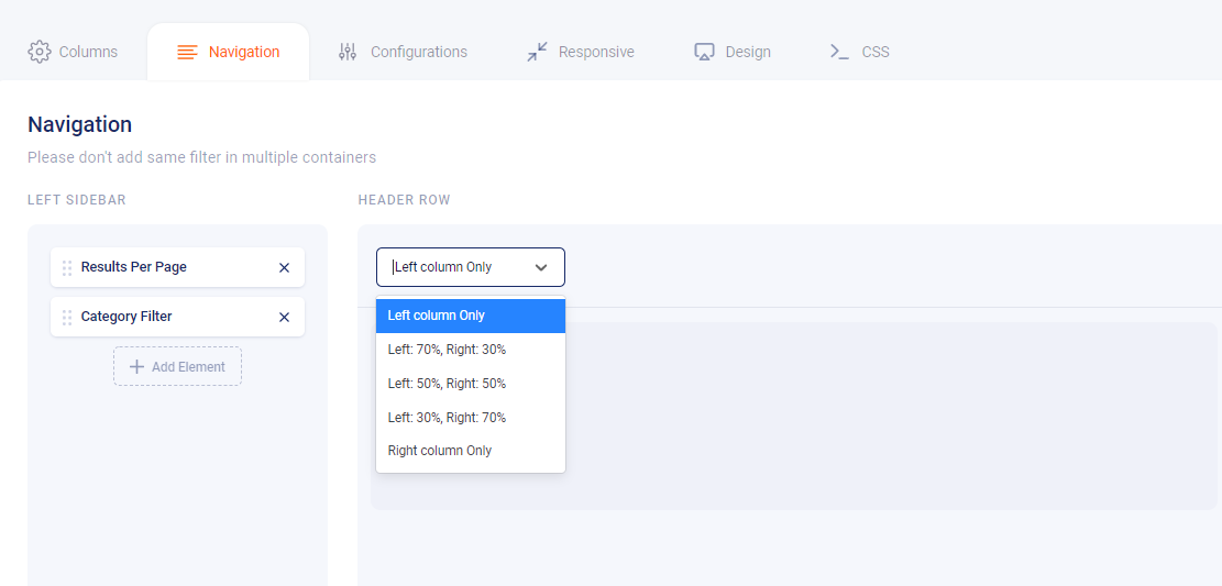
The header navigation is further divided into left column only,left 30% right 70%,left 50% right 50%,left 70% right 30% and right column only.
1. Add Elements: Used to add navigation element to the header row of the product table
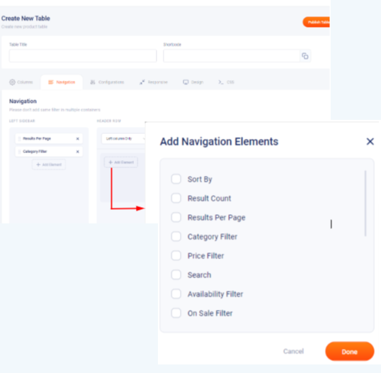
Each option can be customized according to the need of the user
1. Table Width (PX): Used to define the width of the table
2. Show Product Variations: Enabling this option will show product variation as a part of the product table. If you enabled product variations you have to confirm all variations are configured properly. Such as they will not support the “any attribute(Any Color)” option for variation
3. Show Only Customers Ordered Products: Enabling this option will display only the customer-ordered products in the product table.
4. Show Only Recently Viewed Products: This toggle button helps to show only recently viewed products. You need to have woo commerce recently viewed widget enabled on your site to use this feature
5.Products Type:Select your product type from external/grouped/simple/variable product options
6. Products Visibility In: You can show or hide the columns based on the device using this option. Display one or more columns while considering a device, and the rest columns can be chosen to be shown for a large device
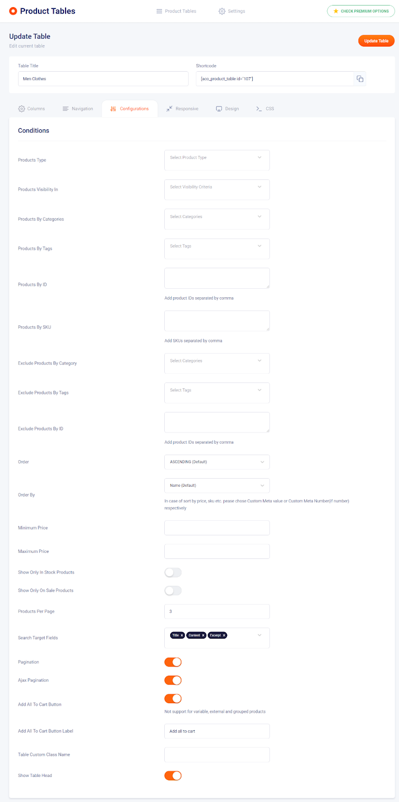
7. Products By Categories: Choose the required product category from here.
8. Products By Tags: Choose the required product tags from here.
9. Products By ID: Specify the product ID of the product you want to add to the table.IDs must be separated by commas for the feature to function
10. Products By SKU: Specify the product SKU of the product you want to add to the table. For multiple SKUs, it must be separated by commas for the feature to function
11. Products By Author/Vendor ID: Specify the Author/vendor ID here.
For multiple IDs, it must be separated by commas for the feature to function
12. Exclude Products By Category: Used to exclude a particular product category for the table
13. Exclude Products By Tags: Used to exclude certain product tags
14. Exclude Products By ID: Used to exclude certain product ID
15. Order: Used to arrange the table either in ascending or descending order. The value will be set to ascending by default
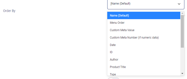
16. Order By Used to arrange the order of the table, select the required arrangement method from the dropdown. In case of sort by price, SKU, etc. please choose Custom Meta value or Custom Meta Number(if number) respectively
17. Minimum Price: Define the minimum price of the products that you want to display in the product table
18. Maximum Price: Define the maximum price of the products that you want to display in the product table
19. Show Only In Stock Products: Enable this option to show only In-stock products
20. Show Only On Sale Products: Enable this option to show only On-stock products
21. Products Per Page: Define the number of products you want to display in the product table
22. Search Target Fields: Set the required target field from here.
23. Attributes For Search: Set the required search attributes from here
24. Search Meta keys: Set the required meta keys from here
For multiple meta keys separated it by a comma for the field to function.
25. Search Taxonomies: Set the required taxonomy from here
Add taxonomy slugs separated by a comma for multiple entries.
26. Pagination: Enable this option if you require pagination
27. Ajax Pagination: Enable the option if you want to show the new page without being refreshed
28. Load More Button: Enable this option if you require a load more button
29. Load More Button Label: Change the corresponding text of the load more button.
30. Add All To Cart Button: Enable the option if you require an Add all to cart option in the product table. This feature will not be supported for variable, external, and grouped products
31. Table Custom Class Name: Define the custom class name here
32. Show Table Head: Enable this option to show a table header.
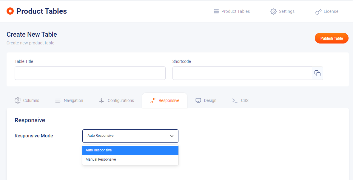
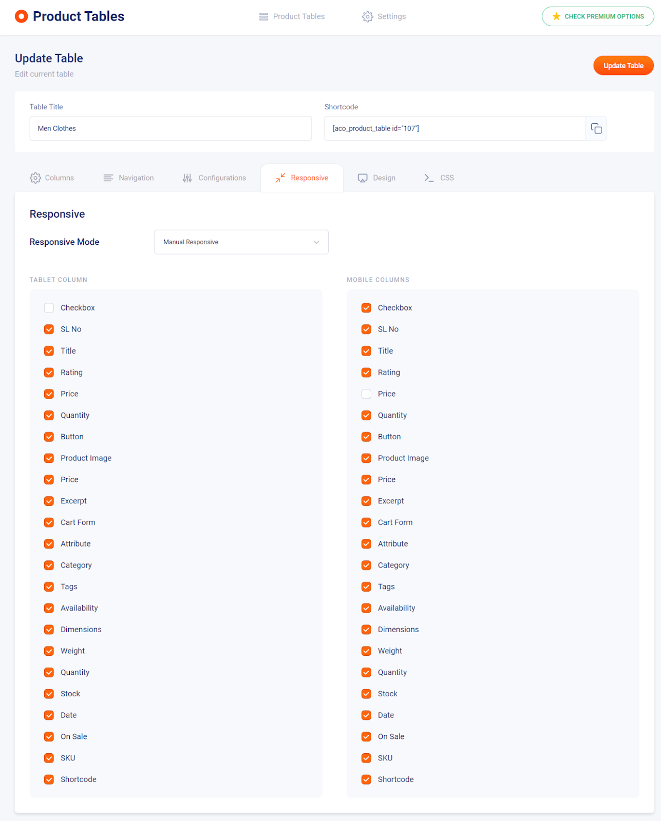
You can easily create a highly responsive woo-commerce product table as per your needs. You can show or hide the columns based on the device. This can be done without needing additional CSS, directly from the table settings. You can display one or two columns while considering a device, and the rest columns can be chosen to be shown for a large device.
It consists of two option
1. Auto Responsive: The responsive gets created automatically.
2. Manual Responsive: You have to manually create it by selecting from the options.
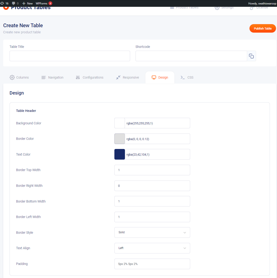
1. Background Color: Change the background of the table header from here.
2. Border Color: Change the border color of the table header from here.
3. Text Color: Change the text color from here
4. Border Top Width: Adjust the table border-top width from here
5. Border Right Width: Adjust the table border-right width from here
6. Border Bottom Width: Adjust the table border-bottom width from here
7. Border Left Width: Adjust the table border-left width from here
8. Border Style: Change the border style from the given dropdown options
9. Text Align: Change the text alignment according to your needs
10. Padding: Adjust the padding of the table header by defining the required value
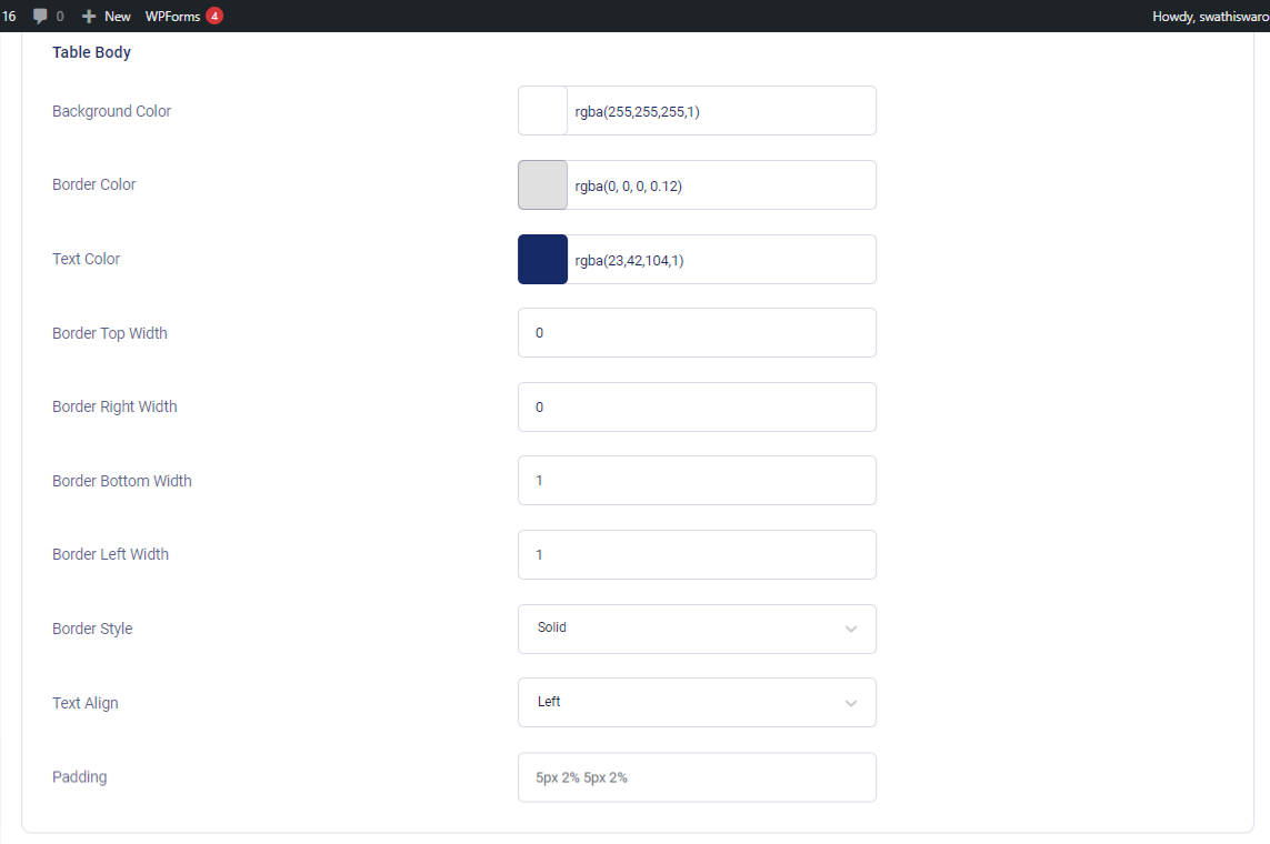
1. Background Color: Change the table body background color from here
2. Border Color: Change the table body color from here
3. Text Color: Change the table body text color from here
4. Border Top Width: Adjust the table body-top width from here
5. Border Right Width: Adjust the table body-right width from here
6. Border Bottom Width: Adjust the table body-bottom width from here
7. Border Left Width: Adjust the table body-left width from here
8. Border Style: Change the border style from the given dropdown options
9. Text Align: Change the text alignment according to your needs
10. Padding: Adjust the padding of the table body by defining the required value
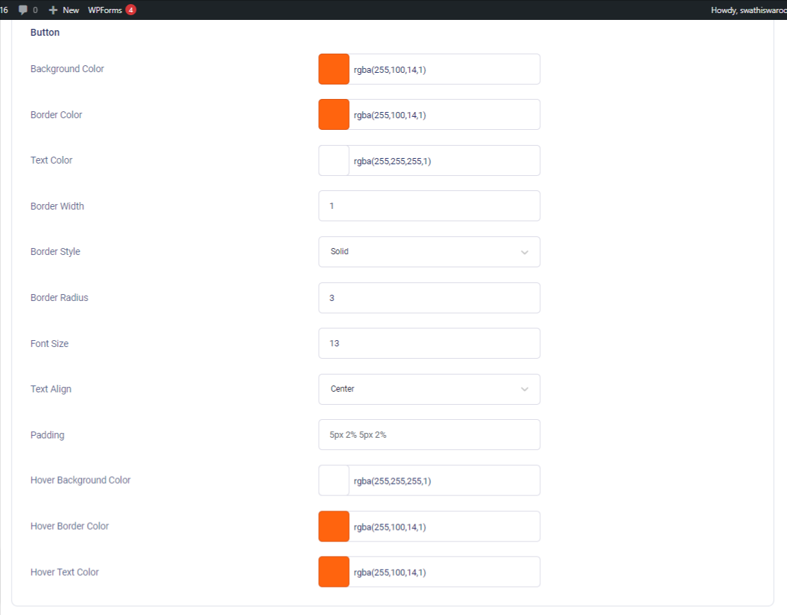
1. Background Color::Change the button’s background color from here
2. Border Color: Change the button’s border color from here
3. Text Color: Change the button”s text color from here
4. Border Width: Adjust the button’s border width from here
5. Border Style: Select the button’s border style from the dropdown options
6. Border Radius: Change the button’s border-radius from here
7. Font Size: Change the font size from here
8. Text Align: Change the text alignment according to your needs
9. Padding: Adjust the padding of the button by defining the required value
10. Hover Background Color: Change the background color of the hover from here
11. Hover Border Color: Change the border color of the hover from here
12. Hover Text Color: Change the hover text from here
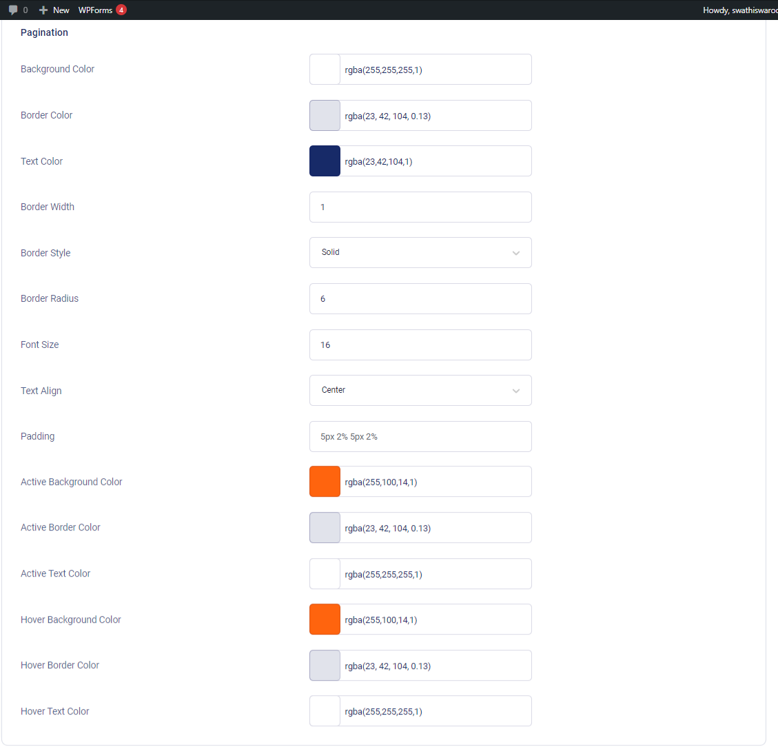
1. Background Color: Change the background color of the pagination from here
2. Border Color: Change the border color of the pagination from here
3. Text Color: Change the text color of the pagination from here
4. Border Width: Adjust the border width of the pagination from here
5. Border Style: Adjust the border style of the pagination from the dropdown options
6. Border Radius: Adjust the border radius of the pagination from here
7. Font Size: Adjust the font size of the pagination from here
8. Text Align: Change the text alignment of the pagination according to your needs
9. Padding: Adjust the padding of the pagination by defining the required value
10. Active Background Color: Change the active background color from here
11. Active Border Color: Change the active border color from here
12. Active Text Color: Change the active text color from here
13. Hover Background Color: Change the background color of the pagination hover from here
14. Hover Border Color: Change the border color of the pagination hover from here
15. Hover Text Color: Change the text color of the pagination hover from here
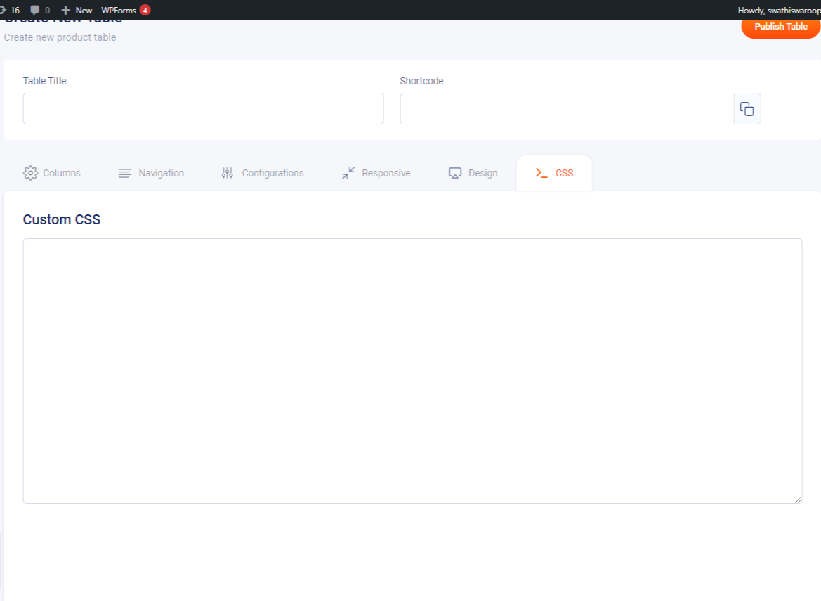
This tab is used to create custom CSS for the admin’s desires so that additional configurations can be made to the product table.
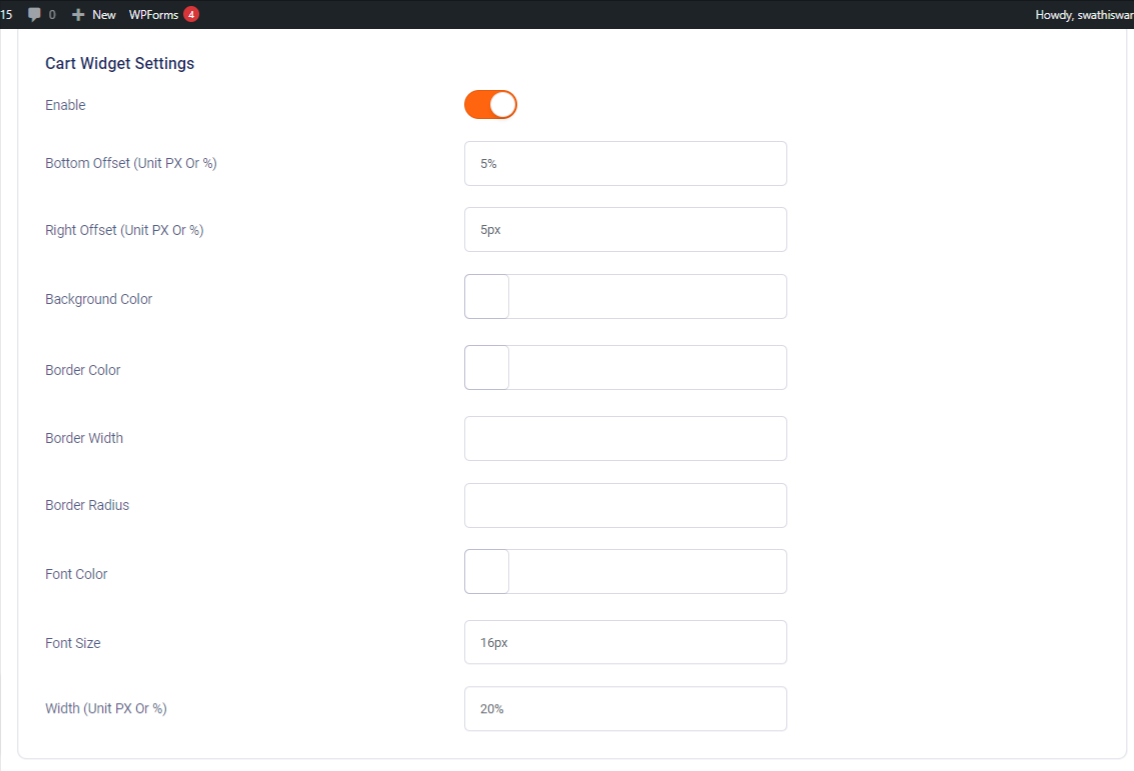
1. Enable: Used to enable/disable cart widget settings
2. Bottom Offset: Define the required bottom offset value from here either in PX or in percentage
3. Right Offset (Unit PX Or %): Define the required right offset value from here either in PX or in percentage
4. Background Color: Change the background color of the cart widget from here
5. Border Color: Change the border color of the cart widget from here
6. Border Width: Change the border width of the cart widget from here
7. Border Radius: Change the border radius of the cart widget from here
8. Font Color: Change the font color of the cart widget from here
9. Font Size: Change the font size of the cart widget from here
10. Width: Change the width of the cart widget from here, either in px or percentage
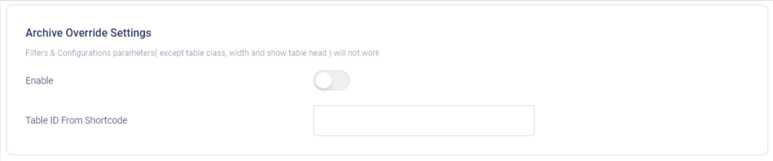
The Template for displaying product archives, including the main shop page is a post-type archive.
This template can be overridden by copying it to your theme/woocommerce/archive-product.php.
You can also modify it by applying this condition to your template
if( class_exists('AWCPT_Front_End') ){
$awcpt_obj = new AWCPT_Front_End();
if( $awcpt_obj->awcpt_archive_override_status() ){
$awcpt_obj->awcpt_archive_override();
} else {
woocommerce_product_loop_start();
if ( wc_get_loop_prop( 'total' ) ) {
while ( have_posts() ) {
the_post();
/**
* Hook: woocommerce_shop_loop.
*/
do_action( 'woocommerce_shop_loop' );
wc_get_template_part( 'content', 'product' );
}
}
woocommerce_product_loop_end();
}
} else { woocommerce_product_loop_start();
}
// along with the default template codes
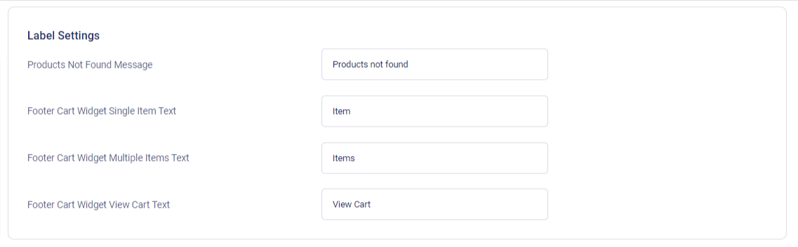
1. Products Not Found Message: Edit the “Products Not Found Message” using this option, Default text will be beset to “product not found”
2. Footer Cart Widget Single Item Text: Edit the “Footer Cart Widget Single” Item Text using this option. Default text will beset to “item”
3. Footer Cart Widget Multiple Items Text: Edit the Footer Cart Widget Multiple Items Text using this option. Default text will be set to “ items”
4. Footer Cart Widget View Cart Text: Edit the footer cart widget view cart text using this option. The default text will be set to “view cart”
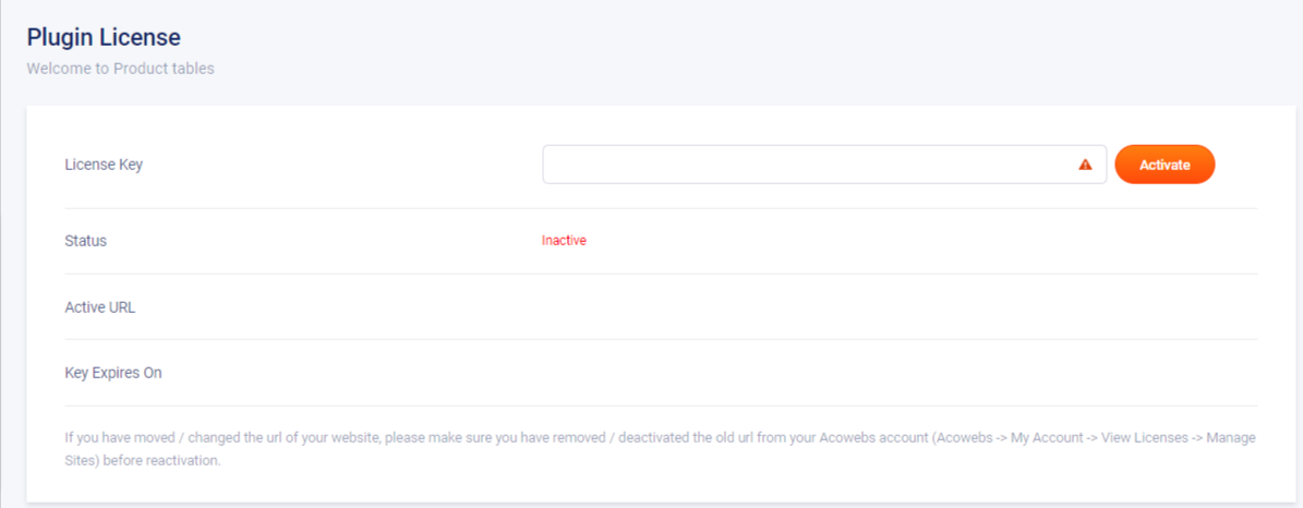
1. License Key: Enter the license key here
2. Status: License key active/inactive status will be displayed here
3. Active URL: The site URL of the active license will be displayed here
4. Key Expires On: License key expiry date will be displayed here
If you have questions about our plugin(s), are experiencing issues with any of our plugin


 Login
Login
 Cart
Cart BUY THIS PLUGIN