- Woocommerce
- Shopify Apps
- WordPress
If you’ve already created a badge and want to make changes to its design or settings, follow these steps:
Step 1: Open the Labeler Dashboard in your app.
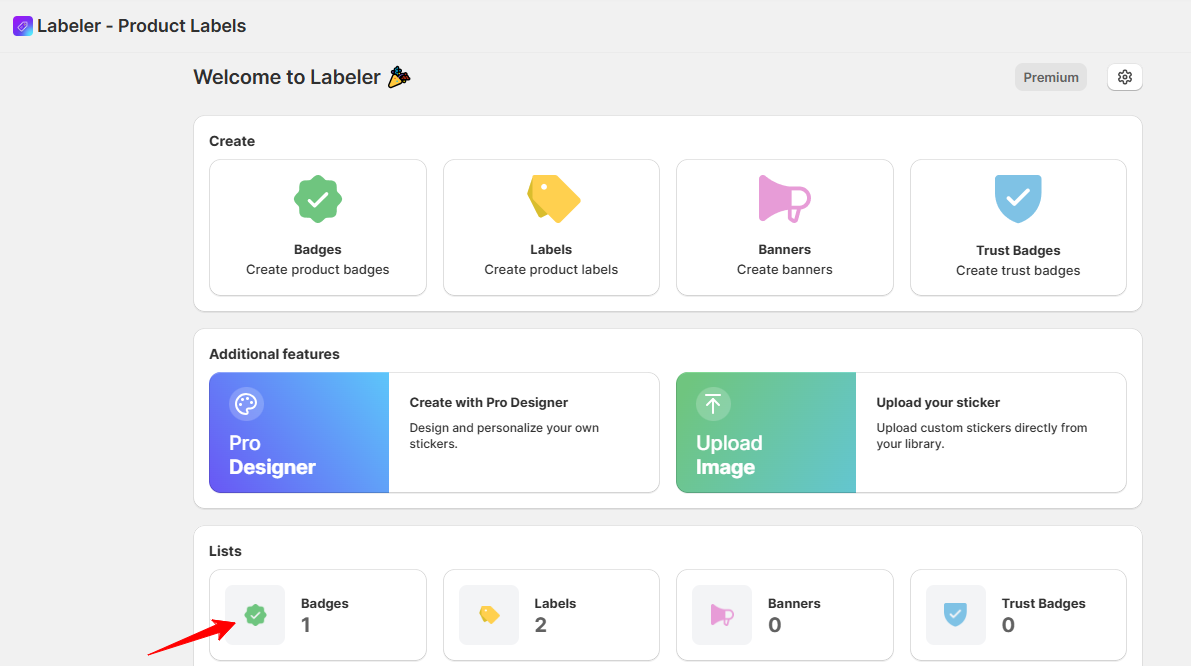
Step 2: Scroll down and click on the Badges/Labels from Lists section.
You’ll see a list of all the badges you’ve created. Find the badge you want to edit.
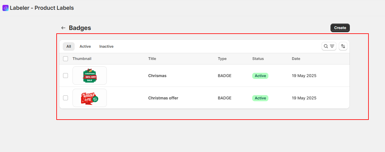
Step 3: Click on the Badge
Click directly on the badge. This will open a pop-up window where you can edit the badge’s details. Badge types are organized into different categories. Select the one you need from the list for editing.
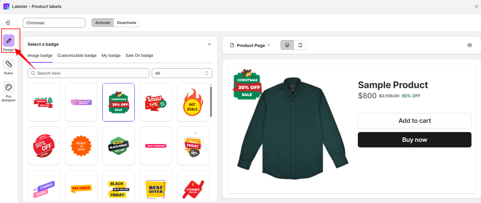
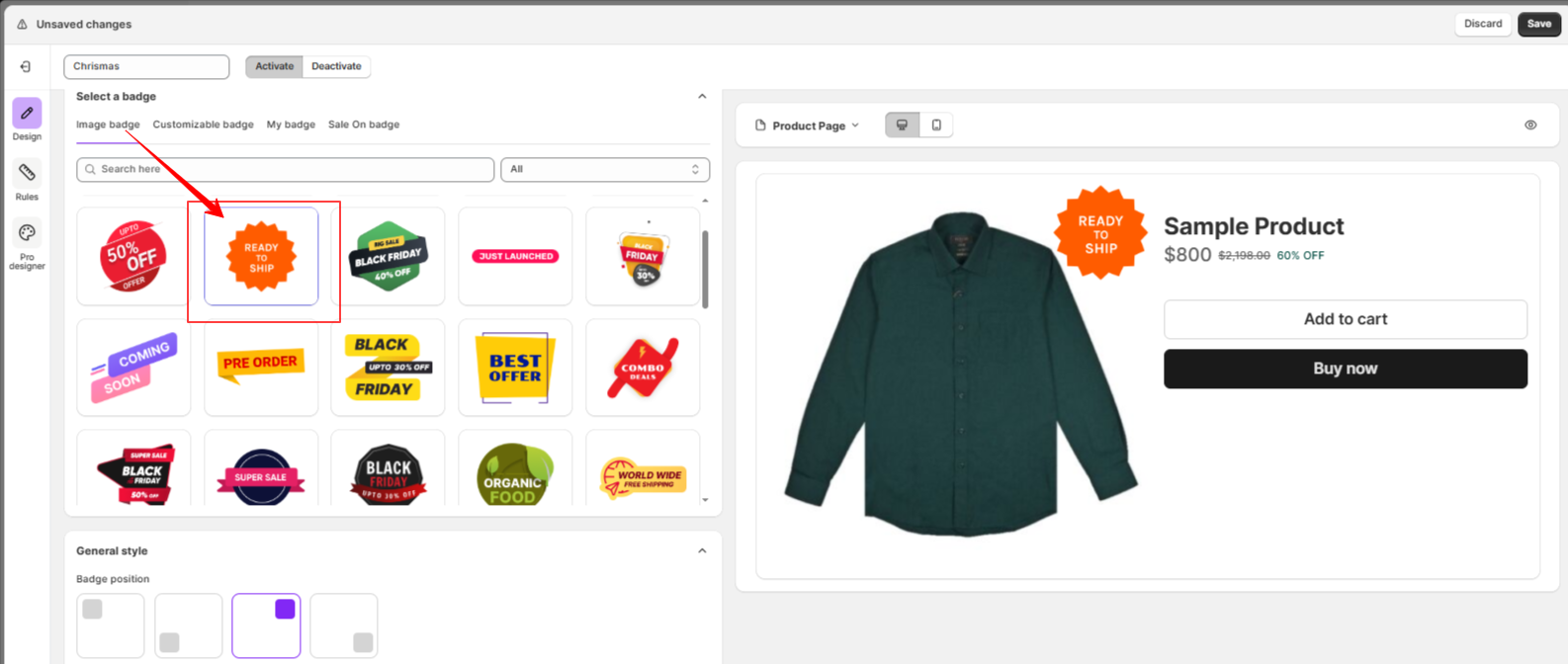
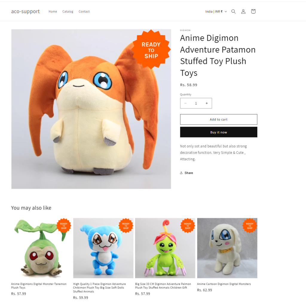
For example, here I am changing the Offer image Badge to a “ready to ship” image badge and moving its position to the top right. It was previously set to a different position.
Step 5: Set Display Rules
Switch to the “Rules” tab to control where the badge should appear. You can define conditions such as:
Say, You can choose the All Products option to display your badge sitewide for a promotion, or use the Product Tags condition to show it only on items tagged “Coming Soon” for a pre-order badge. Here, I am selecting All Products.
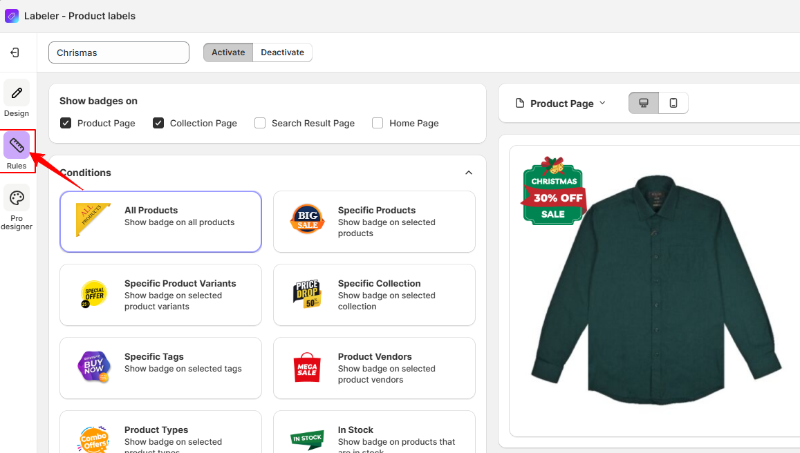
To learn more about each condition and how to use them, please click on the condition names for detailed explanations.
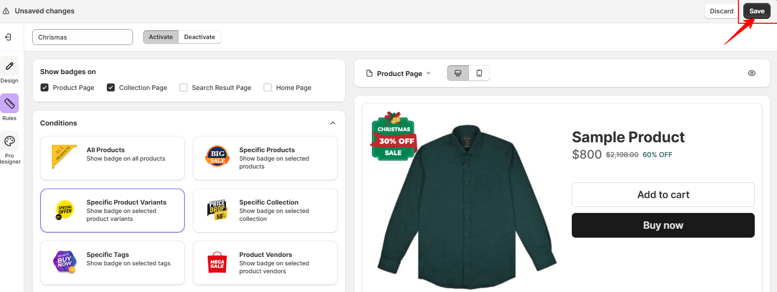
Step 6: Save Changes
Once you’ve made your updates, click Save to apply the changes. The edited badge will now reflect on your store based on the rules you’ve set.
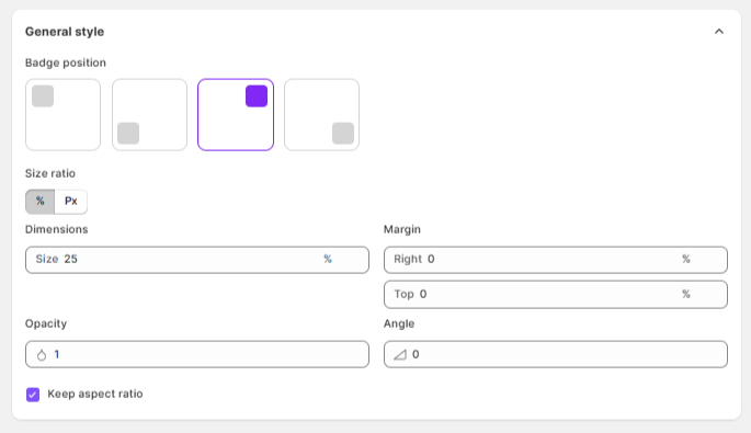
When editing a Badge, you’ll find several styling and positioning options. Here’s what each of them means and how to use them:
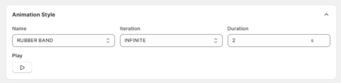
You can add animation effects to your badge to make it more eye-catching. Here’s a breakdown of the animation settings:
Sample View – Preview how the badge will be displayed on your product images with your chosen position and style
If you have questions about our plugin(s), are experiencing issues with any of our plugin


 Login
Login
 Cart
Cart BUY THIS PLUGIN