- Woocommerce
- Shopify Apps
- WordPress
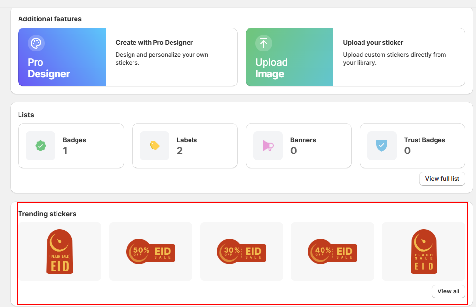
Want to highlight your products with labels featuring festive or currently trending badges?
The Labeler App makes it easy to add stylish, trending stickers from a large variety of popular designs. This helps your products stand out, grab customer attention, and create a more engaging shopping experience.
From the dashboard,Click on a sticker directly, or select “View Full List” to explore the latest and most popular sticker designs.In this example, I clicked on “View Full List” to see more sticker designs.
On clicking “Viewl all ” window will appear where you can choose your preferred sticker.Then, click on Badge, Label, or Banner under the Start Creating with Trending Stickers section.
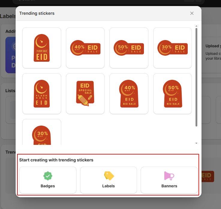
In the “Start Creating with Trending Stickers” section, select the type of visual you want to create: Badge, Label, or Banner. Then, click on Badge, Label, or Banner
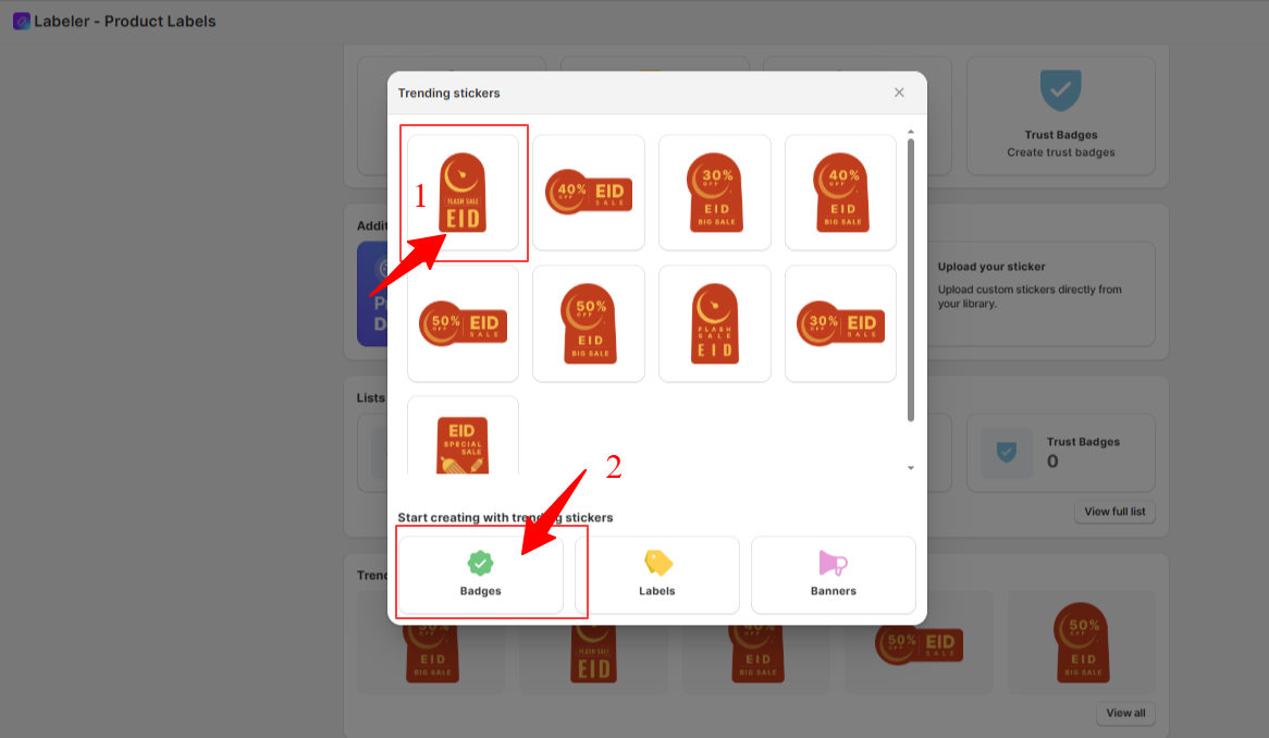
Here, I selected the first trending image and then chose the type as “Badge.
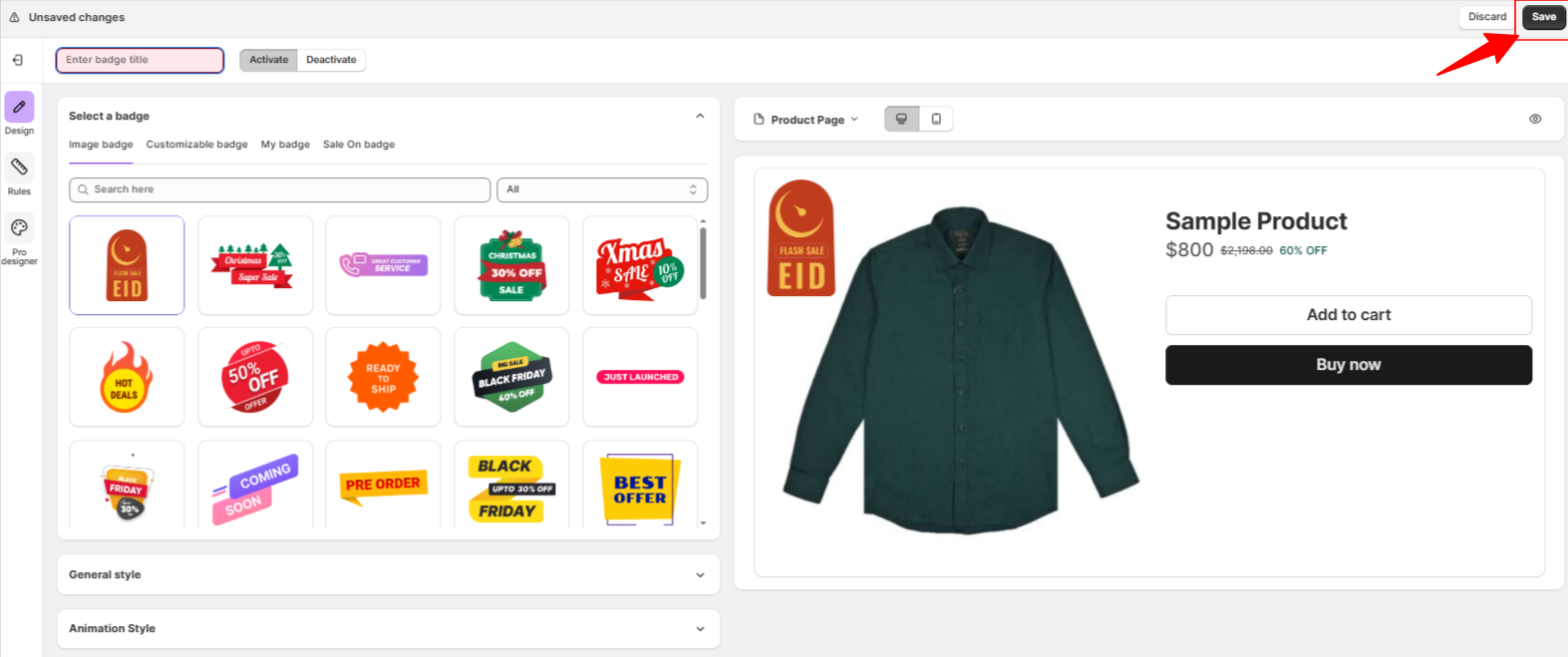
After selecting the type, a badge configuration screen will appear with the Image Badge option selected by default. Simply enter a badge title to get started.
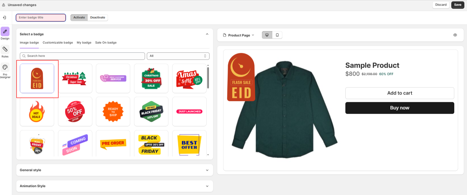
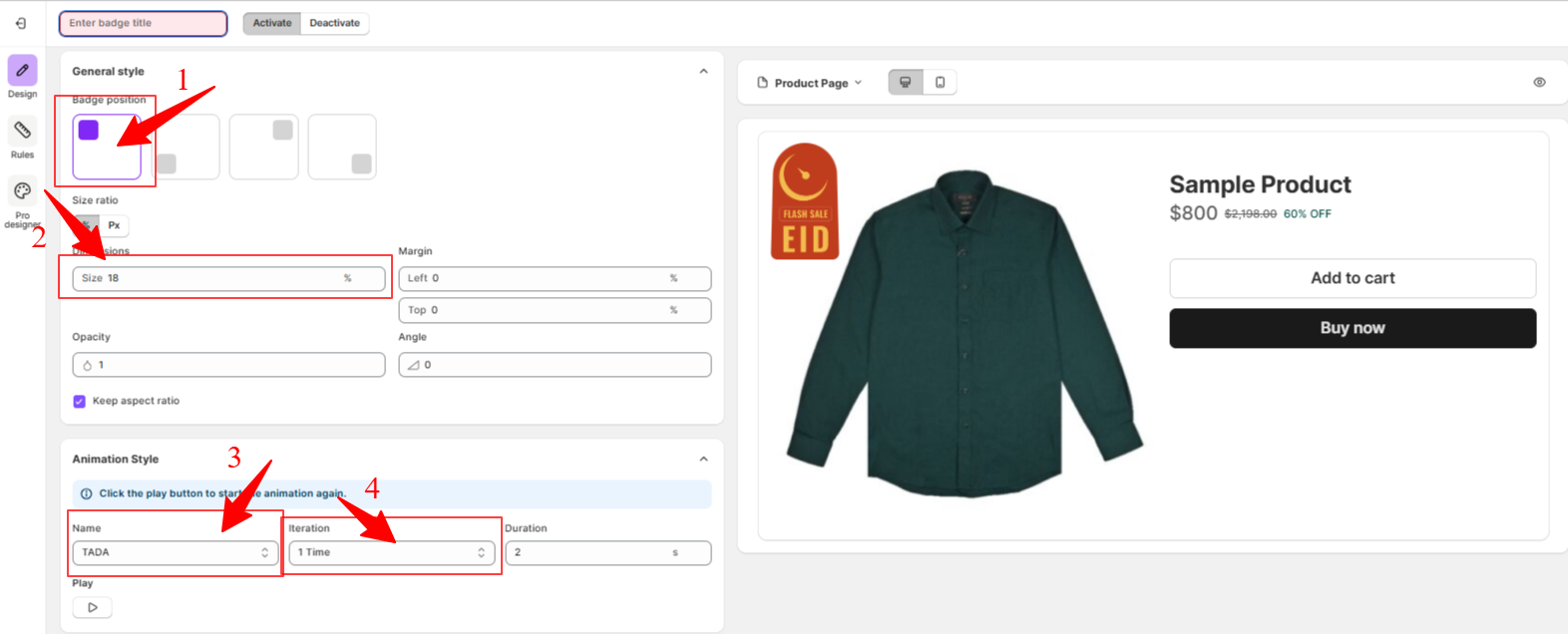
You can change the position on the product image, adjust the size and scaling, enable animations, and set when and where the badge should appear.
Here, I configured the badge to be positioned at the top left, sized 18, using the “TADA” animation set to play once. You can change the settings as you like.
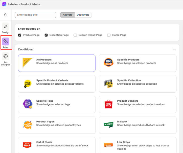
Click here to learn more about the general settings and animations.Then, click on Rules to assign the badge to products. Here, you can select the conditions where you want the Image Badge to appear.
Once you’re done, click “Save” to apply the changes.
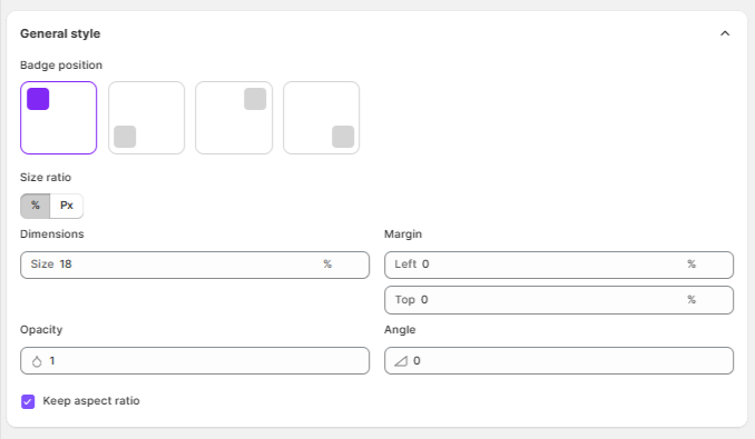
When creating an Image Badge, you’ll find several styling and positioning options. Here’s what each of them means and how to use them:
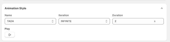
You can add animation effects to your badge to make it more eye-catching. Here’s a breakdown of the animation settings:
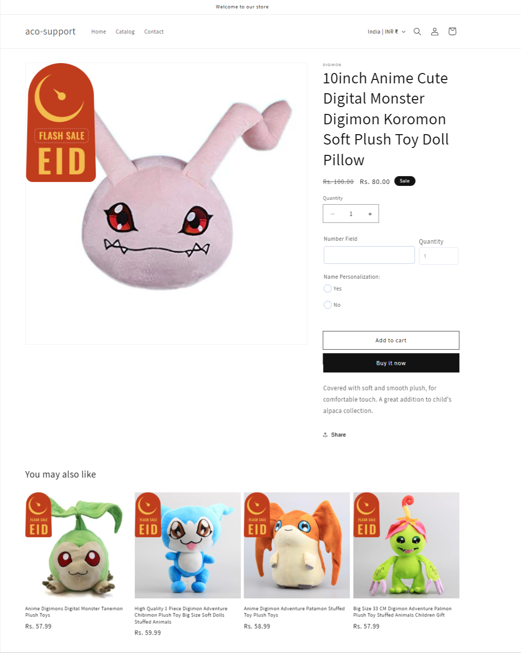
The badge will display on your product images in the position and style you configured, helping your products grab attention instantly!
If you have questions about our plugin(s), are experiencing issues with any of our plugin


 Login
Login
 Cart
Cart BUY THIS PLUGIN