The Shopeo app gives you full design control over how your shoppable videos blend into your storefront. By selecting the Videos by Playlist block in your Shopify Theme Customizer, you can fine-tune your layouts, responsive behaviours, and video styles to build a completely tailored brand experience.
Set Your Display Mode: Grid vs. Carousel
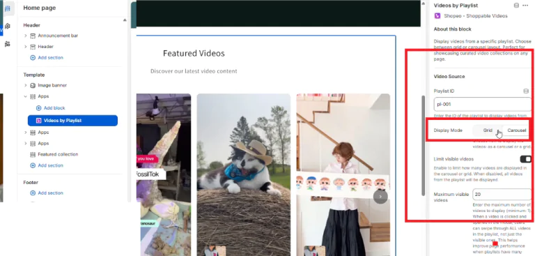
By default, your video player block is set to render as a structured grid layout. However, you can toggle between presentation layouts at any time using the settings panel shown in
Grid Layout: Spreads your video cards out cleanly across rows and columns—ideal for making dedicated landing pages or video gallery hubs feel complete.
Carousel Layout: Packs your playlist into a space-saving horizontal slider. Users can swipe through thumbnails organically, which keeps busy sections (like product pages or homepages) incredibly compact.
Control Your Layout Density with Visible Video Limits
To keep your store design organized without burying your content library, you can configure the block’s initial video loading caps:
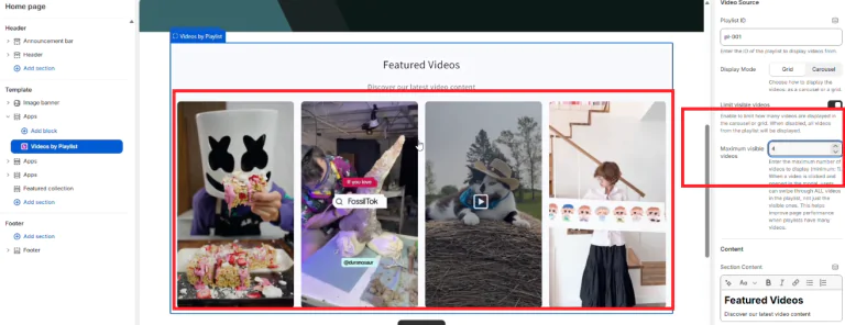
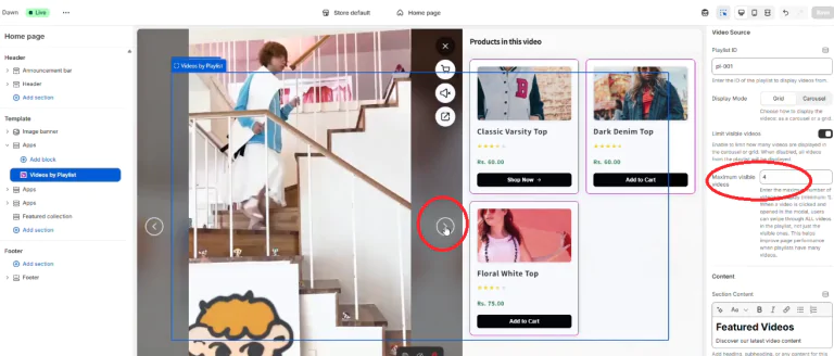
Set Initial Loading Thresholds: Use the Maximum visible videos field to define exactly how many video cards show up when the page first loads (for instance, restricting the initial view to 4 videos).
Full Library Availability: Restricting the homepage view does not cut off your playlist content. When a visitor clicks into a thumbnail to open the fullscreen popup modal, they can tap or swipe freely through every single video attached to that playlist ID code.
Toggle Storefront Product Tag Visibilities
You can easily adjust how prominent your tagged products look directly inside your main display feed:
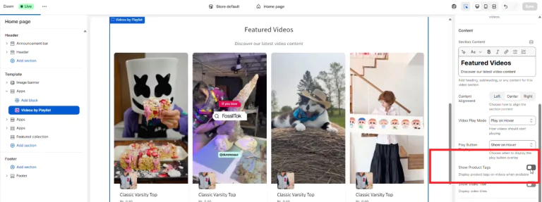
Minimalist View Grid: Use the Show Product Tags toggle switch to turn off the product info cards that sit beneath the thumbnail frames.
Guaranteed Popup Shopping: Disabling main grid tags will not impact conversions. No matter what choice you select here, your interactive tagged product carousels will always appear on the right-hand panel inside your fullscreen video modal popup whenever a buyer opens an asset.
Optimize Screen Real Estate with Responsive Style Presets
You can build multiple custom presets from your app dashboard to fine-tune your grid proportions:
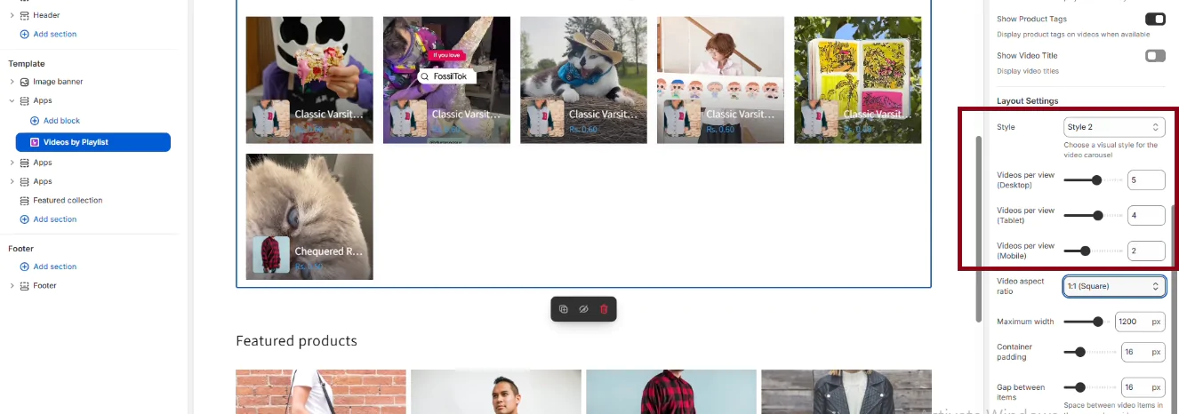
The Layout Settings menu allows you to choose your layout style and set exact column quantities via Videos per view sliders for Desktop, Tablet, and Mobile viewports. This ensures your video configurations shift dynamically across changing device orientations.
Crop Thumbnails Using Native Aspect Ratios
You can control the visual layout of your cards instantly by selecting a media shape template:
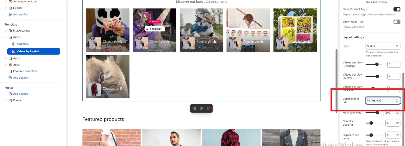
Locate the Video aspect ratio selector drawer
Pick a 1:1 (Square) crop rule to balance standard collections, or pick a 9:16 (Vertical/Reels) standard frame layout to give your storefront a modern, social-first TikTok or Instagram feel.
Create Multiple Test Layouts by Duplicating Blocks
If you want to evaluate two completely different layout styles across the exact same playlist data, you can use standard theme customizer shortcuts:
Simply duplicate your active Videos by Playlist block layer inside your template tree.
Configure one instance to a dense Grid mode and set the second copy to a Carousel slider format. This lets you test configurations side-by-side on your preview canvas before saving your design to live customers.







 Login
Login
 Cart
Cart