


 Login
Login
 Cart
Cart
Call-to-action buttons (CTAs) like “Buy Now” or “Subscribe” highly influence the number of leads, conversions, and revenue you are likely to generate.
However, selecting the best color for your campaign, newsletter, or product page is a debatable issue because every brand has its preference, yet, there are several factors affecting how customers will perceive your CTA button colors.
In terms of meanings, different cultures attach diverse associations to every color. For instance, blue is a symbol of masculinity in Western cultures, while China associates it with femininity.
Middle Eastern countries perceive blue as a symbol of safety and protection (spirituality and immortality), while Catholics see it as a sign of hope and good health.
Given the wide range of perceptions around colors, it is hard to settle for one CTA button color in the hope that it will suit or please everyone.
Instead, your goal should be to ensure that irrespective of the color, your CTA buttons are clear and visible, and the colors contrast the page background.
At the same time, you must apply color psychology to your CTA to determine which colors trigger the desired emotion and action.
To create a CTA button that actually converts without causing undesirable mixed reactions, this article will show you how to choose the perfect color.
Why are call to action colors important?
Color affects people’s emotions and mood, causing them to take action according to the meaning and feeling associated with the color.
For instance, red causes a rise in blood pressure, respiration speed, or even a faster heart rate. On the other hand, blue is linked to lower blood pressure, respiration, and heart rate.
Indeed, according to research conducted by the University of British Columbia, red is associated with improved memory and attention to detail, whereas blue helps improve creativity.
Borrowing from this and other findings, it is reasonable for marketers to use color psychology to create persuasive CTA buttons and promotional materials that trigger the desired buyer effect. Other studies on color psychology show that one color cannot suit all.
For example, while the color red has been associated with encouraging appetite, using it on CTA buttons for brands that sell food may not cause higher conversions. This is because other research indicates that red improves appetite only in Nile Tilapia fish.
Similarly, the color black symbolizes death, mourning, and funerals in Western cultures, while white is linked to purity, brides, and weddings.
However, when you use black and white CTA buttons in China, the impression is different, because the Chinese associate color black with youthful males, while white is a sign of death and loss.
Depending on your target market, your call to action button colors will determine your conversions and sales, because aside from cultures, the male and female genders also perceive and react to colors differently.
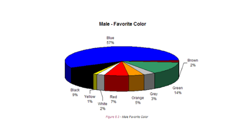
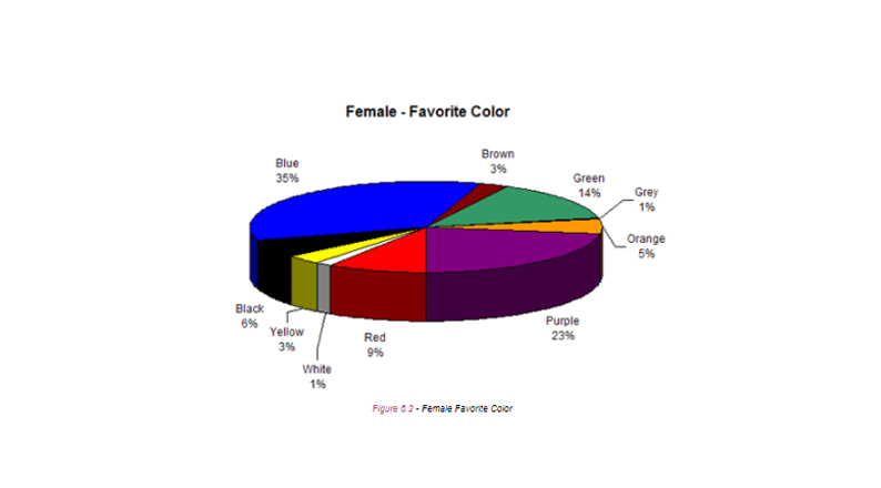
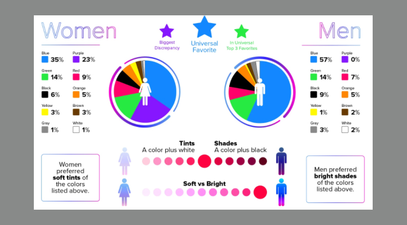
Indeed, research by Joe Hallock shows that blue is the favorite color for both men and women, but men have a higher preference for the color than women. The second-best color for men is green and purple for women.
When choosing colors for call to action button, it is essential to consider the emotions attached to it. For example, the color red can convey a sense of urgency. A red color button for offers and sale urges customers to take immediate action. Whereas, black CTA button implies luxury or exclusivity, while white signifies minimalism. While selecting the best color for call to action button, factors like color psychology plays a pivotal role, but the ultimate goal is to highlight your call to action.
Despite your knowledge of colors and their meanings, not every color will suit everyone or every situation. The most important idea is to choose CTA button colors according to the context while ensuring to contrast them with your brand colors and the background of your promotional materials.
Now that you understand the benefits of CTA colors, let’s have a look at their application.
How to choose the perfect color for your CTA buttons
Use your brand color
Use CTA button colors that match the colors used on your header and logo. A matching scheme on these elements should contrast the CTA button color in order to make it pop.
When sending promotional materials on email, displaying the same color on your CTA buttons and at the upper part of the email will help your message appear balanced and unified.
This repetition also reinforces your brand, because it shows consistency in your brand emails and product pages.
BarkBox, a company that sells dog clothes, treats, and goodies, prompts its web visitors to subscribe to monthly goods using a perfect blue-themed homepage.
The logo, homepage background, and CTA buttons carry a consistent color, reinforcing the feeling of trust associated with the color blue.
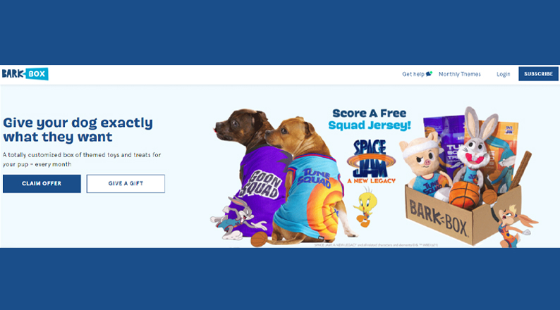
While blue is also a favorite color for many people, other colors, such as red, yellow, green, and equally common, and designing CTA buttons that match these colors will go a long way in improving your sales conversions and revenue.
ALSO READ: Top 8 Social Media Strategies That Every E-commerce Store Needs To Implement
Use the email’s color scheme
Another way of choosing the perfect color for your CTA buttons is to match them with the colors used when sending your order confirmation and promotional emails.
You can choose either to sync your logos and headers with the email CTA button or choose a color scheme that rhymes with a particular email or campaign.
Note that there is no harm in changing your button colors between emails, but ensure to retain consistency in a particular email.
In one email, you can choose to match your CTA button colors with your logo and header colors, while in another you can use seasonal colors depending on the occasion, season, target audience, or other factors.
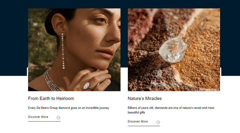
In the below example, De Beers, a company that specializes in diamond mining, exploration, and trading, the CTA buttons (Discover More) used on the homepage are in black color, against a white background.
The brand uses black CTA colors to symbolize power and minimalistic sophistication.
However, in the email CTAs De Beers changes the color scheme slightly, to create more visibility and to elicit the desired action.
The blue-colored CTA button creates the impression of trust, while the black fonts and white background help reinforce the original perception that customers have towards the brand.

As you interchange the color scheme to match the email CTA buttons, ensure to maintain some level of consistency to avoid confusing your customers or losing others due to lack of originality.
Use contrasting colors
One thing that makes CTA colors stand out is how they appear in contrast to the background colors. Changing your CTA colors to give them more contrast against your homepage or product page colors creates more visibility, leading to higher conversions.
You don’t have to adhere to the psychology of colors to choose the perfect color for your CTA buttons. Instead, check to ensure that the color that is dominating your page is different from your CTA button colors.
Also, to ensure better visibility, use high contrast button text color against the background color.
The power of using contrasting colors has been demonstrated in previous studies, such as the button color A/B test research conducted by HubSpot.
According to the study, the red-colored CTA button performed better than the green-colored one (21% more people clicked on the red CTA button than on the green button).
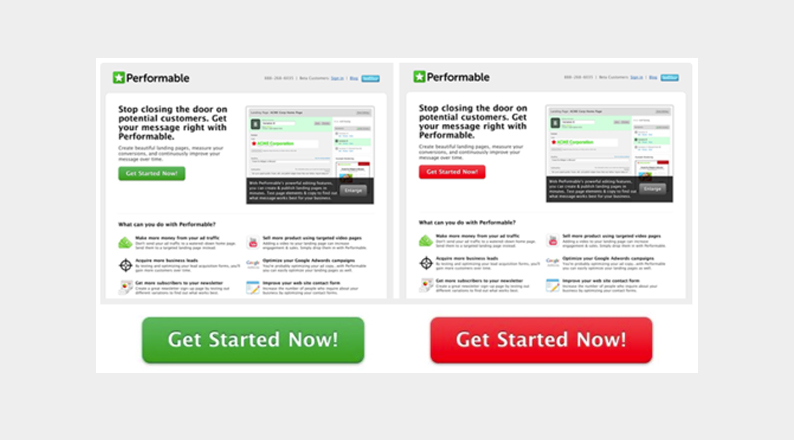
Since everything else on the page remained constant, the results of the research show that the red button was more visible because the background was already in the color green.
In this case, red was a contrasting color, as it was opposite to the dominant color.
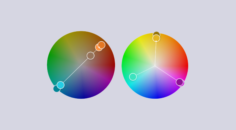
Similarly, you can select a complementary color for your CTA buttons using the color wheel. A complementary color creates the most contrast because it is on the opposite side of your dominant color.
A triad will also portray a good contrast since it is within a third of the wheel from your dominant color.
Keep the background clean
Contrast can be derived in many ways, and one effective approach when choosing the perfect color for your CTA buttons is to reserve the color solely for CTAs.
You can decide to keep the background clean with white or calming colors, making the CTA buttons stand out. You can also use less vibrant background colors compared to the CTA button.
Using a clean background will increase your conversion rates because, whether the CTA button has shoppers’ favorite color or not, it will still pop out.
Customers will not have to read or scan through the entire page to spot the CTA button. Users can look at the page and immediately recognize where to click.
Asana, a platform that helps businesses organize, track, and manage their work, uses two clear backgrounds – the top of the page has a white background with black-colored CTAs, while the bottom part has a black background with a contrasting white CTA button.
On the top-right, the images used are also in black in white, making the multicolored CTAs highly visible and beautiful.
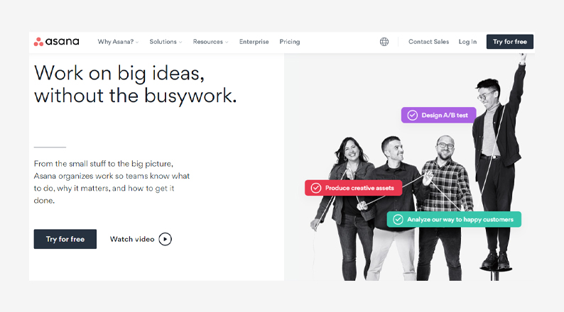

A clean background does not have to be boring. Spice it up with a few contrasting colors, and you will gain higher conversions than a heavily colored eCommerce site whose CTAs are hard to find.
ALSO READ: Impact of e-Commerce On Society: Advantages and Disadvantages
Have a secondary option
Your site visitors may not always take the desired option at one glance. Some will be testing the waters to see if your goods or services are worth their money.
How do you entice customers who are not ready to still come on board?
The best approach would be to use more than one CTA button, which will trigger testers to go with a trial version of your offering.
This way, you will not lose customers to the competition, either because they do not trust your services, or the pricing is not favorable.
Capture the attention of your customers using both a primary CTA button, which is the most appealing and prioritized according to your brand colors, and a secondary button.
The secondary CTA button can have a complementary color or it can come with a simple outline.
Zoom uses multiple CTAs and the most prioritized buttons are in orange, which is a great contrast to the blue-colored logo and the grey and white page background.
The “Buy Now,” “Learn More,” and “Sign Up, It’s Free” buttons are in orange. In contrast, the secondary option, “Request a Demo” is in white against an already white background, creating lower contrast.

When using two or more CTAs ensure to still retain a level of consistency to avoid using too many confusing colors.
Despite the secondary option having a lower contrast, it is still important because customers who request demos or who sign up for free trials are already interested and are likely to pay for your services eventually.
Investigate your audience
The most obvious way to choose the perfect color for your CTA buttons is to study and understand your target audience according to demographics or cultural background, age, gender, etc.
While blue is the favorite color for both men and women, there are still other variations you can apply in your CTAs. For instance, men prefer bright shades (a shade is a color plus black), while women prefer soft tints (a tint is a color plus white).
Therefore, irrespective of the primary color you have chosen for your CTA, you can create appealing buttons using subsets, wherein pink CTAs would appeal to women, whereas ruby red would appeal to male customers.
Similarly, depending on the geographical location of your business or cultural environment, you can use one or more CTA buttons to appeal to customers from specific groups.
The greatest flexibility can be achieved through email marketing campaigns and social media promotional materials because it is easy to segment the target audience.
Moreover, to create inclusivity and enhance user experience, consider using high contrast combination to enhance readability for users with visual impairments. The Web Content Accessibility Guidelines (WCAG) advises certain contrast requirements like a minimum contrast ratio of 4:5:1 for visual presentation of normal text and images and for large scale text and images, it is 3:1.
Test your CTA buttons
What if the color you have chosen is not as attractive, appealing, and favorable to your customers as you thought?
You cannot choose a perfect color for your CTA buttons simply by guessing. A/B test your buttons to understand what the majority of your page visitors want.
You cannot please everyone, but you can try to accommodate the interests of as many cultures and target groups as possible.
Conduct user interviews to test the colors that create the highest clicks and conversions. Ensure to keep reviewing the selected winner against other colors and contrasts.
However, avoid changing the CTA colors too often because the goal should be to train your customers to take a particular action whenever they see a certain color on your web page or promotional materials.
ALSO READ: How eCommerce businesses can turn organic traffic into valuable leads
Conclusion
CTA button colors are highly influential because customers take action according to how they perceive or interpret the appearance of the CTAs.
Choosing the perfect color for your CTAs is not always determined by color psychology because different colors carry different meanings across cultures, gender, and age groups.
The right choice lies in your ability to use CTAs according to your brand color, the color scheme of your emails, and contrasting colors.
You can also adopt a simpler approach by using a clean background or you can attach a secondary CTA button.
Investigating and understanding your audience is still key because different customer groups have varying perceptions of color variations like shades and tints.
Finally, before settling on a given color scheme, ensure to test on your homepage, product pages, emails, and social media platforms.
Acowebs are developers of WooCommerce plugins that will help you personalize your stores. It supports the additional option with feature-rich add-ons which are WooCommerce Product Addons, that are lightweight and fast. Update your store with these add-ons and enjoy a hassle-free experience