


 Login
Login
 Cart
Cart
As you start your eCommerce business, your main goal is to drive traffic and generate sales. Apart from that, you probably have created other smaller business goals such as providing better customer experience as a way of increasing conversion points.
All these are strategies marketers put in place to lure customers into taking the desired action. For the prospects to visit your website and take the action you intend them to, having the right product is not always enough; you also need to be persuasive.
This is where calls-to-action or CTAs prove effective.
If you’ve been taking CTAs for granted, then you need to rethink. Perhaps this is the reason why your total revenues never seem to go up. A strong and well-crafted call-to-action could instantly surge your sales.
Smart online store owners understand that you can never leave your site’s visitors to solely make decisions on what actions to take; otherwise, you risk losing potential buyers all the time.
Unfortunately, including a CTA on your pages isn’t always enough to improve your conversation. Sometimes it needs a touch to make it effective if you are to reap good results.
ALSO READ: Silent Killers of Customer Checkout
Before we dive into the actions that could help you create effective CTAs, first know what a call-to-action is.
What is a Call-to-Action?
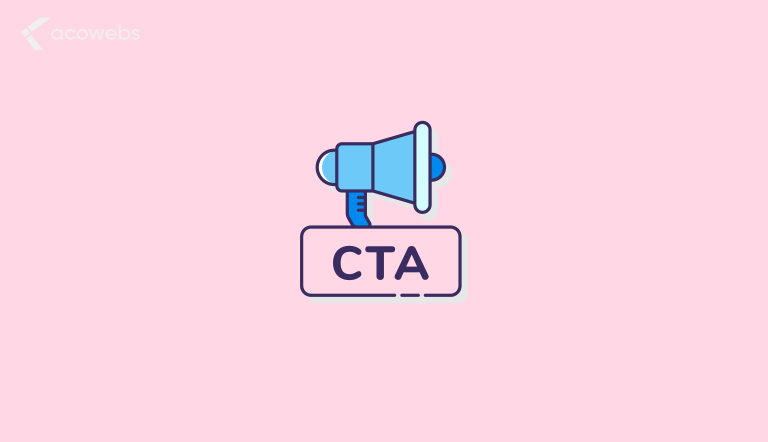
Calls-to-action (CTAs) are links or buttons found on eCommerce websites that tell your visitors what to do next. Whether it is signing up, making a purchase, creating an account, etc.
With that in mind, not all CTAs are crafted equally, and in order to maximize your efforts with your CTAs, then you need to design an approach that aligns with your brand.
While there are no proven CTA templates or designs that you can use to sky-rocket your conversions, there are best practices that store owners use that prove effective for better conversions.
However, for most of these practices, you have to be patient, doing tests to determine what works for your brand and audience.
ALSO READ: Top E-Commerce Marketing Strategies
7 Best eCommerce CTA Practices to Follow
Below are 7 simple, yet highly effective CTAs characteristics that could yield better conversions.
Use Proven Call-to-Action Phrases

In the eCommerce world, certain phrases have shown to drive more clicks than others. While the best phrases for your page should be unique to your brand, you could increase effectiveness by focusing on a handful of proven examples.
Here are some of the best and commonly used phrases on most eCommerce websites:
- Learn More – This is a soft phrase that doesn’t seem to ask users for any commitment. Use it to advertise for offers, discounts, etc.
- Join Free – The catch in this phrase is the word free as it will instantly catch the attention of your prospects. For effectiveness, use it to lead your visitors to join some kind of loyalty program.
- Buy Now – Buy now sometimes is accompanied by the words “with one click”. This is a good way to assure customers that the checkout process is fast and swift. No one wants to go through the hassle of going through several steps before making a purchase.
- Add to Cart – Add to Cart is so popular that when you use it in your CTA, it invokes an automatic behavior to your customers. This approach has been used by giant online stores like Amazon, and it keeps getting better and better.
Stand Out With Contrasting Colors
If you want your CTA to be effective, your site visitors have to see it. No matter how compelling your online store might be, it won’t save you from a low-conversion rate if you have a tiny CTA button with colors that blend in with everything on your website.
A highly effective call-to-action ensures a brilliant use of strongly contrasting colors, especially if your CTA takes the form of a button. This will make your button stand out from the rest of the background on your page.
Despite the recommendations of web designers and marketers, there are no universal colors that could help you increase your conversion. You just have to make it stand out. With that in mind, play around with different colors and gradient variation to see how they might affect your conversion rate.
Whatever you decide to do, eliminate confusion to make sure it is impossible for anyone to miss your CTA whenever they visit your eCommerce website.
ALSO READ: Customize WooCommerce Product Page to Boost Your Sales
Ensure Right Size, Shape, and Position
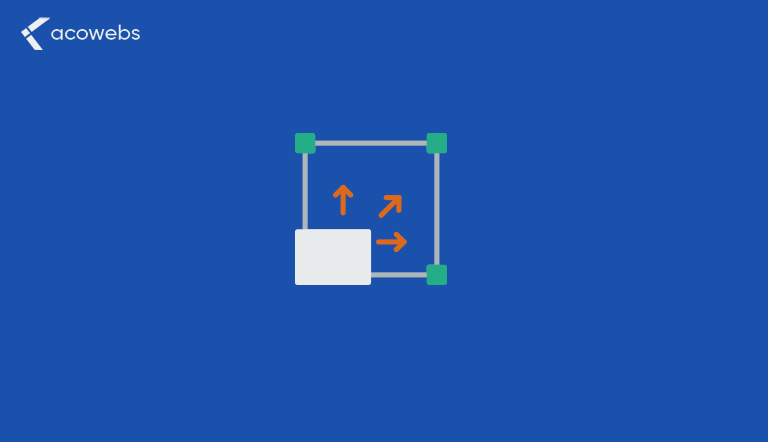
The perfect CTA button should be striking well enough to draw your customers’ attention instantly. With overcrowded elements on your online store, if your button is small, it can easily be invisible by your prospects.
Despite the fact that there are some tips and tricks to use with CTAs, it’s always good to keep in mind that what really works varies and depends on the content and the layout of your page. But let’s explore the following:
Size
When choosing the size of your buttons, make sure it’s moderate and balances well with your site’s elements. That said, choosing larger CTAs are more likely to be visible by your prospects than smaller ones.
Shape
Depending on the design and the set up of your landing page, experiment with simple shapes to see what works and what doesn’t. For most business owners, however, they consider using either rounded or rectangular shapes.
Position
While positioning your CTA, consider placing it above the fold of your website page as it has proven to be the most effective area, since it’s the first place your prospects are likely to notice when they visit your store.
Include Urgency Building Elements Next To Your CTAs
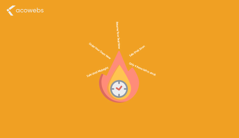
To get a high conversion rate and boost your sales, then you need to incorporate urgency into your calls-to-action. This creates anxiety among your prospects giving them the impression that your products or services are scarce and that the future of their availability is uncertain.
A study by the American Psychological Association found that the way this psychology works is that prospects tend to put more value on items that are limited in stock or supply.
This actually aligns with the law of demand and supply; which says that the less the supply, the higher the demand, and vice versa.
Scarcity creates a sense of urgency. Use the following examples on your call-to-action and keep experimenting until you get what might work for you:
- Sale Until Midnight
- Reserve Your Seat Now
- Sale Ends Soon
- Only 4 items left in stock
- Order Your Dress Now
ALSO READ: Best UX Practices for an eCommerce Checkout
Focus On The Action Part Of Your CTAs
High-conversion CTAs are always action-oriented. They are often crafted with a verb which drives that particular action. They are often referred to as trigger words. Trigger words, as the name suggests, are phrases which trigger customers into clicking your CTA.
To create something unique and one that will easily grab the attention of your site’s visitors, play around with the power of words by using highly compelling words.
Examples of high-converting calls-to-action that uses trigger words include:
- Join now and get a discount
- Get my free quote
- Go to checkout
- Create my account
- Get instant access
It’s always good to tailor your trigger words to align with your brand or the action you want your customers to take.
For instance, if you are running a campaign to promote your products, adding a discount to your CTA to read, buy now and get a 15% discount, would help you yield to higher conversion than just saying go to checkout.
Win Sales With Extra Information Next To The Main CTA
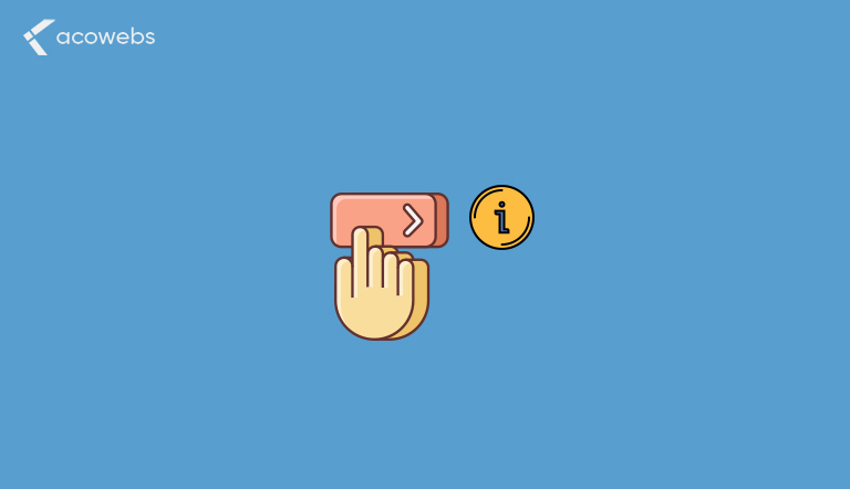
Sometimes try tipping your site’s visitors by providing extra information next to the CTA.
It doesn’t have to be a huge footnote or a block of texts, but it can be as simple as just a line with 100 characters. This could help reduce the anxiety and uncertainty that your prospects usually have when they are about to take action.
To help you stand out, include some of the following information alongside your main calls-to-action on your product pages:
- Price (including any discounts)
- Color, size, and quantity options
- Availability
- Delivery policy
- Aggregate reviews
ALSO READ: How to Enhance Buying Experience from Customers
Get Personal In CTA
Giving your call-to-action a personalized touch is one of the most effective ways to make your site visitors feel more comfortable. It makes them feel they can relate with your brand and this builds more trust.
However, first person writing like “I” and “My” does not mean it can be applied in every instance where a CTA is placed, although it is usually effective. You could also try writing in the second person like “you” and “your” and make your own observations.
Do several tests with your CTA so as to see which one could work better for your brand. In an interesting test done by Michael Aagaard, who is the Senior Conversion Optimizer at Unbounce, where he compared whether a “Get your free template” button would yield better than a “Get my free template” button, he found that using the first person pronoun increased conversions by 90%.
From analyzing the test results, you can easily see what pronouns could perform better with your brand.
Conclusion
Calls-to-action is an important part of a broader strategy to optimize your conversion rate. However, while there are no specific blueprints that marketers can use to create a perfect CTA, I believe the above practices could be of great help if you want to create winning CTAs. Always remember to do several tests to find out for sure what works best with your audience.
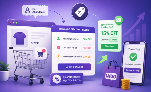
Acowebs are developers of WooCommerce Discount Rules that will help you personalize your stores. It supports the additional option with feature-rich add-ons which are woocommerce product addons, that are lightweight and fast. You can easily update your store with these add-ons and enjoy a hassle-free experience, check out the best options for additional woocommerce custom product options.