Color and eCommerce go hand in hand. Many people will be quick to notice and appreciate the colors in your online store and product pages.
While they may not consciously take note of the exact color theme of your call-to-action buttons or other aspects displayed on your eCommerce store, customers’ subconscious will quickly drive them into making a decision whether to buy your product or not.
Being a universal content, color communicates directly with the subconscious minds of viewers.
Indeed, people from all professions, including doctors, designers, and electricians are concerned about how they use color to convey messages easily and effectively to their target audience.
Similarly, eCommerce owners must create the right impression by choosing the right color scheme, an aspect called color psychology. Color psychology is the study of people’s behavior to understand how this aspect influences their perspective, attitudes, and behavior.
A color pattern can affect a shopper’s mood and decision-making capabilities. Online retailers can use a particular color scheme to manipulate customers’ moods, leading to improved engagement, sales, and conversions.
Indeed, 62 to 90 percentof consumers assess products based on colors alone, while a study by Kissmetrics shows that 85 percent of shoppers buy a product primarily because they were influenced by its colors.
In this article, you will learn the benefits of color psychology, and how to effectively use color psychology in eCommerce for the best results.
Why Color Psychology?
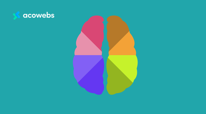
Different colors evoke different sets of perceptions and emotions. Our minds react to prolonged behavioral patterns because they have been accustomed to certain perceptions about that same color.
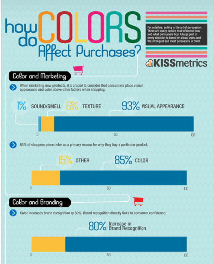
Color psychology is not uniform across all cultures because it is not an exact science. Factors such as context, culture, demographics, personal experiences, and fluctuations in emotions/feelings, can affect a person’s perceptions and actions.
For instance, red is associated with fire or dangerous things, while in other contexts, it portrays love and affection, perhaps due to the red rose, which mostly symbolizes love.
In Western societies, yellow is associated with cowardice, but the Japanese view it as a symbol of courage.
What does color psychology have to do with your eCommerce store?
A lot of your product pages, call-to-action buttons, and homepages create different perceptions among your audience. Every color contains certain attributes, and color psychology tries to identify which one will create the best effect for your eCommerce.
Let’s have a look at the most popular color associations and emotional triggers:
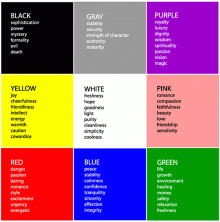
- Black is a show of stability, power, and intelligence. Some banks offer black-colored cards to demonstrate prestige and elegance.

- Gray is closely linked to black as it implies stability, authority, and security.
- Purple is linked to elegance, royalty, respect, and wisdom.
- Yellow is a cheerful color used to show openness, alertness, activity, and sometimes, cowardice.

- White is used to expressing innocence, efficiency, purity, and cleanliness. The Japanese and Chinese associate white with funerals or mourning while Western cultures use white in weddings as a show of purity or innocence.
- Pink is closely linked to red, but because it is milder, businesses can use it to portray compassion, faithfulness, beauty, friendship, and sensitivity.
- Red is a show of urgency, energy, passion, love, excitement, anger, strength, and aggression. Depending on the context, red can imply anger or danger as seen in bullfighting or love like in the case of Valentine’s Day.
- Blue is mostly associated with peace, tranquility, and security – financial institutions use blue to imply trust, but different shades and hues can create diverse perceptions.
- Green shows fertility, wealth, natural energy, nature, environment, and life and growth. Businesses specializing in environmental stability and healthy living use green to appeal to their audience.
- Orange implies friendliness, excitement, and cheapness. It creates a friendlier environment than red, hence, positive excitement. It can also be combined with reds and browns to symbolize autumn.
The color-emotion chart can be misleading due to people’s differences in culture, personal experiences, and other factors discussed earlier. Therefore, you should not assume that using blue instead of green will get your customers buying.
You should also not ignore the role of colors because figures don’t lie. Colors can help differentiate your products from the competition and influence your customers positively or negatively.
A good color scheme requires a multifaceted approach to ensure your homepage has the right balance to appeal to different customers.
Now you understand what every color stands for and how it is likely to influence your audience.
But how do you determine which colors to use for your store?
Let’s learn some useful tips for using colors to create beneficial impressions for your online business.
ALSO READ: How to Use Psychology to Shape Your E-commerce Success
How to Effectively use Color Psychology in eCommerce for Best Results
1. Leverage the Demographics
Different genders and age groups have varying color preferences. Therefore, if you are selling men-oriented products, you should go for colors that appeal more to the male audience.
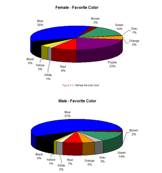
A study by Joe Hallock shows that blue is men’s favorite color followed by Green and black in third place. As for women, blue is their favorite color, purple follows closely in the second position, and green takes the third position.
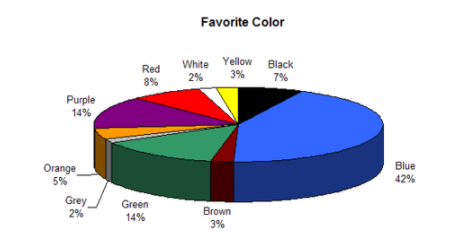
Hallock also found out that blue (42%) is people’s favorite color when gender is disregarded. Purple and green share the second position at 14% followed by red (8%).
From this data, it is clear why many businesses use blue as their primary color for their homepages.
Brands like Chase, VISA, Microsoft, and GE, use blue as they understand the positive impression this color has on customers. Similarly, you can effectively use this color psychology in your eCommerce store for the best results.
In contrast, the least favorite branding colors for both men and women are orange (30%), brown (23%), yellow (13%), purple (13%), and grey (12%). Brown is men’s most unpopular color, while orange is least popular among women.
In terms of age group, blue takes the first position as the favorite color while green and purple secure the second slot. Brown and orange are the least favorite colors among all the age groups.
Keep in mind that blue is almost always the best color scheme (most popular) for an eCommerce site, irrespective of your target market’s demographic and age.
Brown and orange could possibly put your customers off and hurt your conversions.
ALSO READ: Ways You Can Use Gamification To Boost Ecommerce Sales
2. Shades, Tints, and Hues
Bright homepage colors would appeal best to the male demographic, while most females prefer soft colors.
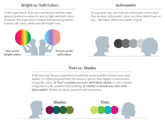
Only use achromatic colors if you are mostly targeting men because such colors lack hue. They have black, white, and gray layouts.
Tints are colors with white added, while shades are colors with black added. Men tend to respond positively to shades, while women gravitate naturally towards tints.
Understanding how to integrate shades, tints, and hues in your product pages and homepage will help improve customer engagement, impressions, and conversions.
3. Trigger the Right Emotion
Use your homepage to create the right impression from the onset. Different colors will trigger different emotions from your audience.
A study on the North American demographic shows that many eCommerce brands in the region create homepages that strike a correlation between colors and emotions.
It is one thing to understand which colors appeal to the male or female population, and it is something else to blend these colors in an eCommerce store to create the desired emotion and action.
This tactic calls for a combined knowledge of color psychology and the target market’s demographics.
For instance, blue implies peace, tranquility, and security, yet it also appeals to all demographics and age groups. Indeed, ScienceDaily associates blue with creativity and peace.
Black demotes luxury and power. It can be mixed with silver and gold and used on eCommerce sites selling high-end, trendy products.
Depending on your nature of business, you should blend colors appropriately and moderately to create the right impression across your target audience.
4. Use Colors that Sync with your Products
Choose and use a color that blends psychologically and logically with your products. This practice will increase your brand’s visibility, making it easily recognizable.

For instance, if you are selling healthcare products, you can use a green color theme because this color is the most favorable and recognizable with lifestyle elements.
By naturally linking colors with your products, you connect with shoppers even before they learn more details about what you’re selling.
ALSO READ: Using Personalization On Your Online Store To Enhance Customer Experience
5. Incorporate Brand Color in Marketing Campaigns & Blogs
Many eCommerce businesses are running social media accounts on platforms like Facebook, Instagram, and Twitter for marketing purposes.
To remain competitive, ensure your brand color is visible across all your marketing campaigns as doing so helps create a positive first impression.
Similarly, product-based blogs and articles enable businesses to present detailed, interesting facts about their product or service offering. You can incorporate your brand colors in the following areas of your blog:
- The blog banner
- Blog images or feature images
- Scroll indicator
You can also present your brand colors in structured emails sent to customers to improve the open rate and click-through rate. Emails carrying elements of color psychology convert more than flat email messages.
ALSO READ: Top 8 Social Media Strategies That Every E-commerce Store Needs To Implement
You can use email templates to achieve the desired visual appeal and blend it with your brand colors. Ensure the colors also rhyme with the purpose of the email to derive the best results.
For instance, most brands prefer using white as the background color in emails because it fits well with other products or brand colors.
When effectively used, color psychology can help improve your eCommerce results as it evokes positive perceptions and behaviors among shoppers.
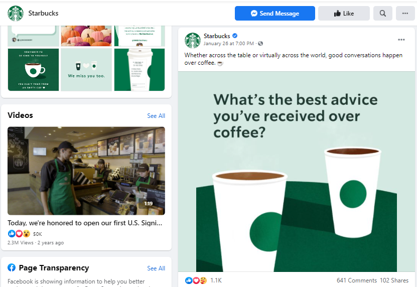
Starbucks’ green colors are featured in the brand’s social media campaigns:
6. Use a Complementary Color for CTAs
Call-to-action (CTA) buttons have diverse functions and objectives, such as “Buy Now,” “Add to Cart,” “Form Submission,” and “Social Sharing.”
Each of the buttons demand different moods, and the colors used will trigger different emotions and actions from your customers.
In addition to other aspects of the CTA, such as size and positioning, color is essential for eCommerce sites seeking to maximize their results. It is advisable to go for something bold.
According to a button color A/B test done by HubSpot, a red-colored CTA would outperform a green one by up to 21% (21 more clicks). Although the results show that red would convert more traffic than green, this scenario will not always apply in all circumstances.
The main objective should be to ensure your buy buttons leverage color psychology through a contrast between the CTA and the remainder of the page. Therefore, depending on your color scheme, red may not be the best.
Contrast can be derived using a complementary color. For instance, red and green, blue and orange, and purple and yellow are viable color combinations for a CTA button.
Keep in mind to only use pure colors (no added white, black, or gray shades) on your CTA buttons. You can use shades, tints, or tones on backgrounds other than on the CTA.
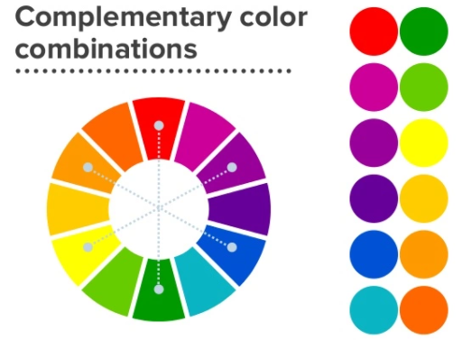
This approach will enable you to effectively use color psychology in eCommerce for the best results.
7. Leverage the Negative Space

Negative space is the background within, surrounding, and between an object in an image. The positive space focuses on the object itself, while the negative space creates a desirable proportion by defining the object’s outline.
Artists often use the negative space to form another image or symbol, but you don’t need artistic skills to use the negative space and color psychology in eCommerce for best results.
The idea is to use the negative space to define the boundaries of positive space and develop a balanced composition to your logo, homepage, or product pages.
Homepages with plenty of negative space appeal better to the audience because they tend to appear and feel clean, minimalist, and crisp.
Your audience will not have the impression that your display is too busy. Your customers will feel less overwhelmed looking at or searching for specific products and features in your catalogue.
A good balance between the positive and negative space also brings out an impressive design for your homepage, creating a relaxed feel.
Sites leveraging this tactic have improved customer engagement and conversions as shoppers tend to have a positive experience and remain on the page for longer.
The images below have a balanced combination of color psychology and negative space to bring out other objects that may not be visible unless the viewer takes more time to look.

ALSO READ: Best UX Practices for an eCommerce Checkout
8. Avoid Overuse & Place Strategically
Avoid mixing too many colors, shades, and tints, as your site will be unattractive driving away the much-desired traffic.
Ensure the image or object colors chosen and the background on which they are placed (homepage, product pages, and logo) blend well to avoid clashing and creating the wrong feelings.
In terms of placement, eCommerce stores leverage color psychology in the header texts, CTA buttons, and sales pages.
The goal is to use the colors to create the desired appeal where it matters most. When used strategically, colors will trigger the emotions you want with minimal effort.
L’Oreal uses black and white colors on the homepage. The brand uses white and a shade of gray for the podcast pages and dark blue colors in the blog posts. For the product pages, L’Oreal uses red CTA buttons across all its products.
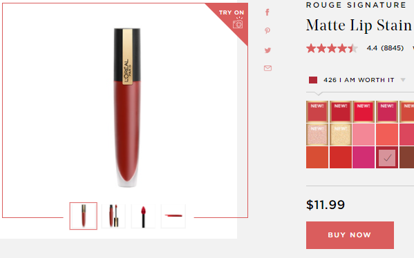
Notice also the gray background on the product pages, creating consistency and a smooth blend with softer colors.
Darker backgrounds imply sophistication, authority, stability, and maturity, while the red CTAs trigger passionate and daring feelings. The white background is also used consistently to express coolness, freshness, simplicity, efficiency, purity, and cleanliness.
ALSO READ: Dark Mode in eCommerce: Does It Really Improve Sales and UX?
Conclusion
Being a universal content, color communicates directly with the subconscious minds of viewers.
It affects a shopper’s behavior, mood, and decision-making capabilities. Online retailers use a particular color scheme to manipulate customers’ moods.
Different colors evoke different perceptions and emotions, which differ depending on factors like a person’s experiences, context, culture, demographics, and emotional fluctuations.
To effectively use color psychology in eCommerce for best results, you should understand what every color implies and the impression it has on men, women, and different age groups.
Blue is the universal color of choice for all demographics and age groups followed by purple and green, while brown and orange are the least preferred.
Shades, tints, and hues should also be integrated into your website according to your target audience.
You should balance these aspects to trigger the right emotion while ensuring the chosen colors are in sync with your products and are incorporated in your marketing campaigns, blogs, and emails.
Use complementary colors for CTAs, and be creative in using the negative space for images, such as logos. Remember to take a minimalist approach, and place your colors strategically to avoid overuse.
Acowebs are developers of Woocommerce dynamic pricing that will help you add bulk discounts to products on your stores. It also developed the plugin for adding various extra product fields which is called Woocommerce custom fields, that are lightweight and fast. You can easily update your store with these add-ons and enjoy a hassle-free experience, check out the best options for additional Woocommerce custom product addons.


 Login
Login
 Cart
Cart