


 Login
Login
 Cart
Cart
The primary aim of every e-commerce website is to sell products.
Attracting a large number of visitors, converting them into customers, and making first-time buyers the future consumers of your products is part of the process.
Enterprises invest a significant amount of time, energy, and money on internet marketing and various advertising methods in order to bring visitors to their online shops.
Online stores are competing fiercely for every customer they can get, and they are all trying to win.
Given the high stakes involved, incorrect website design mistakes might be too costly and inconvenient.
Here are fifteen common web design mistakes eCommerce websites should avoid.
#1: Lack of design consistency
Various other design mistakes associated with e-commerce store design might stem from the lack of design consistency.
Without any set standards, it becomes difficult to create a design that is functional as well as aesthetically pleasing for your customers.
Therefore, you should have predefined rules in terms of colors, fonts, navigation elements, and so on.
Design consistency contributes to a good user experience which directly impacts conversion rates.
For instance, if your customers cannot find what they are looking for or that something is amiss on your website design because it looks different compared to other sites selling similar products; you will sell.
If the design falls apart and does not match, it will be difficult to design a layout.
#2: No design planning
If you want your e-commerce website to excel, it should follow the proper design planning process.
It is necessary that you begin by defining what you want to achieve from your site design and then move on to the execution stage (which is where prototyping comes into play).
A design plan can also assist in creating a successful color scheme.
Most importantly, design planning helps you determine if the elements on your store’s webpage remain consistent with one another.
Do not choose a design for your online store without first considering these basics as they can turn out to be costly mistakes if ignored at the outset of the project.
ALSO READ: 10 ways to optimize your back in stock marketing for your ecommerce store
#3: No design hierarchy
There should always be a design hierarchy if you want to design an e-commerce website that looks great and is easy to browse.
The design hierarchy contributes greatly to a good user experience and enables your visitors to find what they are looking for quickly.
In most cases, it comes down to using the right design elements for your web pages such as images, graphics, video, text, etc.
If all of these elements appear equally important on a webpage, then there will be confusion among customers who will not know where or how they can get more information about a product they have an interest in buying from your e-commerce site.
A design plan with proper design hierarchies helps businesses build websites that look great and are easy to use by their customers.
This design mistake is critical because there must be a design plan in place on how these design elements will appear on your store’s pages.
In other words, you need to make sure the design looks attractive while also being functional at the same time from a consumer perspective.
#4: Lack of proper image sizes
Another common design mistake that e-commerce websites make includes using images that are too small or big for specific content elements on a webpage.
It is important to know what size each product picture should have on an online store, otherwise, it can lead to confusion among visitors who might not spot products they want to purchase immediately.
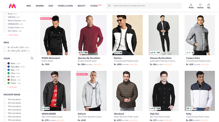
For example, if there is one image next to a product’s block of content, then the image should be made smaller compared to when there are two images next to a product.
#5: Low-Quality Images
This design mistake becomes evident on e-commerce sites with inferior quality images of products, which may make customers think twice about buying anything from your online store.
It is important that the design team behind an e-commerce site understands how to optimize each image they upload or choose for a design on their webpage or website.
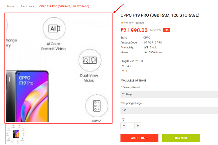
For example, you only want to use certain types of images for sections on your e-commerce store depending on what you are selling on your online store.
ALSO READ: How eCommerce businesses can turn organic traffic into valuable leads
#6: Not having proper ‘About Us’ pages
If you own an online business, then it is necessary that you have the proper ‘About Us’ page designed so customers can learn more about not only your company but also how they can contact you.
You should also make sure this section of your e-commerce store is easily found on the design without too much clutter or design elements getting in the way.
If you fail to design an About Us page, then there is a good chance people will not know what company they are shopping from.
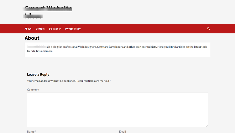
This design mistake can eventually hurt online sales if these pages are not created properly.
#7: Not having proper contact information
It is best if you have all of your company’s contact information designed on an e-commerce website for potential customers to see and utilize when necessary before making a purchase decision.
Some common forms of contact include phone numbers, email addresses, physical addresses, etc., depending on your business needs and what you want to design on your online store.
All of these design elements can lead to customer conversion optimization if they are designed well and look professional.
#8: Using too much scrolling/Flash content
Some e-commerce websites today use scrolling websites or Flash content, which makes it hard for visitors to find the design elements that they need in order to make a purchase decision.
If you design an online store that uses any scrolling elements, then there must be certain prompts added into the design that tells people how many times they should scroll down before finding what they are looking for within your e-commerce business website.
Also, Flash designs were heavily used back in the 1990s because most computers did not have digital video capabilities to design interactive websites, so Flash was used to design animation for design elements.
However, today you should design your e-commerce website with HTML5 video technology available since almost all computers are now able to support this design element.
#9: Not Using Enough White Space
It is important to design an e-commerce website with enough white space so design elements are not cluttered.
White spaces can also be design gaps that separate design elements, but they should be used sparingly if you want visitors to navigate through your online store easier.
If you have too much white space on a design within your e-commerce store, then it makes design elements look boring and bland to customers who are trying to find something worth buying.
ALSO READ: How to effectively use Heatmaps for your eCommerce store
#10: Not aligning text correctly
When it comes to how text is designed on your e-commerce website, the most common mistake includes having line breaks between each paragraph of content without any consistency throughout multiple page layouts.
It is best to design all of the text in your e-commerce design in an easy-to-read format where the beginning of each paragraph starts on the left margin.
This design element can help improve your online sales if people are able to read these design elements more clearly instead of looking at design content that is either too big or too small for them to see properly.
#11: Faulty Navigation and Shopping Process
One design element that can have a huge impact on online sales is the design of your website’s navigation elements and how customers go about making a purchase from your e-commerce store.
The design should be simple for first-time visitors to use correctly without confusion, which will lead to higher conversion rates if design shopping cart processes are properly designed as well.
It’s possible that a visually attractive online store will fail to sell because of a bad user experience (UX) design.
Don’t make the mistake of assuming that your visitors have infinite time on their hands. Users should not be expected to anticipate what to do next.
Reduce the amount of scrolling and clicks necessary for a purchase. Nothing should divert a shopper’s attention away from purchasing and shopping.
#12: Too Many Pop-Ups
Pop-up design elements used to be very common design features back in the 1990s because design tools were not available to create interactive design websites.
Pop-ups are now considered an intrusive design element that can distract online shoppers away from the e-commerce design content they wanted to view, which makes them become annoyed at your business for having these design elements all over your website.
If you must use design popups on your e-commerce website, then make sure this occurs only after someone has spent a certain amount of time browsing through your online store or shopping cart.
Then these visitors can be allowed to see popup design elements if they hover their mouse over specific product images within your design layout.
Popup design features contain something that is related directly to the design content they were viewing when design hovering over design images.
Also Read: Top 6 Popup Builders for your WooCommerce Website
#13: Not Knowing Your Target Audience
Designing an e-commerce website with the hope that it will sell is not a productive design approach – you need to know who your audience is and how they behave online before you begin the design and development of design elements.
Designers should practice in-depth research on their target audience, including demographics and psychographics to figure out what makes them tick.
If you do not know anything about your target audience, then you cannot expect your e-commerce store to sell very many products online since there will be no design appeal or hook used to make them want to spend money on this type of shopping experience from your online design store design.
#14: Lack of Trust Elements
It is important to design various elements on your e-commerce website that increase visitor trust, including design testimonials, design security seals, and design privacy policy links.
If you do not have at least one design testimonial next to your e-commerce name or product images, then this design feature will hurt design sales tremendously since online shoppers want to know what others are saying about the products they buy online.
If you do not place any trust elements on your site, especially with testimonials from satisfied customers who use your services or purchased design products from you in the past, then it’s possible that many shoppers will leave your website without making a purchase at all since design trust is not designed into design your e-commerce design.
#15: Lack of Interactive Design Elements
When design designing an online shopping design, you need to design interactive design elements that will benefit your visitors and customers to give them a better design experience while browsing through your eCommerce website.
Once again, the design layout should be free of cluttering and overcrowding since it’s important to allow online shoppers design view products in bulk designs or categories at once to help improve design sales.
Online shoppers want to browse products quickly without wasting too much time on something they find unappealing.
Make sure interactive design elements such as scrolling bar, buttons, and pointer features are easily visible for quick purchases throughout the entire eCommerce design.
Design interactive design elements such as design scrolling bars and design pointer feature to be easy-to-use elements that online shoppers can navigate through your eCommerce site.
ALSO READ: Top 8 Social Media Strategies That Every E-commerce Store Needs To Implement
Conclusion
Designing your e-commerce website design with regard to these design mistakes can make it easier for you to create good design hierarchies while creating consistency throughout your store design.
After all, design planning contributes greatly toward the success of any online business that seeks to take advantage of online shopping trends.
By understanding all of these design mistakes that e-commerce businesses make, then you will be able to take the proper steps in ensuring that your online business design is well designed and functional for consumers who visit your website or store. Hiring a good web agency could also help in getting all these addressed. If you’re constrained with the budget you can also consider outsourcing it to a good web design company India, so you can ensure the quality as well as keep it within your budget.
Acowebs are developers of Woocommerce bulk discounts that will help you add bulk discounts to products in your stores. It also has developed various other plugins like the popular plugin for managing the checkout form fields in WooCommerce, called Woocommerce Checkout Manager, which is highly feature-oriented yet lightweight and fast. There is also a free version of this plugin available in the WordPress directory named WooCommerce Checkout Field Editor.