A/B testing is not a new concept, but there is a lot to it, such that it is easy to get it wrong, leading to incorrect conclusions and decision-making.
When done right, A/B testing enables you to derive valuable insights into what your target audience likes. You also get a better idea of how your marketing campaigns are performing and which ones to use.
However, A/B testing tools do not work on their own; hence, you need to learn a few things that you should do to make the tools useful while delivering the most reliable and accurate results.
There are a number of challenges that you could be facing when running your eCommerce stores, such as low conversion rates, high cart abandonment rates, or even low returns on ad spend.
While A/B testing strategies like changing the color of your call-to-action (CTA) buttons could help address the identified problems, you still may not know how to do this effectively.
The good news is that when executed well, A/B testing will enable you to improve your online store’s performance metrics, and this guide contains all the information you need to make the best use of eCommerce A/B testing tactics.
What is A/B testing?
A/B testing, also known as split testing, entails determining the most successful design, content, and functionality for your eCommerce site visitors. It is a way of testing and comparing a variety of page elements and versions to determine their appeal to your customers’ behavior.
A/B testing requires repetitive changes and improvements to your eCommerce layout, content, and other attributes to get the best possible version and results. For the content part, an experienced paper writing service provider or content writer can help you to create better versions for A/B testing.
For instance, you could be testing two different content layouts for a product, email, or digital asset, to determine which design performs better or creates the highest sales conversion. You could also change your product page navigation to see which contributes to more engagement and sales.
As you continuously improve your website design and product pages, so will you be aligning your eCommerce store to your customer behavior and business goals.
The process helps improve your decision-making capabilities as it enables you to determine the most effective ways to generate more revenue from your existing traffic.
ALSO READ: Top 8 Social Media Strategies That Every E-commerce Store Needs To Implement
Why should you do A/B testing?
When done well, A/B testing can significantly improve your customers’ shopping experience, leading to increased click-through rates, conversions, and revenue. You can use the results obtained from the tests to determine the changes to be made to remedy low conversion rates, poor return on investment (ROI), and high cart abandonment rates.
The improvements you make to your eCommerce sites, such as the site layout and appearance, also help contribute to increased customer loyalty, fewer complaints, and more referrals.
Companies like Amazon have achieved massive success thanks to their consistent A/B testing tactics. Jeff Bezos, the company’s founder and CEO indicates that the more experiments you perform, the more you learn and become innovative.
If you have a “what-if” mindset, you can establish solutions to a set of questions, leading you to discover new and better ways of doing things. A/B testing is associated with differentiation, setting you apart from the competition.
A/B testing is also an ideal way of segmenting your customers, whereby you present certain sales copies and landing pages to specific groups of customers to determine the right outline and appearance for improved conversion. Customers are not the same, and their shopping trends differ across demographics, age groups, and behavior.
For instance, Millennials and Gen Z consumers are more eager to spend on personalized products and services that highlight individuality, uniqueness, and exceptional experience. When targeting these groups, A/B testing will help you design and differentiate your landing pages, product pages, and marketing campaigns in ways that will appeal most to the specific target audience.
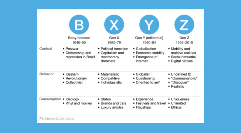
Overall, you should be A/B testing if you are looking to uncover insights into the performance of your new product designs, content, and functionality. The results will help inform your product descriptions, visual appeals, and value proposition, leading to improved performance of your eCommerce store.
How to perform eCommerce A/B testing
A/B testing is a process, which requires preparation to ensure you are doing it right.
Let’s have a look at the best A/B testing approach:
Test a hypothesis
Before the A/B test, you must write a hypothesis, which is a measurable explanation of what you are aspiring to solve or achieve.
Borrowing from Craig Sullivan’s Hypothesis Kit, a simple hypothesis is guided by the following factors:
- Your current performance – the data/metrics or feedback you have gathered from research will give you an idea of where you are in terms of conversion rates, click-through-rates, email open-rates, cart abandonment rates, etc. You can also take note of the number of sales per month or quarter. The metrics will be used to compare against future performance to determine the winning variable.
- Your expectations – Given what you see from the current performance, you can now list down the change you are testing or the impact you anticipate from conducting the A/B test. This practice is similar to defining your overall goal of the test, such as the areas of your site or metrics to improve. For instance, you can set a goal to raise your eCommerce store sales or conversion rate by 15%.
- Select the data metric – Your goal should be measurable, and you should be able to identify a metric or variable to test, which can help you achieve your expectations. Variables like headlines, CTAs, site design, SEO tactics (keyword volume and density, meta descriptions, etc.) can be tested one at a time to determine the outline, design, and layout that achieves the best results.
Choose an A/B testing tool
There are several A/B testing tools to choose from, such as Google Optimize, Visual Website Optimizer (VWO), and Optimizely.
Google Optimize is free and comes with Google Analytics, while VWO has SmartStats, on-site surveys, heatmaps, and other analytical elements.
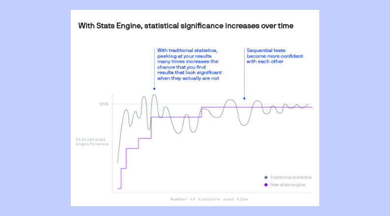
Optimizely is also an effective A/B testing tool because it has a Stats Engine for easy analysis of test results, enabling you to run your experiments with ease, get real-time results, and take proactive action to improve your eCommerce store outcomes.
You can also find other A/B testing tools in the Shopify App Store.
Ensure that the tools selected have quantitative and qualitative analytical capabilities. Elements like technical analysis, analytics analysis, on-site surveys, and session replays should be configured correctly for proper and accurate data tracking and reporting.
Once you select a testing tool or split-testing software of your choice, you should sign up with the service provider and follow the instructional manual. Most of the tools will direct you to install a snippet on your website and set A/B testing goals.
ALSO READ: Using Personalization On Your Online Store To Enhance Customer Experience
Create variations and test them concurrently
The next step is to create two test variations across your site pages and email marketing headlines. Ensure to document the different variations, such as a red-colored and a green-colored CTA button.
It is advisable to run the two variations of your A/B test concurrently because conditions are likely to change when variable A is run at a different time from variable B, creating unreliable results.
For instance, if you are measuring the conversion rate during a marketing campaign, results derived after deploying different variations two weeks apart may differ simply because of other causes unrelated to your changes.
The test period will depend on the type of the variable being measured, your site traffic, and other factors. For instance, a high-traffic site testing CTA-button placement can run the test for a week, while testing SEO tactics can last longer due to the period it takes to obtain significant user results.
Analyze your test results
When analyzing your A/B test results, you should be guided by insights as they apply to different segments.
For instance, depending on the goal set when creating the hypothesis, you can gain insights that certain segments, such as new visitors, paid visitors, social media visitors, etc., shop more when a vertical page layout is displayed than with a horizontal page layout.
The test tool will also show you the better performing variation, but the analysis part has to be done by you to determine which aspects or features customers like more than others. Insights like the visual representation and design will entice customer groups differently, and it will be clear which variations are associated with increased engagement and conversions.
Statistical outputs will tell you how important the results are. For instance, a 90% and above click-through rate is statistically significant, and a variable performing lower than this is not the best choice for your eCommerce pages.
A 95% confidence interval will tell you that 95 out of 100 similar samples of the variable tested will fall within a given range, giving you a better idea of the variable attracting a greater number of site visitors.
The lower the statistical significance, the higher the chance that the variation tested is not the winner of the two.
Remember to always use a large enough sample size for the experiment to derive reliable results; hence, A/B testing may not work for a low-traffic site. Instead, small sites can conduct user testing or surveys.
Take action
With the results in place, it is now time to update your site, landing pages, product pages, and marketing tools with the winning features or variables.
If the results were very close for the two variables tested, consider if it is necessary to undergo the change process, or if you should rerun the test or reanalyze the results.
ALSO READ: Best UX Practices for an eCommerce Checkout
Where should you use A/B testing?
The test ideas should come from your own data because every eCommerce business is unique from the other. Your customers, products, web design, and marketing strategy may differ from those of another online store quite significantly.
However, there are a number of elements that you can A/B test, which is common online shopping hassles:
Free shipping
Before implementing a free shipping policy, you should A/B test to compare your product sales performance with and without free shipping.
Shipping costs account for high cart abandonment rates, making this variable one of the areas where eCommerce store owners are looking to differentiate themselves from the competition.
For instance, you can use the A/B test to determine if free shipping is a viable option to lower the cart abandonment rate, or if you should use a combination of paid and free shipping, which can be achieved by creating a threshold value for qualifying items.
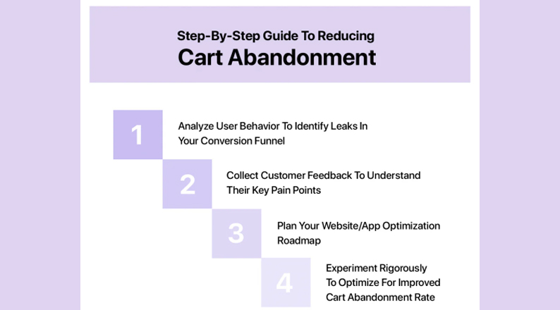
Many eCommerce platforms have eliminated shipping costs for certain items because they have experimented and determined that free shipping leads to high conversions.
CTA
Call-to-action (CTA) buttons are a driving force for eCommerce conversions, but aspects like the ideal button color, size, and placement are best determined by experimenting.
You can test with two CTA buttons on one page, in which case, you should minimize the size of the secondary CTA relative to the primary one to avoid confusing your customers.
Ensure to test the phrasing, such as “Buy Now,” “Get Started,” “Free Trial,” “Join Free for a Month,” etc. “Buy Now” has a sense of urgency, which can prompt shoppers to take more immediate action.
“Submit” can convert better than “Apply,” depending on the context because the former is more welcoming and reliable than the latter, which implies that one could get rejected.
OfficeVibe uses two CTA buttons, one at the top right-hand side of the page, and the other at the bottom-left.
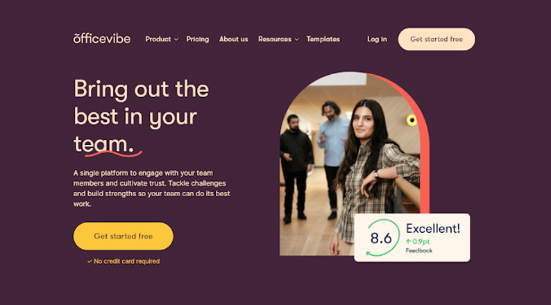
Your CTA colors should also stand out; they should be visually appealing and visible, and should blend well with your website colors. You can run a test to determine which button color is better.
When testing for placement, consider the above-the-fold, middle, right, and left sections of the website to determine which areas create the best impression and the highest conversions.
Product page
You must use high-quality images for your product pages to appeal to your target audience and compel them to take the necessary action.
Test the location and display of your products on the homepage and product pages to determine the places that customers prefer engaging with your content.
For instance, eBay’s homepage features colorful images of the most popular categories and daily deals, while the products page has more detailed categories, whereby site visitors can view product descriptions and complete their purchases.
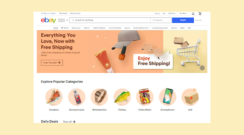
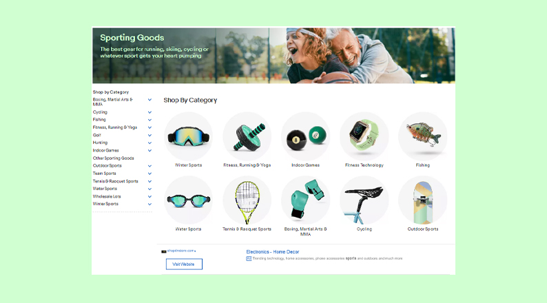
Test to determine which page display your customers prefer to see and use the insights to create attractive product pages.
ALSO READ: Tips to use content marketing for eCommerce sales
Headline wording
Your eCommerce web pages and marketing campaigns should carry powerful, catchy, and customer-friendly text.
A/B test different headline wordings to identify one with the highest conversion rates. The wording variations can also be used to track several metrics, such as the number of shares, bounce rate, click-through rate, and average reading time.
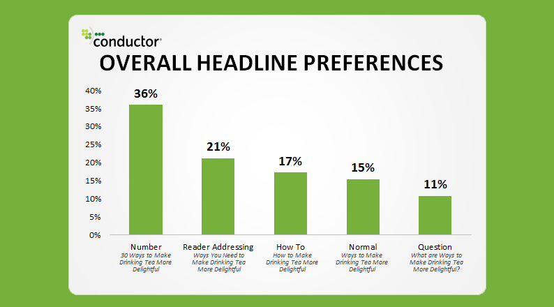
Your A/B testing will help you determine the winning variant by sending a percentage of your site’s visitors to each of the headlines being tested. One of the best tactics to consider in your wording is adding numbers for credibility and addressing the reader to make the message more personal.
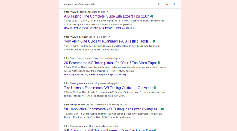
For instance, a Google search for how different content writers do their headlines shows that a mix of numbers and compelling terms that address the reader is a common practice that will enable you to rank well on search engines and improve site visits.
A/B tests either of the mentioned headline preferences to determine the best one for your web content.
Typography
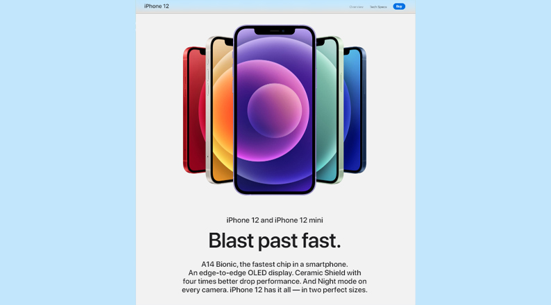
Another target area for A/B testing and experimentation is your font sizes, type, and spacing. Ensure that you select clear fonts and layouts that do not distract your readers.
Some brands like ‘Apple’ use minimal product descriptions, plenty of white space, and large fonts for increased readability.
The typography selected for your eCommerce site should be driven both by your brand culture and customer preferences. The less clumsy your web pages are the better the engagement and conversion rates.
ALSO READ: How to use psychology to shape your E-commerce success
Conclusion
eCommerce A/B testing entails testing and comparing a variety of page elements and versions to determine the designs, content, and functionalities that influence your customers’ behavior the most.
Digital marketers perform A/B testing in order to improve their customers’ shopping experience, which trickles down to increased click-through rates, conversions, and revenue.
It is also a great way to segment the target audience and gain great insights that can help the decision-making process and business performance.
You can conduct A/B testing effectively by testing a hypothesis, choosing an A/B testing tool, creating and testing variations, analyzing test results, and taking the appropriate action.
There are many places to A/B test on your website, including on the checkout page where you can feature free shipping messages, CTAs, product pages, headline wording, and typography.
When executed well, A/B testing can derive tremendous success for your business, as it makes you innovative and differentiates your brand from the competition.
Acowebs are developers of WooCommerce plugins that will help you personalize your stores. It supports the additional option with feature-rich add-ons which is WooCommerce Product Addons, that are lightweight and fast. Update your store with these add-ons and enjoy a hassle-free experience.


 Login
Login
 Cart
Cart


