However, optimized pages are what make the difference in the e-commerce world by enabling browsers to become buyers. Creating stunning pages is even harder for Shopify store owners, as their digital storefronts draw customers and keep their interest. In this guide, unlock the secrets to Shopify product page optimization.
Through the various strategies ranging from targeting your audience to conversion and increasing sales, you will learn how one should create pages rather than offer curiosity but also convert them into items such as sales. Using the right strategy, your Shopify store’s product pages can hold the attention of clients and directly affect your revenue. Let’s go into it and learn how to make high-performing product pages.
Understanding Your Target Audience
The first step before optimizing the Shopify Product Pages is to know your target market. With an understanding of their likes, desires, and habits, you will be able to adjust the content based on specific knowledge about them. Make use of data analytics tools such as Google Analytics to collect information on the age, location, and interests of your site visitors. Age ranges, gender, income levels, browsing and shopping behaviours should be analyzed. With this knowledge at your disposal, you can produce engaging content for your target audience.
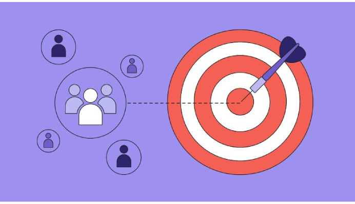
For instance, if your analytics reveal that your target audience is mainly women aged 25-40 who are interested in green products, ensure that you highlight the sustainability and empowerment of women on the product page. Place messaging about how your product can be part of a mindful overall lifestyle. Use a tone that is inclusive and friendly. Photos and videos of women from your target audience having fun with the product should be included. The more relevant It is to the target audience, the higher its conversion rate will be.
Analyzing Customer Behavior
In order to design a product page that yields desired results, you must first understand how your customers navigate through the website and interact with products or services on offer. Track the most often visited parts of your website using heatmaps and user journey analysis tools. Consider the numbers of clicks, page views and conversions for which products. Analyze your website user flow and identify pain points in the checkout process. Having this data will give you valuable insights into which products are the most popular, how customers interact with your site and what they find appealing about it.
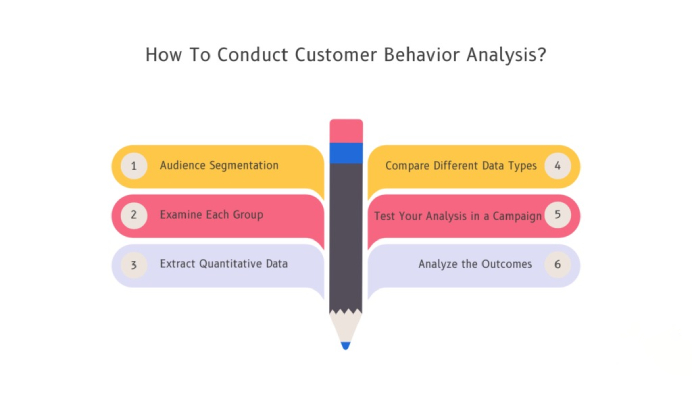
For instance, if the product pages that you need for your eco-friendly laundry detergent register high traffic but low conversion rates, this is an indication of a place where enhancements should be made. Maybe, try out the page layout rearrangement or change in simple description. Analyzing customer behaviour provides data-driven insights to improve clicks and conversions.
Crafting Compelling Content
It is now time to develop compelling content for the product pages after identifying your target audience and their behaviour. For your material to appeal to Shopify readers, it should be educational, entertaining, and visually appealing.
Therefore, ensure your pages are easily scanned by employing concise but descriptive headlines and subheads. Provide such product details as the materials used, dimensions, care instructions and warranty conditions. Use lifestyle imagery and clear instructions for visualization purposes so your readers can imagine themselves using the product successfully.
Share the story of your product and business to establish an emotional relationship. For instance, narrate the founding story and heritage behind an artisan pottery company brand.
Good product images and interactive features should improve the user experience as well as raise dwell time. Use professional photography and videos to capture your products’ best side while helping customers picture how their lives can be changed for the better with these items. Crafting compelling Shopify product pages means using detailed descriptions, engaging imagery, and storytelling to connect with customers. Partnering with Shopify Plus eCommerce Agencies can help refine these strategies, ensuring your pages resonate with your audience and boost conversions.
Optimizing Your Shopify Product Pages
Now that you have a solid foundation let’s dive into the specific strategies for Shopify product page optimization:
1. Keyword Focus: Optimize Your Title and Meta Description
Keyword optimization of product page titles and meta descriptions is essential. Perform extensive keyword analysis to find long-tail keywords with low competition and that accurately describe your product. Tools such as Google Keyword Planner and SEMrush may be used to create suggestions for keywords.
Create interesting, griping titles containing your main keywords. Do not let them be more than 60 characters so that they are not cut off in search results.
Meta descriptions include secondary long-tail keywords and compelling calls to action while concisely describing the product. Uniquely describe each page. Duplicate meta descriptions hurt visibility.
2. Alternative Image Tags
Alt tags are an integral part of the product images. The alt text should be written with careful consideration to denote the details of what is shown in the image and why it has been included on this page. For example, ” A red long-sleeved cotton shirt lying on a table.”
Use more specific wording than descriptions, such as “Product Image #3”. If the image contains the product name, this detail should be present on a short alt text. The description should be comprised of colour, pattern, purpose and even fabric.
Well-written alt tags improve image search engine optimization, accessibility for individuals with disabilities and conversions when proper if images fail to load.
3. Backlinks to Your Shopify Store
Building high-quality backlinks will help your Shopify product pages rank higher in search results. Some strategies to acquire relevant backlinks include guest blogging on industry blogs, controlling link placements and content marketing.
Emphasize obtaining links from authoritative sites linked to your industry. Where possible, link to your most important and high-value product pages. Use the tool in Google Search Console to monitor your backlinks and find out toxic links.
4. Social Proof and Reviews
Product reviews and testimonials create credibility that can be converted into sales. Include high-quality four stars to five review comments near the top of product pages. Ask satisfied customers to provide video testimonials chronicling their experiences.
The user-generated content, such as customer photos/videos using your product, serves to authenticate “social proof“. After purchase, ask customers to review the product and give permission to use UGC. Offer incentives to spur participation.
5. High-Quality Product Images
Spend on professional high-definition product photography. With highly clear and bright pictures, customers can review product information in detail, such as appearance, before buying. Make use of various angles and magnification shots in accordance with your products.
Keep the same kind of lighting, image styles and brand appearance in every product photography. Keep products fresh by updating imagery often. To reduce returns and complaints, ensure that the photo depicts products correctly.
6. Detailed Product Descriptions
Don’t forget about product descriptions – this is your chance to provide clients with all the necessary information they need in order to approach their acquisition process on well-informed terms. For each product, include the following:
- Features and Benefits – List the main features of your product, showing how each one improves their lives. Aim at how your product helps them solve problems or better their lives.
- Technical Specs – Provide technical specifications, measurements, materials used and other details about your product’s specification. Whenever possible, quantify claims in terms of numbers.
- Usage Directions – Describe how customers may use your product. Offer suggestions, directions or advice that customers can use to find the highest satisfaction.
- Differentiate your product from the competitors or other available alternatives. Indicate why your product is superior.
- Pictorial Evidence – Furnish pictures, schematic diagrams or even videos that provide visual illustrations of your product’s specific characteristics and applications.
- Sizes – Clothing and accessories should include detailed size charts which can explain sizing conversion as well as measurements.
Your descriptions should be from a customer’s point of view and identify the most critical aspects. Choose vocabulary and phrases that are meaningful to your audience.
7. Clear Call-to-Action (CTA)
By its nature, every product page should include a CTA button that sends visitors to the cart or makes a purchase. Your CTAs should:
- Use phrases such as “Buy Now” or “Add to Cart”.
- This can be achieved visually through the use of colours, size and placement that are somehow different from each other.
- Getting put in the same places on each page – most often near the top and bottom.
- Be a clickable link that goes directly to the checkout or shopping cart page.
Vary the CTA by altering its variations, colours, locations and text to figure out what converts best. Ensure that CTA and path to purchase are prominent on desktop and mobile.
8. Upselling and Cross-Selling
Encourage customers to spend more by presenting upsell and cross-sell offers on your product pages:
- Upsells – Offer an upgrade to the product or additional perks such as accessories, warranties, and services.
- Up-sells – Products that enhance the customer’s purchase, such as batteries for electronic devices or lens cleaners for cameras.
- In-page and at the checkout. Make the additional costs clear.
- And highlight the secondary benefit, cost savings or convenience attached to your upsell/cross-sell recommendations. Put in place bundle discounts to promote purchase rates.
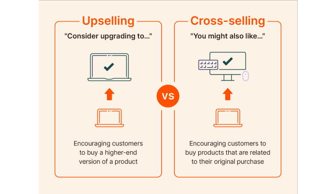
A winning cross-sell/upsell strategy can boost the average order size. Try out a number of different integrations and offers that are more helpful than annoying.
9. Smooth Navigation and Checkout Process
When users become disorientated on the product pages and other website pages, they will bounce. Use clear navigation schemes like:
- It is on the top menu bar of all pages.
- Secondary or side menu with subcategories, featured products and links to the user’s account.
- Buttons CTA that take clients to the next logical development, for instance, “View Cart” or “Checkout Now”.
- Page location visual breadcrumb trails.
- Labeling the titles of linked products to detail pages.
All product pages should be connected to the home, in addition to the category/collection page. Construct customer paths that help them move towards purchase.
10. Video Content
By 2024, e-commerce seems to continue growing and improving each year at those same high levels; there is hardly any organization that does not use video content as a means by which they communicate with customers in forceful ways. Video provides an unprecedented chance to display products closely, in use and using the user. The technology allows for complete immersion that photos of stationary product shots cannot match. The power of video is being used by smart eCommerce companies to communicate their product value propositions.
Demonstrating the product’s value proposition through video increases engagement and builds trust, ultimately creating conversions. As the video format is diverse, it allows businesses to be creative when displaying their products from any angle. Products come in unboxing videos, tutorial clips and testimonials, as video works allow shopping from a distance to become a reality. A new era of video marketing encourages e-commerce companies to create upbeat content that attracts the attention of modern consumers. Video is a magical visual story-telling instrument which can show the best sides of product features.
11. Mobile Optimization
In eCommerce, mobile optimization was a crucial winning strategy in 2014 when smartphones dominated online purchases, with more than fifty per cent of all shopping activities done on the move. In order to be able to touch the on-the-go consumers, brands should allow effective mobile connectivity across devices. This involves conducting tests on product pages using different browsers and screens to ensure proper responsiveness as well as accessibility.
Content and images are better off being packed for smooth scrolling on mobile devices, while buttons are highly visible so users can click them. Smartphone screen optimization enables brands to remove the friction from the purchase funnel. By practising conscious mobile optimization, eCommerce companies can ensure that customers shop online through their preferred channels. But an essential approach to successful, seamless user journeys is locating mobile phone users in their familiar natural environments, even on the most miniature screens.
12. Test and Measure Success
In the data sovereign eCommerce optimization of 2024, Smart brands are constantly running tests and measuring the results to get optimal outcomes on their product pages. Measurement-driven approaches to testing different versions, including comparing product copy or the placement of CTAs, are possible.
Quantitative intelligence regarding what shifts the needle can be provided by monitoring critical metrics. With this real-time feedback loop, brands can continuously optimize pages according to data that drives. Evidence-based optimization is possible based on making rounds and measuring outcomes.
Companies can create consumer-pleasing, tightly focused-online experiences that meet the demands of today’s users if they allow data to guide them. As the competition grows in such a market, connecting with customers has become more problematic, but identifying and monitoring product pages is no longer optional. With data-led brands, there would be increased loyalty from their users and revenue.
Conclusion
These techniques can guide you through Shopify product page optimization, facilitate conversions and generate more sales. Remember that audience and relevant content should always be at the forefront. With a user-centric mentality and ongoing testing, you can optimize your product pages to ensure that its overall success is achieved.
Additional Information: This article is the complete guide on how to do the best Shopify product page optimization for better results. These range from diverse approaches such as keyword optimization, alternative image tags, backlinks, social proofs high- high-quality product images, comprehensive product descriptions, clear calls to action, upselling and cross-selling smooth navigation checkout process, video content, mobile optimization testing, measuring success, etc. With such measures, you will be able to enhance the customer journey and raise conversion rates that lead your Shopify store to bring more sales.
Acowebs are the developers of Woocommerce Custom Product Addons which is a optimized, lightweight, and fruitful plugin that is simply the best to add extra product options using its custom form builder easily. WooCommerce product options also comes with drag and drop form builder, 22+ field types and custom price formula.


 Login
Login
 Cart
Cart