Marketers and eCommerce business owners are now more than ever, shifting to digitized platforms, creating a need for better visual and usability experiences.
At the same time, better UX designs for eCommerce are key to shaping the customers’ journey.
The more compelling your eCommerce website design, the more your business will attract more customers, and gain more conversions and sales. It is also a way of minimizing cart abandonment rates.
Paying attention to the principles of UX design in eCommerce puts your business in an even better position to capitalize on the global market growth trends, hence, increased financial returns.
According to Statista, global retail eCommerce sales amounted to USD4.28 trillion and they are projected to reach USD5.4 trillion in 2022.
There is no better way to take advantage of the rising demand for eCommerce sales, than attracting and sustaining a great flow of customers through a powerful, compelling, and user-friendly website design.
If you are looking to entice and motivate your customers to move up the user journey quickly, you must invest in an industry-standard UX design.
In this article, you learn just how to achieve this, as we will be covering the top 8 UX design strategies for eCommerce websites.
The typical user journey
Website discovery
A customer discovers your website after searching for a product online or on social media.
They could also be referred by a friend, but a great UX design is a contributing factor to them reaching your site.
Product catalog browsing
Your page load speeds and ease of navigation will keep customers on the website, browsing for the desired product.
Ensure customers are able to navigate your pages seamlessly to make product search easy.
Product selection and comparison
Customers will gather and review information about the product before making a purchase decision.
For instance, they could be looking for certain benefits like durability and usability, and other features like pricing and warranty.
The clearer your product descriptions, the easier it is for the customer to make a buy decision.
Adding the product to cart
Ensure to provide an appealing call-to-action (CTA) button, which customers will use to buy or add the product to the cart.
The button should be visible and strategically placed on the product page to ease the buying process.
Checking out
Gather details like delivery address, mode of payment, and other customer details necessary to complete the order.
Ensure there are proper security measures to keep the customer’s data secure, while still making the eCommerce check-out process simple and clear.
Order confirmation
Send customers an email confirming the successful placement of the order. The email should indicate the expected delivery time and should be designed in a way that all the product details are listed.
There should also be buttons or links for order tracking, cross-selling, surveys, etc.
The key to a successful customer journey is to keep the process simple, clear, glitch-free, and enjoyable.
What are the benefits of UX design for eCommerce websites?
Ecommerce marketers invest in user-friendly and appealing UX designs for multiple benefits, including high user engagement, improved brand image, and increased conversions. Nowadays, every top web development company invests a good amount of time in UX, before the design and development phase of a website.
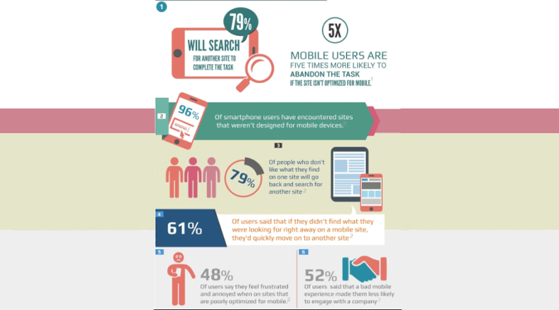
Mobile optimization is also essential for your website because you are likely to lose customers if they have problems accessing your page on the phone.
Indeed, research by Impact shows that 48% of users are likely to abandon a site if they feel that it is poorly optimized for mobile.
Mobile users are 5 times more likely to leave tasks incomplete if the site is not optimized for mobile.
Great UX design also helps with referrals as more customers who are impressed with seamless site navigation will recommend it to their friends and family.
To ensure your eCommerce website has all the necessary features to make it impressive for users, UX designers must consider the following aspects:
- Strong branding
- Operational simplicity
- Effective use of visual effects
- The ability of users to leave feedback
- Accessibility of contact forms
- Clear menus for data representation
With these ideas in mind, let’s have a look at leading UX design strategies that will make your eCommerce website stand out.
ALSO READ: Top 8 Social Media Strategies That Every E-commerce Store Needs To Implement
8 UX design strategies for eCommerce websites
Content, graphics, and overall navigation are some of the few aspects customers interact with every time they land on an eCommerce website.
How attractive, usable, convenient, and reliable your set is will depend on how well you deploy UX design strategies.
Prioritize brand positioning
Your website should grab the user’s attention as quickly and clearly as possible.
First impressions are so important in UX design that web visitors are able to make almost instantaneous judgments of your site’s visual appeal.
In as little as 50 milliseconds, a web user will have decided whether to stay or abandon your site.
The nature of your business will determine the visual effects on your site, but basics like your product or service specifications, positioning, value proposition, and mission statement are clearly communicated.
At the same time, ensure your eCommerce website is personalized for improved engagement with visitors, hence, increased sales and return on investment (ROI).
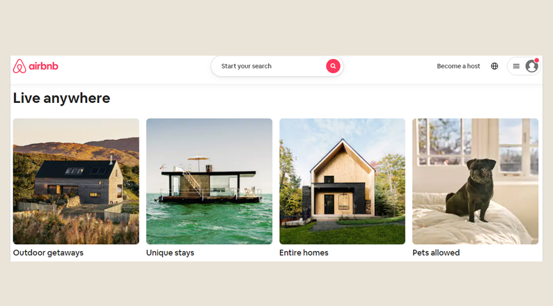
Airbnb is one company whose branding, pink colors, and colorful images, speak the same tone, that of boldness and life.
The company encourages anyone to make the best out of their lives by belonging anywhere. This mission statement is clearly reflected through the website design.
Customize and personalize your brand presence to target the needs of a given demographic group or age bracket, or even to align your business with the celebration of events like Christmas and Black Friday.
Optimize your web design
Ensure the on-site search button on your website is optimized to ease the process of customers locating the products and services they need.
You should also make the search tool impulsive, predictive, or automated to display the search options quickly as soon as customers type their query on the search bar.
You are selling multiple products at one given time. A smart search function will ensure customers can easily, quickly, and accurately find their desired products and services.
The discovery mode is also a great way to entice browsers who are only scanning through your pages for something interesting.
Use the discovery mode to display new or best-selling items, from which web visitors can easily and quickly see product categories.
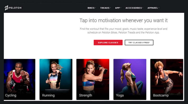
Peloton, an American exercise equipment and media company, enables monthly subscribers to remotely participate in multiple workout classes.
The website is optimized with a discovery mode, whereby customers can easily explore and choose classes.
Another UX design strategy to get your web design optimized is by the use of filters and faceted search.
Faceted navigation enables users to select a set of attributes at a time, such as product size, color, price, and other specific categories.
The UI should be able to recognize the applied filters immediately, and users should be able to remove and edit them easily.
Get your website and mobile app optimized using advanced and efficient web development tools like Jamstack and Laravel. Laravel forge is the perfect way to make deployment easier, with customizable UX and UI kits that will inspire your next project.
ALSO READ: A complete guide to BOPIS (buy online pick up in-store)
Feature similar products
Customers might not always find the product or service they were searching for, despite providing them with a smart search button.
To ease the shopping process and to ensure customers don’t abandon your page because they could not find something to buy, ensure to display similar products through the “You May Also Like” section.
Feature this section either at the bottom of the product page or on the side panel, but ensure the positioning is noticeable.
This approach helps customers to see both the item they want and other accompaniments, leading to higher sales for your eCommerce business.
Amazon has leveraged UX design strategies in every way possible, including the optimized search tools and the ‘similar products’ features like “Products related to this item,” “Customers who viewed this item also viewed,” “Compare with similar items, etc.”
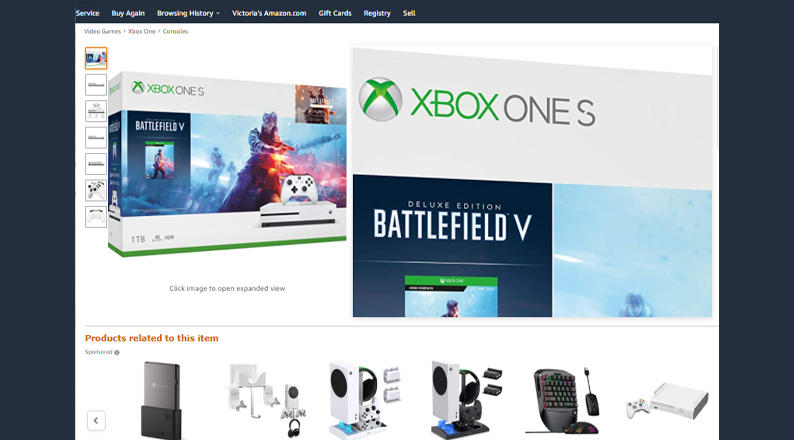
Give your customers a reason to buy more products from your site by providing them with a section where they can view additional items on sale, according to their search or shopping history.
Add interactive CTA buttons
Call-to-action (CTA) buttons guide users to complete a task, such as buying a product, subscribing to a channel, or downloading an eBook.
However, the appearance and positioning of your CTA buttons is an UX design strategy that you must learn to ensure you don’t lose customers for appearing too pushy.
Your CTA buttons must be interactive with the content of the product you are selling. Examples of CTAs include Sign up, Try for free, Get started, Learn more, Join us etc.
In addition to using contrasting colors or colors that blend with your brand, ensure your CTAs are simple and effective, and are accompanied with great phrases.
Customers will be reluctant to click on a button without persuasive content above or befor it.
Barnes & Noble, an online bookstore for books, ebooks, and magazines, it uses highly interactive CTA buttons that blend well with the brand colors.
The user first sees the book’s title, pricing, formats and editions, and mode of accessibility (ship the item or Buy Online, Pick up in Store).
Below these details, the customer can choose to add the item to the cart or to sign in to purchase instantly.
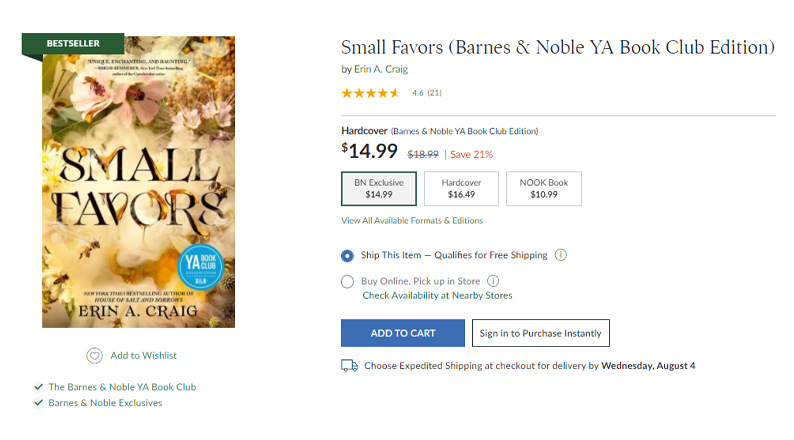
Provide your customers with brief, useful information about the product, or feature a promotional strategy like discounts before displaying the CTA button.
Provide wholesome product evaluation
Your eCommerce website design should feature detailed product information to ease customers’ decision-making process.
Show professional, detailed, and high-quality product descriptions accompanied by images.
The most important information, such as product features and benefits, ingredients or raw materials, measurements, sizes, colors, and pricing should be given priority.
You can then provide a link or a button that customers can use to view additional details and information.
Ensure to also break down your product descriptions into sections, such as overview, dimensions/sizes, pricing, and shipping information. Use expandable sections, which the user can collapse at will.
The better the organization and presentation of your product page, the easier it is for your customers to navigate without feeling overwhelmed or confused, and the higher the conversions.
Buffy, a bedding brand, uses expandable descriptions for product details and free trials.
The simplified but clear product page also contains multiple images of product use, pricing, and sizes. Additional features like product reviews come at the bottom of the description.
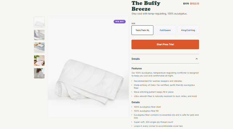
Use high-quality product images, and ensure to capture your offering from all possible angles to provide customers with the necessary information for product evaluation.
You can also opt to provide videos with models using the products or animations and zoom-in images for better visibility.
ALSO READ: Ways to reduce your eCommerce operating costs
Build customer trust and loyalty
Another way of building customer trust and confidence is by providing additional details like shipping options, return policies, warranty, product availability, etc.
Avoid creating a sense of speculation or discomfort by providing essential information related to the purchase. This tactic will also help lower your product return rates. The latest practice entails free trials.
For example, you can display a ‘Free Trial’ with a limited time offer for services like software, training courses, etc.
If you are selling clothes, shoes, or beddings, you can give customers the option to try out the products and return them for free if the items do not meet their specifications.
You can build even more trust and brand loyalty by displaying social proof in the form of customer testimonials and reviews.
The UX design strategy for your eCommerce website should come with a section that customers can use to rate a product or service, as well as view and read reviews and testimonials by other product users.
Briogeo, a company that sells natural, effective hair care products, features reviews for each of its products. Once you click on the ‘Reviews link’ you can see more details of the testimonials by other product users.
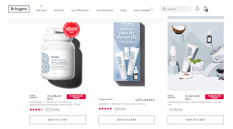
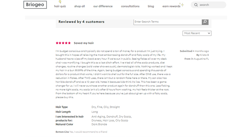
Displaying social proof on your eCommerce website helps influence the behavior of others, and when done in an honest manner, the approach builds stronger, long-term relationships founded on the principles of persuasion.
Provide a seamless checkout process
Requesting customers to register or create an account in order to complete a purchase is an almost sure way of losing customers.
While this practice is suitable for some types of businesses like consultancy, eBooks, and training services, as they ensure to still provide customers with an option to check out as guests.
Add an integration whereby customers are prompted to create an account, sign up for a newsletter or new product alerts, or to become members of a community.
Did you know that impulse purchases represent about 40% of all eCommerce purchases and that 84% of customers have confessed to making impulse purchases?
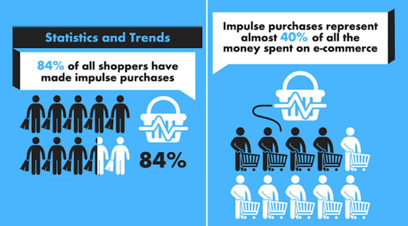
If you are looking to make extra sales from customers who have more cash to spend, ensure to make your eCommerce checkout process hassle- free.
Provide FAQs
Frequently asked questions (FAQs) help customers to access quick answers to basic, common queries like your TAT, product pricing, how to upgrade or update an app or software, etc.
When creating an FAQ section, ensure to reflect on your audience’s needs, cover a broad range of intent (informational, transactional, etc.), update the section frequently, and provide links to the relevant product or information pages.
Use intuitive UX design tools to create a search bar, which customers can use to quickly search for information using specific keywords.
Twitter’s Help Center has a comprehensive FAQ section categorized into “Managing your account,” “Using Twitter,” “Safety and security,” and “Rules and policies.”
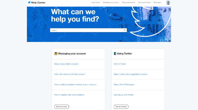
Make your FAQ section useful and reliable, and provide clear sections and links for ease of navigation by customers.
ALSO READ: A complete guide to eCommerce referral marketing
Conclusion
UX design strategies help businesses to create attractive and user-friendly pages for increased engagement and conversions and improved brand image.
When a customer visits your website, they go through 6 steps of website discovery, product catalog browsing, product selection, and comparison, adding the product to cart, checkout, and order confirmation.
UX designers must consider how the website will serve the needs of customers at all these stages while maintaining strong branding, operation simplicity, appropriate visual effects, and clear menus for data representation.
The top 8 UX design strategies that you must incorporate in your eCommerce website for a high ROI include prioritizing brand positioning, design optimization, featuring similar products, adding interactive CTA buttons, and providing wholesome product evaluations.
Ensure to also build customer trust and loyalty by displaying product reviews and testimonials, and to provide a seamless checkout process.
Acowebs are developers of Woocommerce bulk discounts that will help you add bulk discounts to products on your stores. It also has developed various other plugins like the popular plugin for managing the checkout form fields in WooCommerce, called Woocommerce Checkout Manager, which is highly feature-oriented yet lightweight and fast. There is also a free version of this plugin available in the WordPress directory named WooCommerce Checkout Field Editor.


 Login
Login
 Cart
Cart


