- Woocommerce
- Shopify Apps
- WordPress
Here’s a list of the field types of Wcpa and a brief description of each.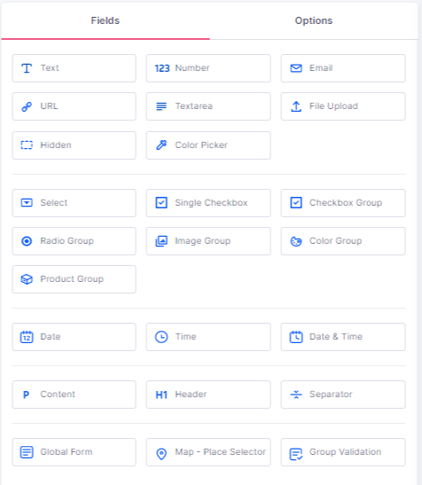
Here are the basic settings common for all field types.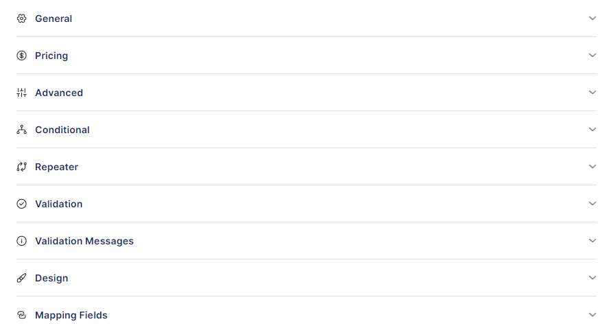
Customers can enter the text using this field. For example, Name, engraving text etc.
Below are the General settings of the Text field.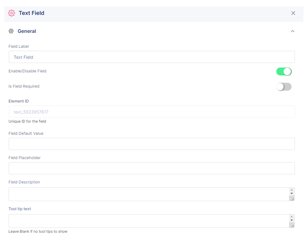
Field Label : You can set a label for the field.
Enable/Disable Field : You can enable or disable the field.
Is field required : Make the field required. So it prevents product from being added to the cart if the field is empty.
Element ID : It is a unique ID for the field.
Field Default value : You can set a default value in the text field.
Field Placeholder : You can set a placeholder for the field
Field description : You can set a description for the field
Tool tip text : You can set a tool tip for the text field
These are the Pricing settings available
Enable price : Enable this option to set price for the text field. Below are the available pricing types.
Use price as fee : That is the price that set to be fee will be calculated only once per order irrespective of quantity.
Use just for show : It can use just to show the price value, price will not count in total amount
These are the Advanced settings of the Text field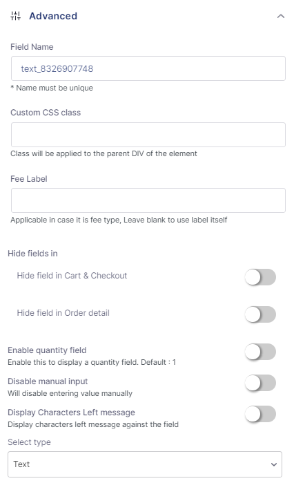
Field Name : Give a unique name for the field.
Custom CSS class : You can add the custom classes to style the field.
Fee Label : Give a label in case of fee
Hide fields in : You can hide the field in Cart & Checkout or hide the field in Order detail
Enable quantity field : Enable this to display a quantity field.
Disable manual input : Will disable entering value manually
Display Characters Left message : Display characters left message against the field
Select type : Select the type of text field as text/password/phone.
Below are the Conditional settings of the text field.
You can show/hide fields with respect to conditions you set in the Conditional Logic. It is the most highlighted feature of WCPA.
Logic Action : You can Show/Hide/Disable the field based on the condition.
Items : Here you want to choose the field name for whichyou want to add a condition.
Relation : Choose the correct relation of the field with the value from the drop down list. You can group 2 or more conditions also.
Here are the Repeater settings.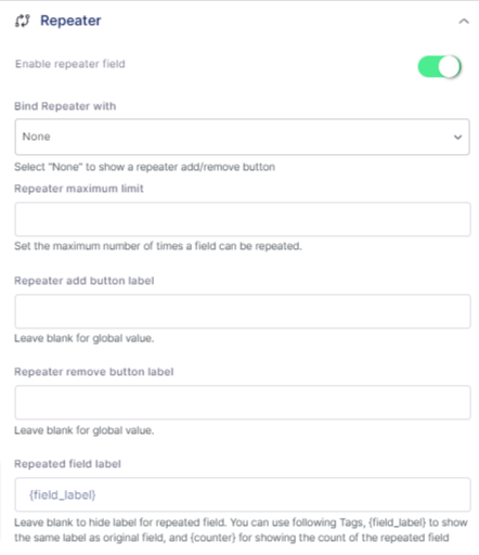
Enable repeater : Enable this field to repeat the field.
Bind Repeater with : Bind the repeater with Product Quantity or another field value, or simply none. Select “None” to show a repeater add/remove button
Repeater maximum limit: Set the maximum number of times a field can be repeated.
Repeater add button label : You can add the label for the add repeater button.
Repeater remove button label : You can add the label for the remove repeater button.
Repeated field label : Add the repeater field label.
Below are the Validation settings.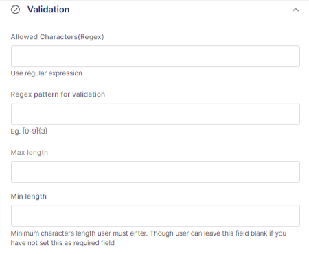
Allowed Characters(Regex) : You can add a regular expression for the allowed characters.
Regex pattern for validation : You can add the regex pattern for validation.
Max length: You can set the maximum length for the field.
Min length : You can set the minimum length for the field.
Below are the Validation Messages settings.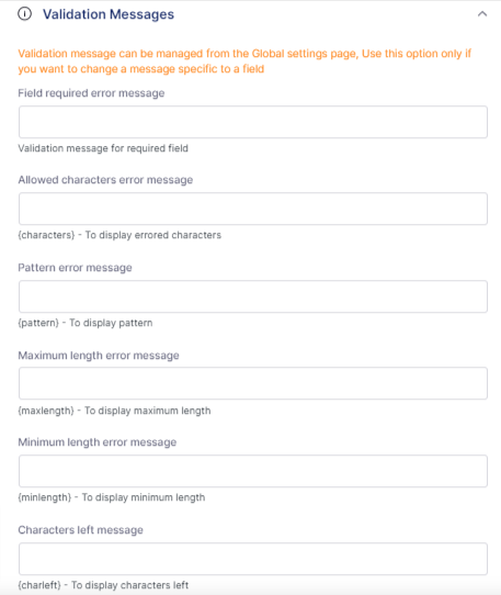
Validation message can be managed from the Global settings page. Use this option only if you want to change a message specific to a field.
Below are the Design settings.
Select label position : You can select the position of the label as above, left, below, disable or default.
Select description position : You can select the position of the description as above, left, below, disable or default.
Enable field specific styling : Enable this to change the label text color, label size, description text color and description size.
Below are the Mapping Field settings.
Enable mapping field : Enable this to map your field.
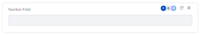
Number field is mainly used to add a specific number. For example, no.of copies for printing a book, no.of items for a pizza toppings, etc.
All the settings for the Text Field is same for the Number Field also. And there is an extra settings in the Advanced Settings area.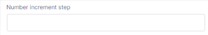
This is used to add/change the number increment step value.
Number field doesn’t include the Allowed characters section for the Validation settings.

Email field is just a variation of the text field. This is used to add the email address only. So the settings available for the text field is also available for email field. There is one extra settings inside the Advanced settings.
This allows the user to enter multiple emails separated by commas.
The validation settings for email field have only the Max length and Min length settings.

This field is used to add a URL if you need a url from the customers. The settings available for the text field is also available for URL field. There is one extra settings inside the Advanced settings.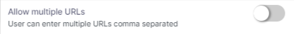
This allows the user to enter multiple URLs separated by commas.
The validation settings for URL field have only the Max length and Min length settings.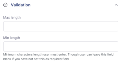

Text area field is used to as set of sentences, like a description. The settings available for the text field is also available for Text area field. There is one extra settings inside the Advanced settings.
This allows the user to set a row limit for the text areas row count.

This field allows the user to upload files. The general settings includes the below additional settings.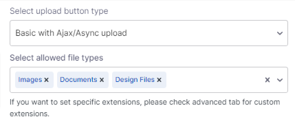
You can choose the Upload button style as Basic file upload, Basic with Ajax/Async upload or Droppable upload. And you can select the allowed file types. If you want to set specific extensions, it is available on the advanced tab for custom extensions.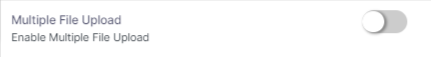
This allows the user to upload multiple files.
The advanced settings include the below settings also.
You can add extra file extensions supported with its tags. And hide the uploaded file preview images from the given areas.
Validation settings includes the maximum file size and minimum file size as below.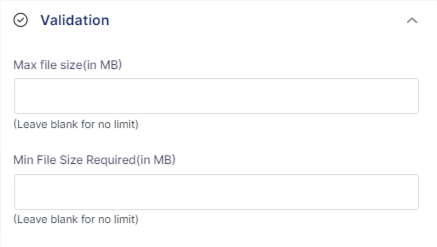
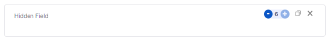
This field is used to add a hidden value. It only contains the Field label, Field id and Field default value.

This field is used to select colors. The general settings include one additional settings for color picker.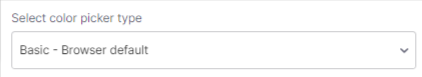
You can choose Basic – Browser default type or Custom color picker. All other settings are similar. If you choose custom color picker, then the below options are available.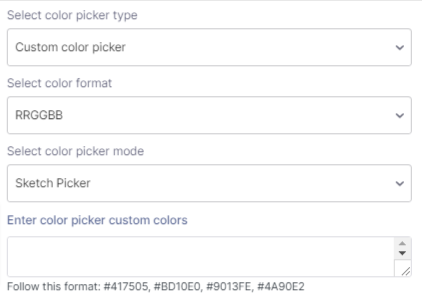
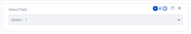
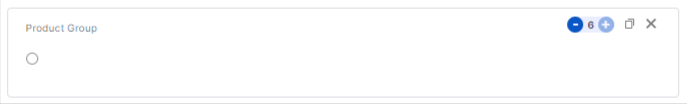
This field is used to add different options. You can choose from the available options.
General settings includes the settings to allow multiple selections and different field options also. You can add a global option also, if you want to select same set of options on different areas.
Advanced settings include one settings to enable product image. If you enable this, then you can add images for each options.
Validation settings allows maximum options allowed and minimum options required.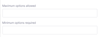

This field is used to add a single checkbox. Ex: agreeing to the terms and conditions.
The general settings include checkbox value. And you can enable it to be checked defaultly.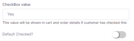
You can choose the checkbox style as Default, Toggle or Button. All other settings are same.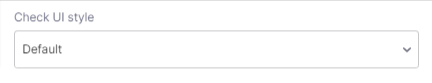
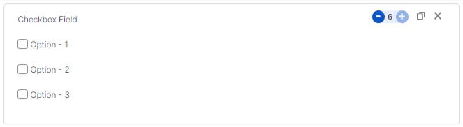
This field is same as the checkbox field mentioned above, but with multiple options. In general settings, it allows to choose the checkbox style as Default, Toggle or Button. Then you can choose the fields alignment as single column, inline, 2 column, 3 column and 4 column. The Enable other field let the users to enter an unlisted option. Then you can add as many options as you want.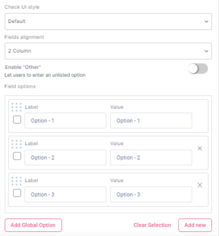
The advanced settings includes the option to enable product image, Set tooltip for each items, Set description for each items, Enable clear selection button, Show selected Option Label on top and you can add the Other option text also.
The Validation Settings includes the maximum options allowed and minimum options required.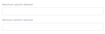
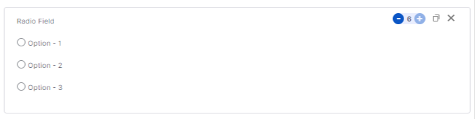
This field is same as the checkbox group field. But this field can select only one option from the set of options. All other settings are same as checkbox group settings
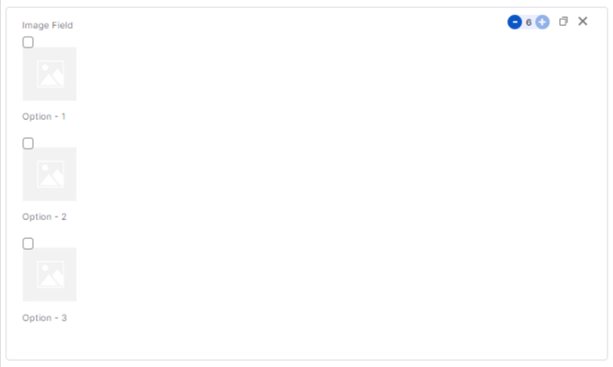
This field is used to add image options. You can choose the options by looking to its images.
In general settings, you can set the image display size(Height and width). Then you can enable the zoom image on hover option. Then you can enable popup for All devices, for touch devices only, on desktop only, or simply disable popup by selecting No. In option settings, it allows you to change the image and delete the image if you want.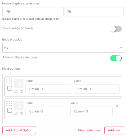
In Advanced settings, you can enable the option to show the image as product image. And you can enable different image for product gallery. You can choose the Box display type as square, circle and squircle. Then you can choose the image selection type as outline, shadow, tick and tick with shadow. Other settings same as previous ones.
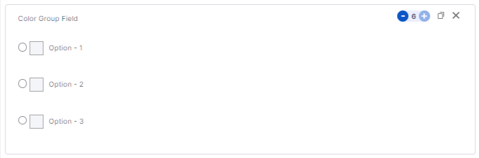
This field is used to choose colors from the given color options. In general settings, you can set the display size of the colors. And allow multiple selections. You can choose the colors for each options.
In advanced settings, you can change the color item selection type as tick, border or tick with border. You can show label inside the field. And adjust the width based on the label. Cart display type can be changed to text mode or mox mode. Box display type can be changed to square, circle and squircle.
This field is used to add different products as an option. General settings include the option to enable custom label for the products.
Then you can choose the products by addings its ID.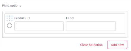
In advanced settings, you have the option to enable independent quantity.

This field is used to choose a date from the calendar. In general settings, you have the option to select date picker type as Custom date picker or basic-browser default type. You can choose the date picker mode as single date, multiple dates or date range.
Then you can enable the option to show the date picker inline. Set the minimum date as yesterday, today, tomorrow, fixed date, days count(from today), field value, or simply select none. Set the maximum date as yesterday, today, tomorrow, fixed date, days count(from today), days count(from min date), field value, or simply select none. You can select days to disable in Date picker as sunday, monday, tuesday, wednesday, thursday, friday and saturday. Then you can select days to disable in date picker and select days to enable in date picker. Then you can set the date format also.
In advanced settings, you can disable manual input. Then you can configure the date picker fof advanced uses. You can add custom javascript code for each date config properties(min date, max date, enable, disable, default date or mode).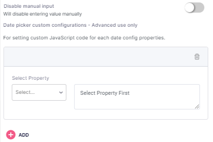

This field is used to select time. In general settings, you can add the time format. Other settings are same. You can change the time format.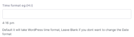
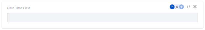
This field is used to select date and time together. All the settings available for date field and time field is available for date-time field also.
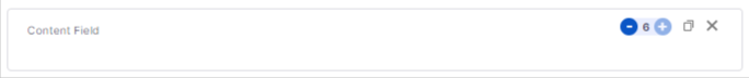
This field is same as the paragraph field, but with more customizations on the text. In general settings, you can choose the content type as Text content or rich text.
You can have a detailed text editing area if you choose the content type as rich text.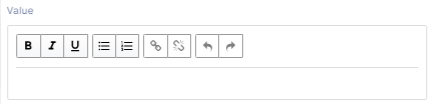
You can choose the field type as div, paragraph, blockquote, canvas or output.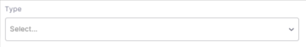

This field is used to add a header or heading in your form. In general settings, you can choose the header type as H1, H2, H3,H4, H5 or H6 as per your need. H1 is the largest header and H6 is the smallest header.

A separator field is used to add space between different fields or sections. In general settings, you can set the separator to be a blank space or as a fill color. Then you can add a height also.
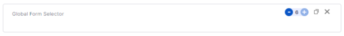
This field is used to choose the global form. In general settings, you can select the global form and assign the form to the desired sections or on all sections.

This field is used to select the place or location. You must setup Google Map API keys in WooCommerce custom product addons plugin settings at (Settings>>Other Settings) in order to work this place selector. In general settings, you can enable the google map. You can show the address fields. Then you can set the height of the map also.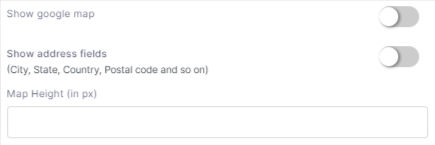
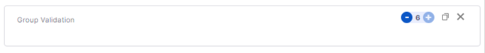
This field is used to add group validation. In general settings, you have the option to select validation type as total selected options, sum of field values, total quantity or custom formula. Then you can Select fields to validate as Group Validation or External Field. If you choose external field validation, the you have to add the label/tag of the field. Then you can add a minimum value and a maximum value.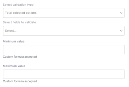
If you have questions about our plugin(s), are experiencing issues with any of our plugin


 Login
Login
 Cart
Cart BUY THIS PLUGIN