- Woocommerce
- Shopify Apps
- WordPress
The form fields in WCPA are easily customizable by styling it using CSS. There are numerous classes to style the fields in a form. You will be able to change the color, background, appearance and so on with using CSS and the concerned classes of the fields. This option will help you to get the Custom Product Addons plugin fields as you want it to look like.
Most of you may have a question that “where we will add these custom styles”?
Normally, you can add the styles you have made in the Additional CSS. Some themes will provide a separate section to add custom styles.
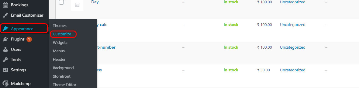
The path to Additional CSS is Appearance -> Customize -> Additional CSS.
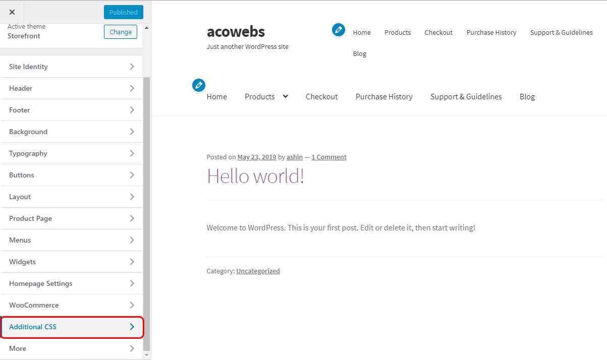
Look at the below screenshots.
2. Additional CSS
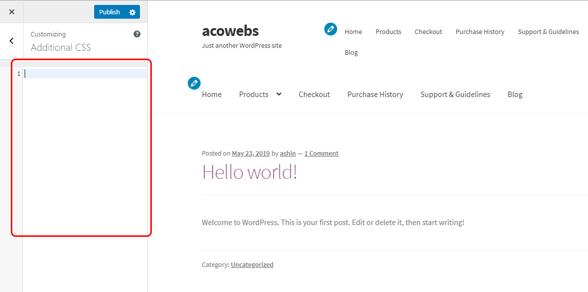
3. The marked area of the below screenshot is the place where you need to add the custom CSS codes.
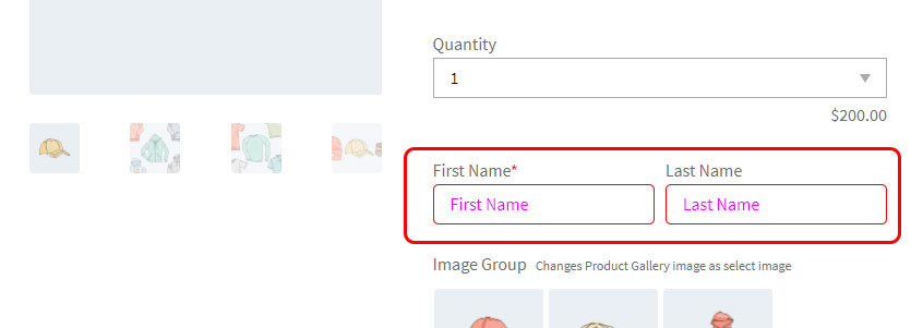
Common class names of WCPA
| Class | Use |
| wcpa_has_options | To select the single product page which contains WCPA forms |
| wcpa_form_outer | To select every single form |
| wcpa_field_price | To select the fields with price |
| wcpa_cart_has_fields | To select fields from cart/checkout |
| wcpa_cart_price | To select WCPA option price |
| wcpa_tooltip_icon | To select a tooltip icon |
| wcpa_tooltip | To select the tooltip |
Let’s have look at the common class names for the custom fields
| Field | Class |
| Text field | wcpa_type_text |
| Text Area | wcpa_type_textarea |
| Number | wcpa_type_number |
| Select | wcpa_type_select |
| Checkbox Group | wcpa_type_checkbox-group |
| Radio Group | wcpa_type_radio-group |
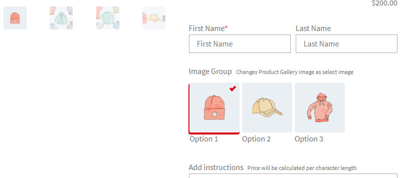
| Image Group | wcpa_type_image-group |
| Color Group | wcpa_type_color-group |
| Google Place Selector | wcpa_type_placeselector |
| File Upload | wcpa_type_file |
| Color Picker | wcpa_type_color |
| Date Field | wcpa_type_date |
| Time | wcpa_type_time |
| Date Time | wcpa_type_datetime-local |
| Paragraph | wcpa_type_paragraph |
| Header | wcpa_type_header |
| Separator | wcpa_type_separator |
| Single Checkbox | wcpa_type_checkbox |
a. Changing color of every custom field label to red
.wcpa_form_item > label{
color: #ff0000;
font-weight: bold;
}
b. Styling input fields
.wcpa_type_text input{
border-radius:5px;
}
.wcpa_type_text input::placeholder{
color:#ff00ff;
font-size:16px;
}
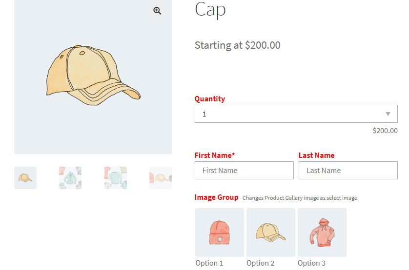
c. Styling selected image shadow of image group
.wcpa_form_outer .wcpa_form_item .wcpa_sel_type_shadow input:checked+img {
    box-shadow: -1px 3px 0px 1px #DC0011 !important;
}
.wcpa_form_outer .wcpa_form_item .wcpa_sel_type_tick-shadow .wcpa_image input:checked~label:after{
    border-style: solid;
    border-width: 0 4px 4px 0;
    border-color: #dc0011;
    right:10px;
}
d. Styling the radio group selection button
.wcpa_form_outer .wcpa_form_item .wcpa_radio input[type=radio]:checked+label .wcpa_check::before {
  background-color: #cc1d65;
}
.wcpa_form_outer .wcpa_form_item .wcpa_radio .wcpa_check{
border:2px solid #cc1515 !important;
}
.wcpa_type_radio-group label {
    text-transform: uppercase;
    color: #ff0000;
}

e. Styling tooltip icon and tooltip text
.wcpa_form_outer .wcpa_form_item .wcpa_tooltip_icon {
    color: #ffffff;
    background: #2196F3;
}
.wcpa_form_outer .wcpa_form_item .wcpa_tooltip_icon > span {
    background: #2196F3;
    color:#fff;
}
.wcpa_form_outer .wcpa_form_item .wcpa_tooltip_icon:hover:before {
    border-color: #2196F3;
}
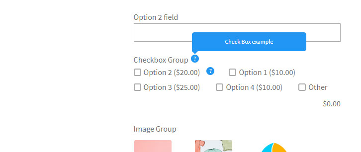
f. Styling checkbox group selection button
.wcpa_form_outer .wcpa_form_item .wcpa_checkbox input[type=checkbox]:checked+label .wcpa_check {
    border: 2px solid #2196f3;
    background: #2196f3;
}

If you have questions about our plugin(s), are experiencing issues with any of our plugin


 Login
Login
 Cart
Cart BUY THIS PLUGIN