- Woocommerce
- Shopify Apps
- WordPress
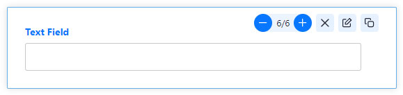
Here we deals with the field specific edit options of the WCPA
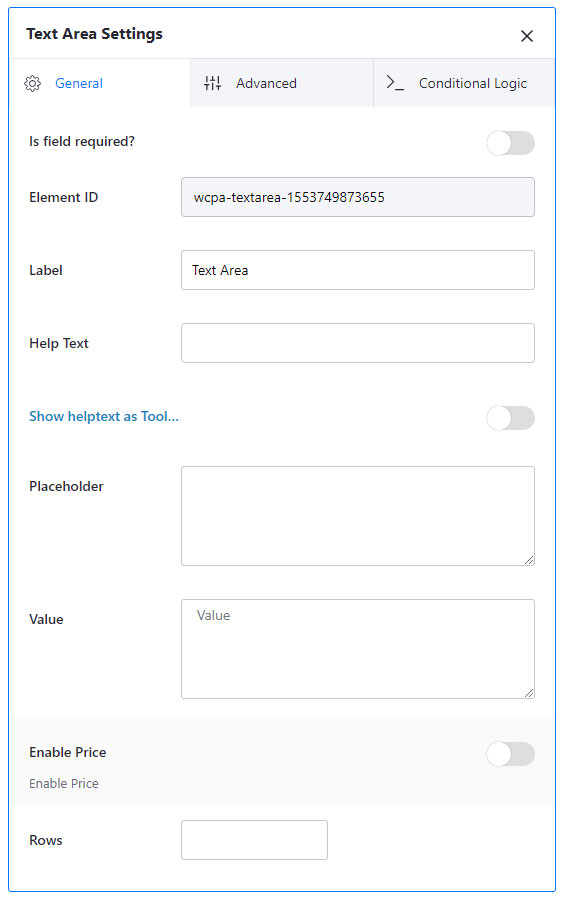
Value: Sets a default value in the text field.
Type: There are 3 types of text fields, namely; text field, password and email.
Disable manual input: It will disable manual user input.
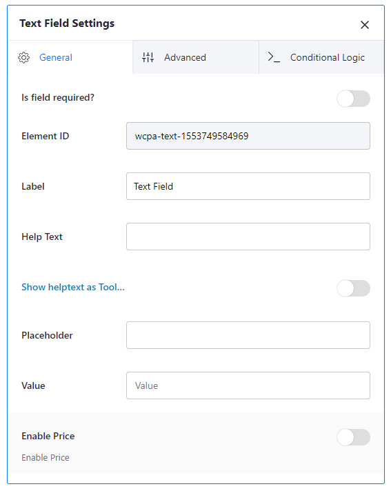
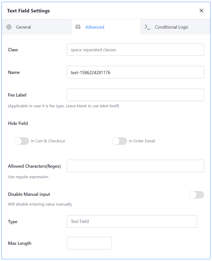
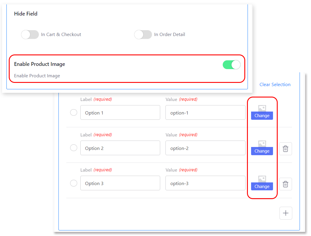
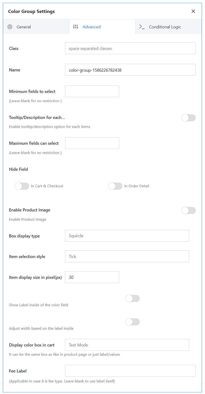
Hide Field: To hide the fields in cart, checkout and order details, check the appropriate button.
Allowed Characters(Regex): Regular expression can be used for restricting the input.
Disable manual input: Manual input by the user can be disabled using this button.
Type: There are three types for the text field; Text, Email, and Password.
Rows: Sets the maximum number of rows the text area can hold.
Max length: Sets the maximum length of characters a text field can hold. It also work for text field.
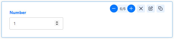
Min: Sets the minimum number
Max: Sets the maximum number
Step: Sets the increment/decrement value
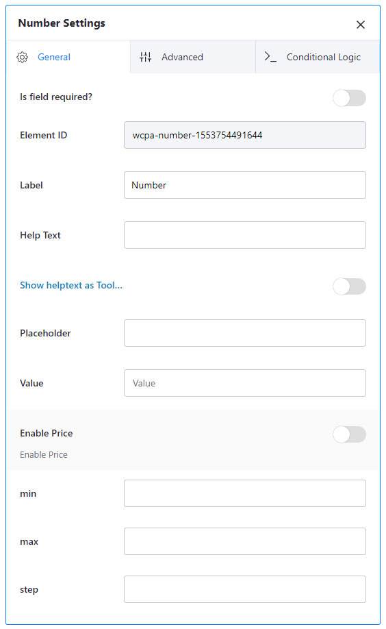
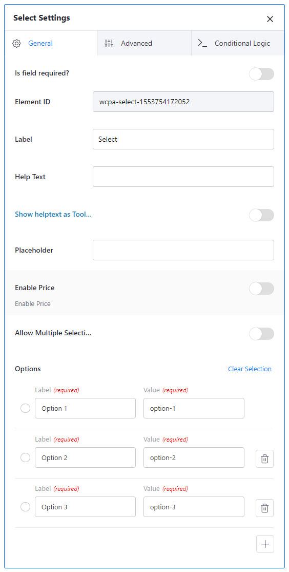
Allow Multiple Selections: Allows you to select multiple values from the list.
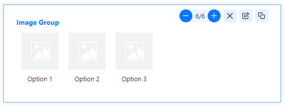
Options: sets the values for the drop-down list(select field). You can add as many as options you want.
Enable product image: Allows you to add product images with the options of the select fields. When selecting the image assigned options the product image will change to the assigned image.
Inline: Makes the values inline
Enable “Other”: Let the users to give an other option
Tool tip for each item: Enables tool tip for each item in the checkbox group
Minimum fields to select: Sets the minimum options the user must have selected
Maximum fields can select: Sets the maximum options the can be selected
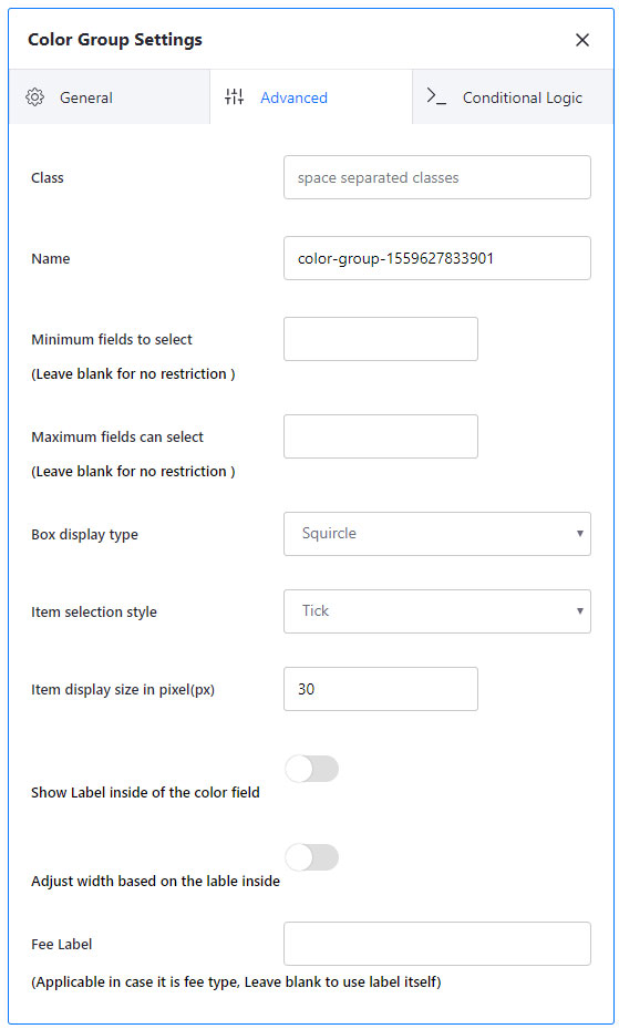
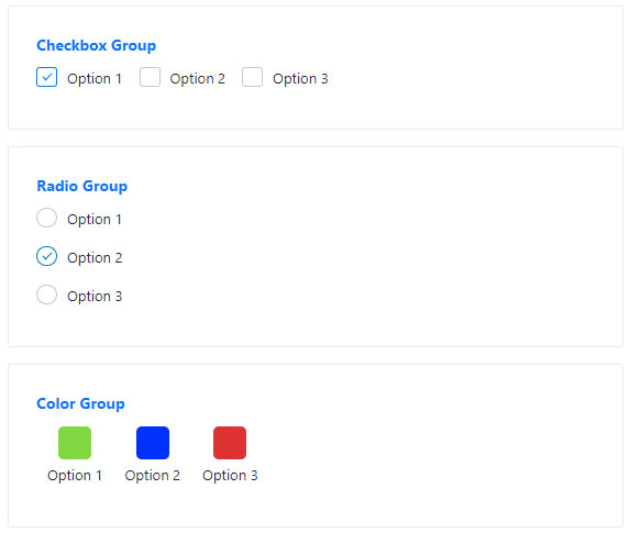
Box display type: You can select the display type of the options from the list. The options are Circle, Square, and Squircle.
Item selection style: It helps to change the selection type for the field. The options you can select are Tick, Tick with Border, and Border.
Item display size in pixel: You can set the size of the field options in pixel here.
Show Label inside of the color field: By ticking this, you can enable showing the label inside the options of the color field.
Adjust width based on the label inside: You can adjust the options width based on the label size inside of it.
Display color box in cart: There are 2 options to show the selected color; box mode and text mode.
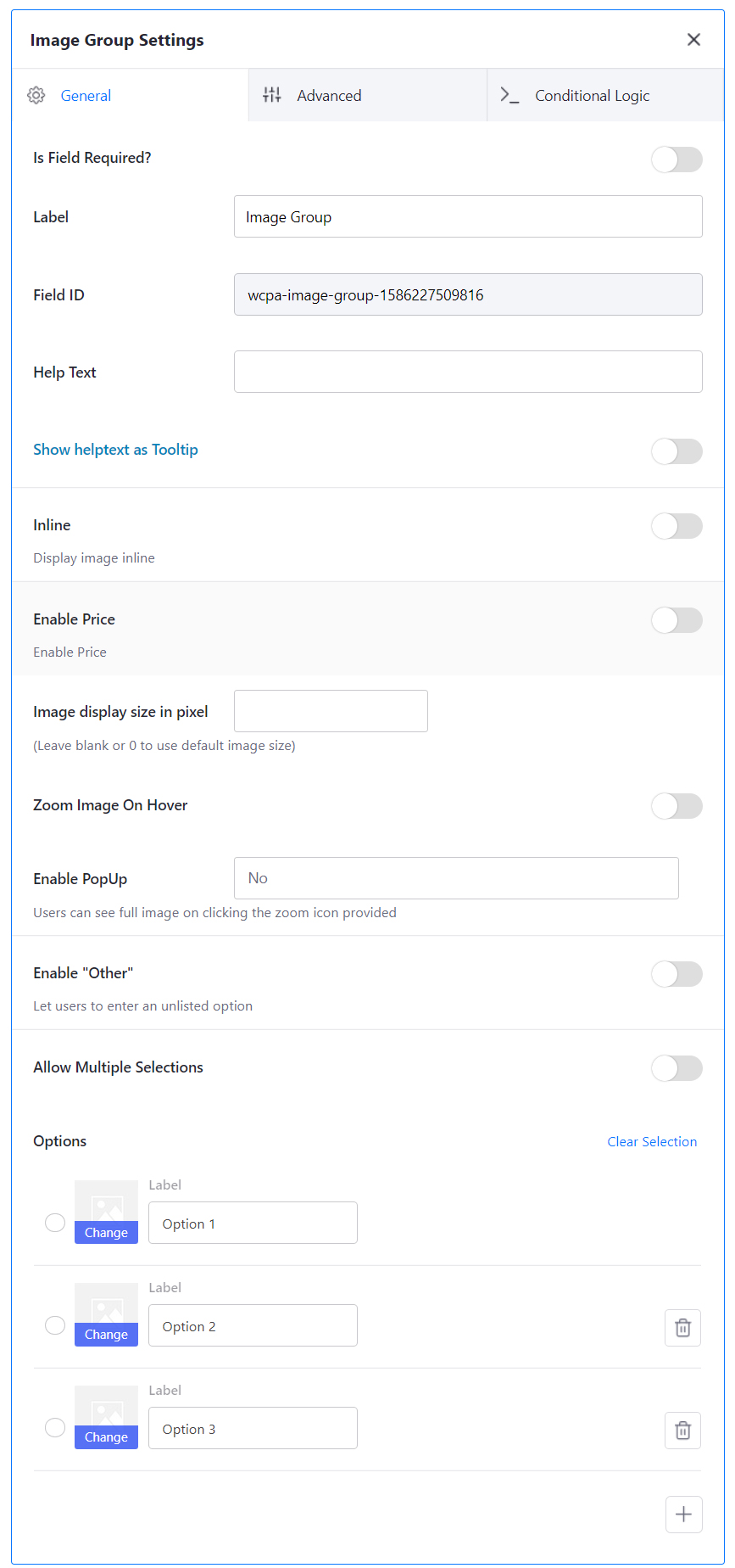
Inline: It sets the image group inline. The default style of image group is one after another downwards.
Image display size in pixel: Sets the image display size. You can leave it blank or 0 to use default image size.
Zoom image on hover: Zooms the image on mouse hover
Enable Popup: Users can see full image on clicking the zoom icon provided
Enable other: It allows the user to enter an option other than in the list.
Allow Multiple Selections: It allows users to select multiple options from the group.
The advanced section of Image group allows you to set more user-friendly options.
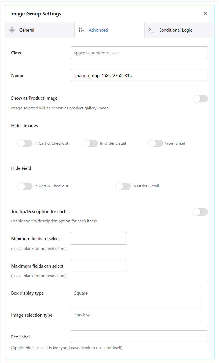
Show as Product image: You can set the selected image group option image as product image.
Hide Images: Allows you to hide the image from cart, checkout, order details and order email.
Minimum fields to select: You can set a minimum number of fields should be selected by the user.
Maximum fields can select: You can set a maximum number of fields can be selected by the user.
Box display type: This allows you to set what type of display of image you want. It has three options namely, Square, Circle, and Squircle.
Image selection type: It allows the you to set what should be the indicator of the selected image. You have four options here. They are; Outline, Shadow, Tick and Tick with Shadow
Fee label: If you set the image group as a fee, then you can set the fee label in the text box. If not leave it blank.
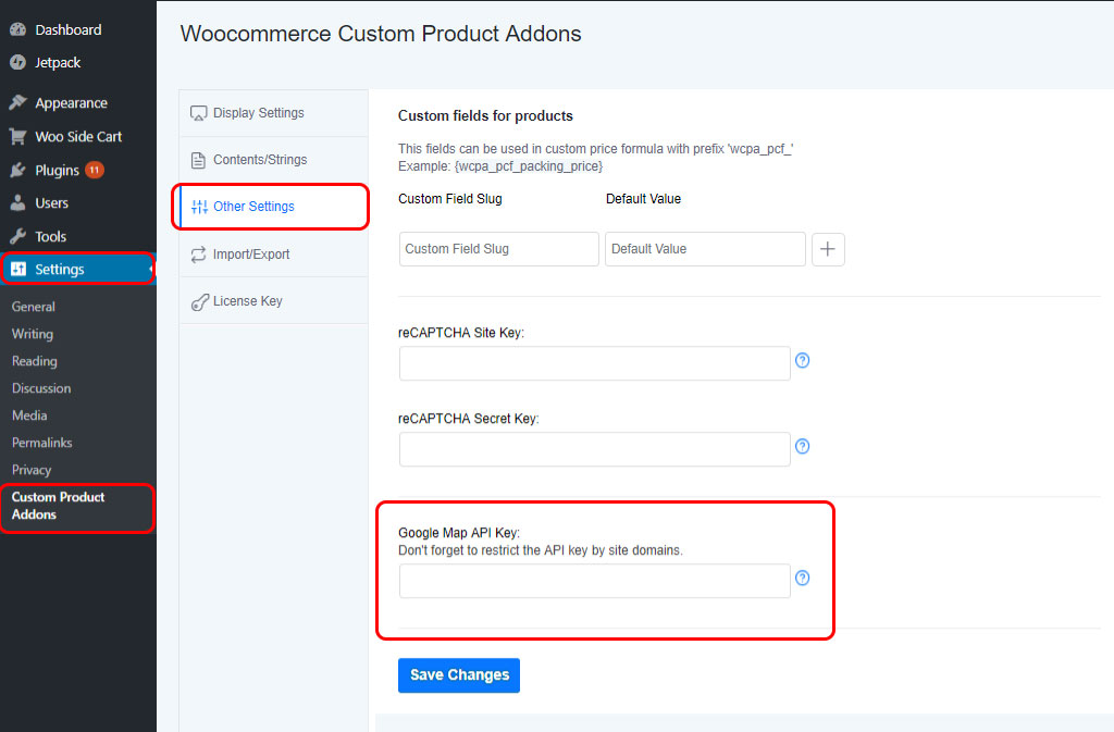
If you want to use Google Place Selector in your website, you must set the Google API key in the path: Settings–> Custom Product Addons–> Other Settings
Now let’s check out the features provided by Google place selector.
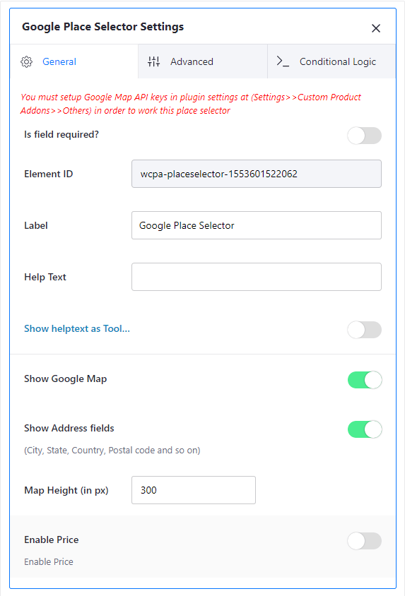
If you tick the Show Google Map, it will show the map at the front-end and Show Address fields allow you to show fields like city, country, etc to be filled up. Map Height can also be set(in pixels).
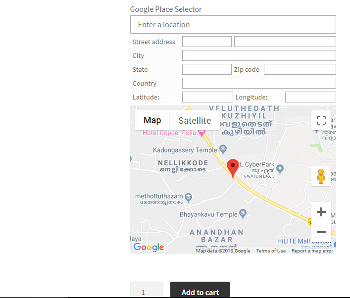
In front-end view, it will be like the below screenshot if you tick both the checkboxes.
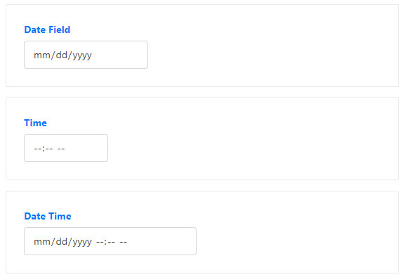
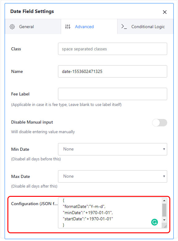
These 3 fields provide an advanced feature that you can configure JSON format codes. The JSON code may change properties like the format, start date, min date, etc of the date and time fields.
For example,
More details about the date and time customization is given in Date, Time & Customization page
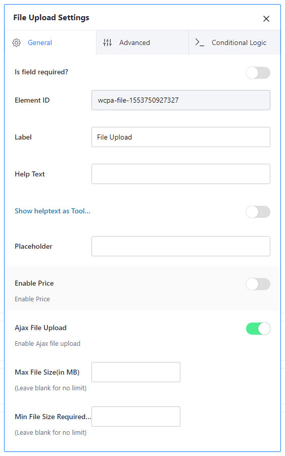
Ajax file upload: It allows you to upload a file without the page reload. It is enabled by default.
Max file size(in MB): Sets the maximum file size allowed to be uploaded.
Min file size required(in MB): Sets the minimum file size to be uploaded.
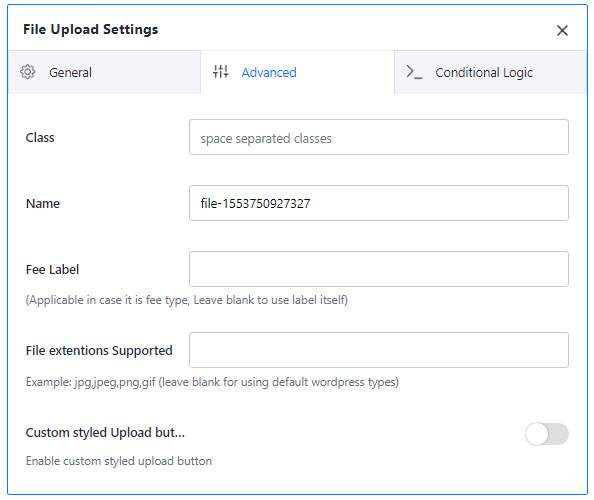
File extensions supported: Sets the extensions for file upload
Custom styled upload button: Tick if you need to customize the upload button.
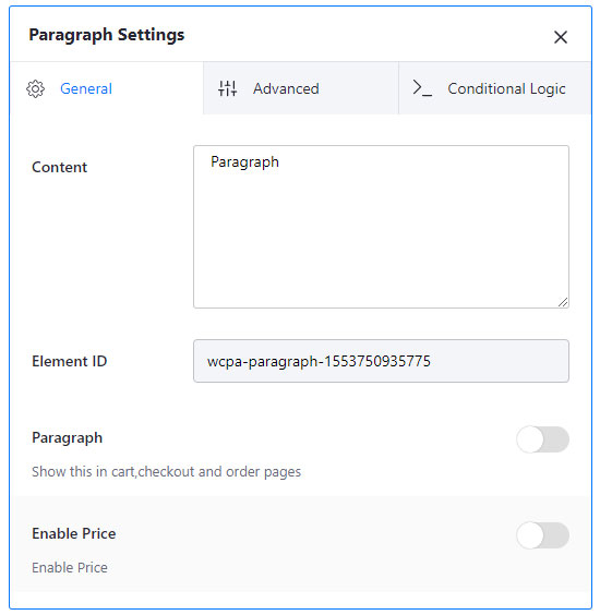
If you need to show some text on the product page or if you need to show something without the help of an input field, then you can use this field.
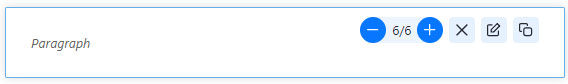
Paragraph: It needs to be enabled to show the values in the paragraph field on the cart, checkout and other pages.
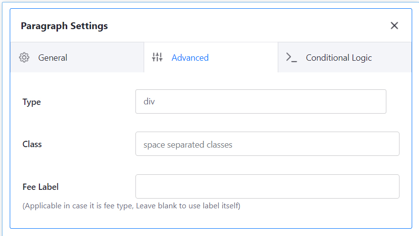
Type: There are different types like div, p, address, blockquote, canvas and output.
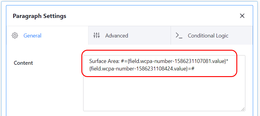
You can add a custom formula in the paragraph field. But it must be enclosed inside the #==#. For example;
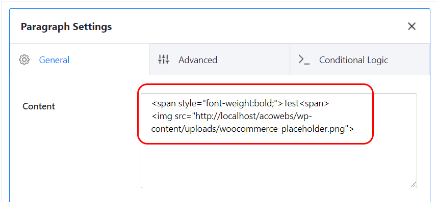
You can add HTML codes inside the paragraph field. For example;
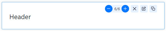
Header is same as the paragraph, but it acts as a heading.
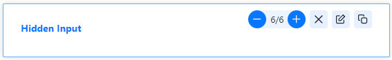
Hidden input allows the admin to set a value to be shown only in the order details page.
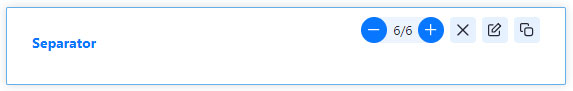
Separator allows you to set distance between fields.
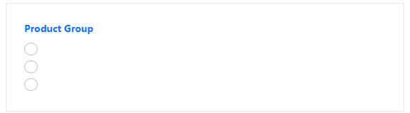
Product groups include simple products as a subproduct to the main product, therefore you need to add the product ID of the required product to enable the field.
Please note that the product group field only supported simple product
Show product image: This option allows you to show the product image on the frontend
Image display size in pixel: Sets the image display size. You can leave it blank or 0 to use the default image size.
Enable custom label: Enabling this option will give a custom field to create a new label for the existing product.
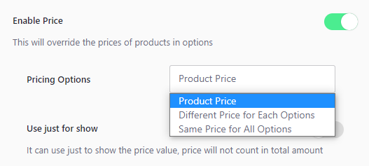
Enable Price: By choosing the pricing option as “Product Price”, the default price of the product will be taken
Independent Products: Enable this option to add the products to the cart independently.
Enable quantity field: Enable this option to display a quantity field along with the product
Independent Quantity: Enable this to add products to the cart independent of the base product quantity.
This option will not be supported for independent products in the cart
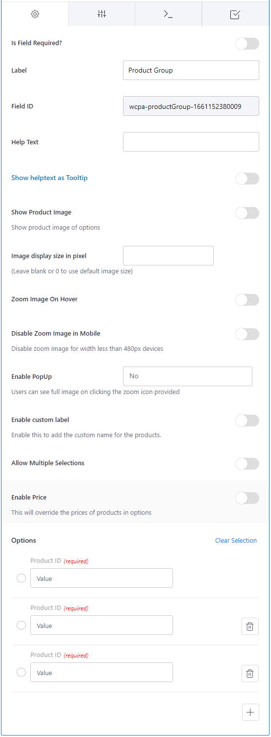
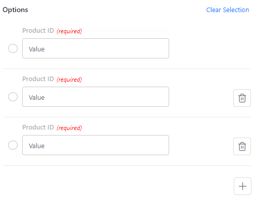
Product ID: Define the product ID of the product you want to set as a sub-product
If you have questions about our plugin(s), are experiencing issues with any of our plugin


 Login
Login
 Cart
Cart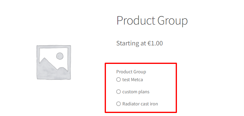
 BUY THIS PLUGIN